All Works – Brand Identity ⊹ Events & Spatial ⊹ Editorial & Publishing ⊹ Illustration ⊹ Posters & Objects
In-house / Studio – Paramount International ⊹ Bandwagon Asia
All Works – Brand Identity ⊹ Events & Spatial ⊹ Editorial & Publishing ⊹ Illustration ⊹ Posters & Objects
In-house / Studio – Paramount International ⊹ Bandwagon Asia
Events

Spatial /
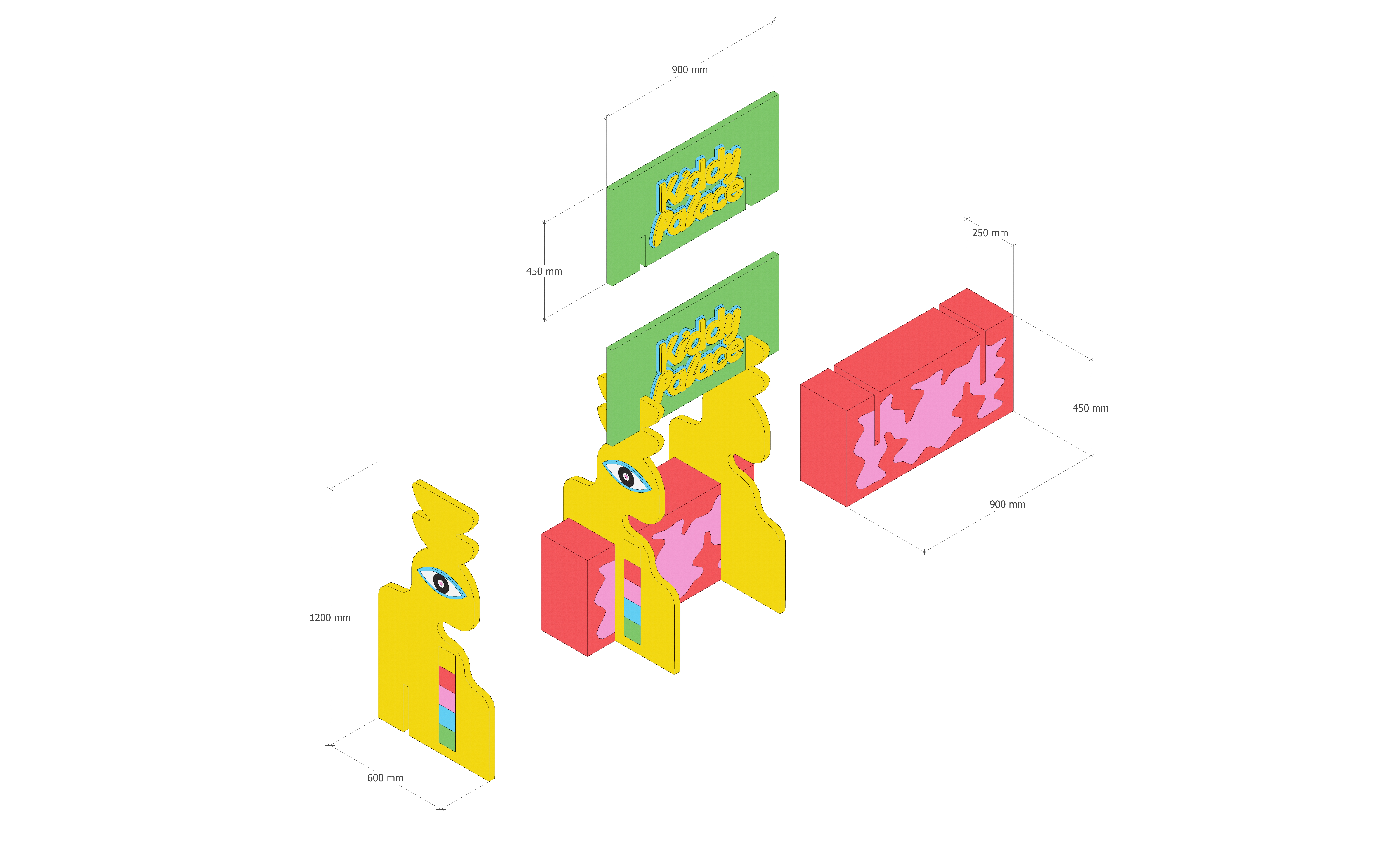
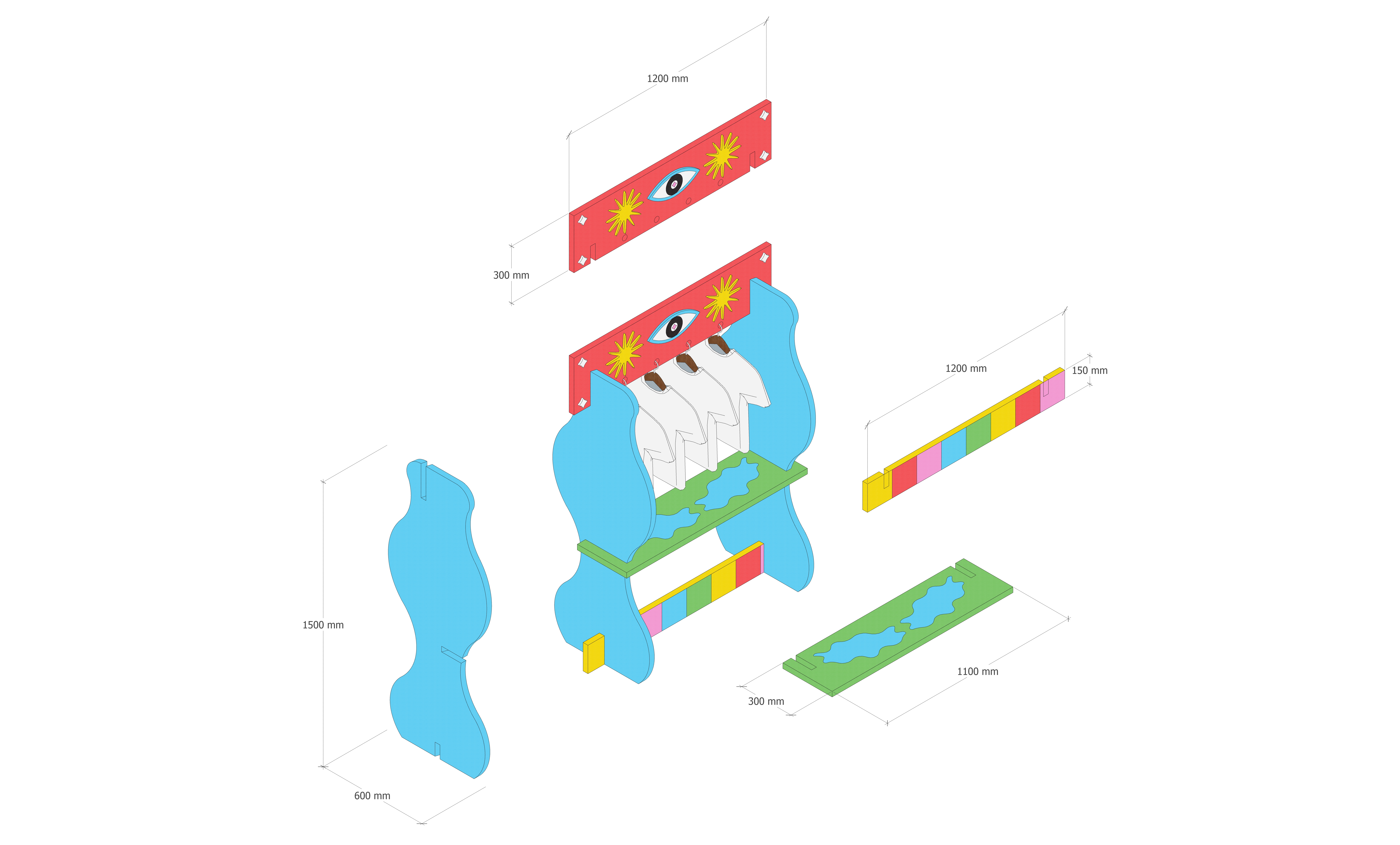
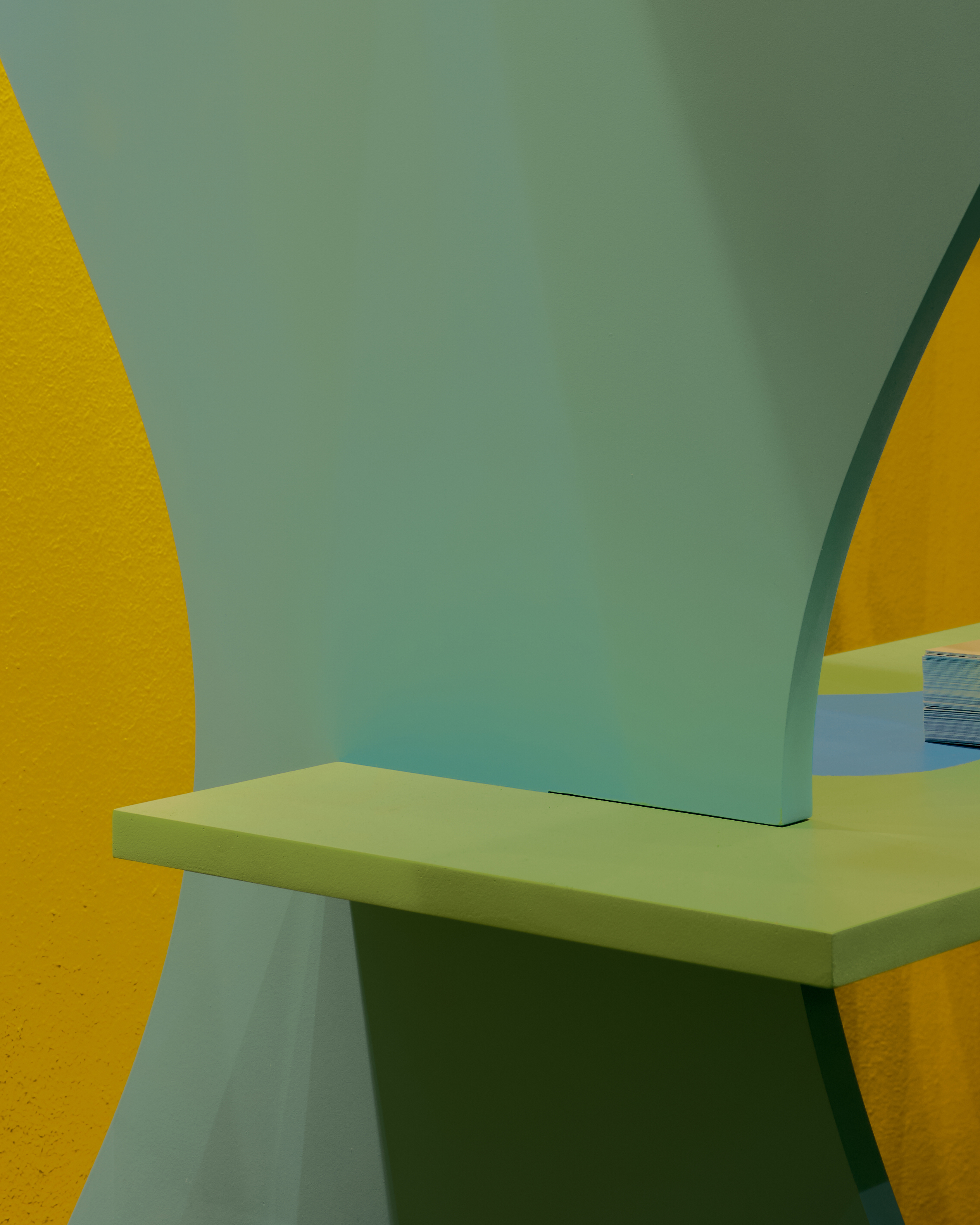
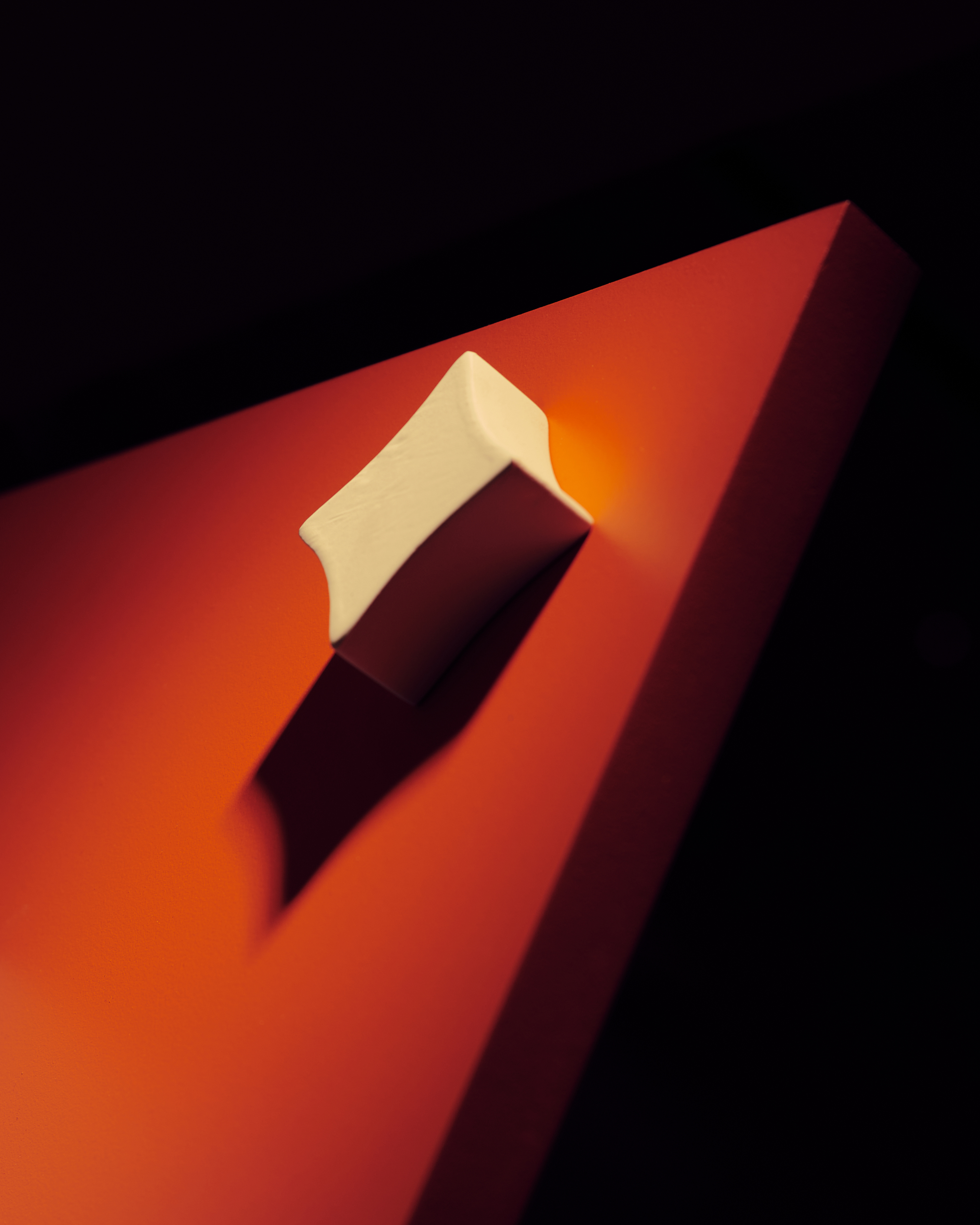
Neu Folk for Singapore Design Week
Exhibition Installation & Brand Reimagining
Client: Neu Folk / Kiddy Palace
Event: Singapore Design Week
Year: 2024
Role: Visual identity, spatial concept & exhibition design
Scope: Brand reimagining, modular spatial system, environmental graphics
Developed an exhibition installation and brand reimagining for Neu Folk, presented at Singapore Design Week 2024 and curated by Nathan Yong (Grafunkt). The project reinterprets Kiddy Palace, Singapore’s long-standing children’s toy and apparel retailer, through a contemporary, design-led lens while retaining its playful spirit and cultural familiarity.
The rebrand embraces curiosity, adventure, and nostalgia, drawing from Kiddy Palace’s 90s legacy while appealing to modern families. Retaining the brand’s iconic blue and yellow palette, the system introduced additional vibrant hues and Memphis-inspired graphic elements, characterised by abstract forms, bold patterns, and playful distortion. Illustration was used to create a surreal, engaging visual language that encourages exploration and interaction.
The rebrand embraces curiosity, adventure, and nostalgia, drawing from Kiddy Palace’s 90s legacy while appealing to modern families. Retaining the brand’s iconic blue and yellow palette, the system introduced additional vibrant hues and Memphis-inspired graphic elements, characterised by abstract forms, bold patterns, and playful distortion. Illustration was used to create a surreal, engaging visual language that encourages exploration and interaction.
CREDITS
3D rendering by Amirul Nazree
Fabrication by GreenQubes
Photo documentation by Samuel Foo
3D rendering by Amirul Nazree
Fabrication by GreenQubes
Photo documentation by Samuel Foo
Working in collaboration with spatial designer Amirul Nazree, a modular plank system was developed to form interactive zones within the 3×3m booth. The spatial design translated the graphic language into three-dimensional forms, allowing abstract shapes to function as both display structures and playful architectural elements.
 3D Rendering by Amirul Nazree

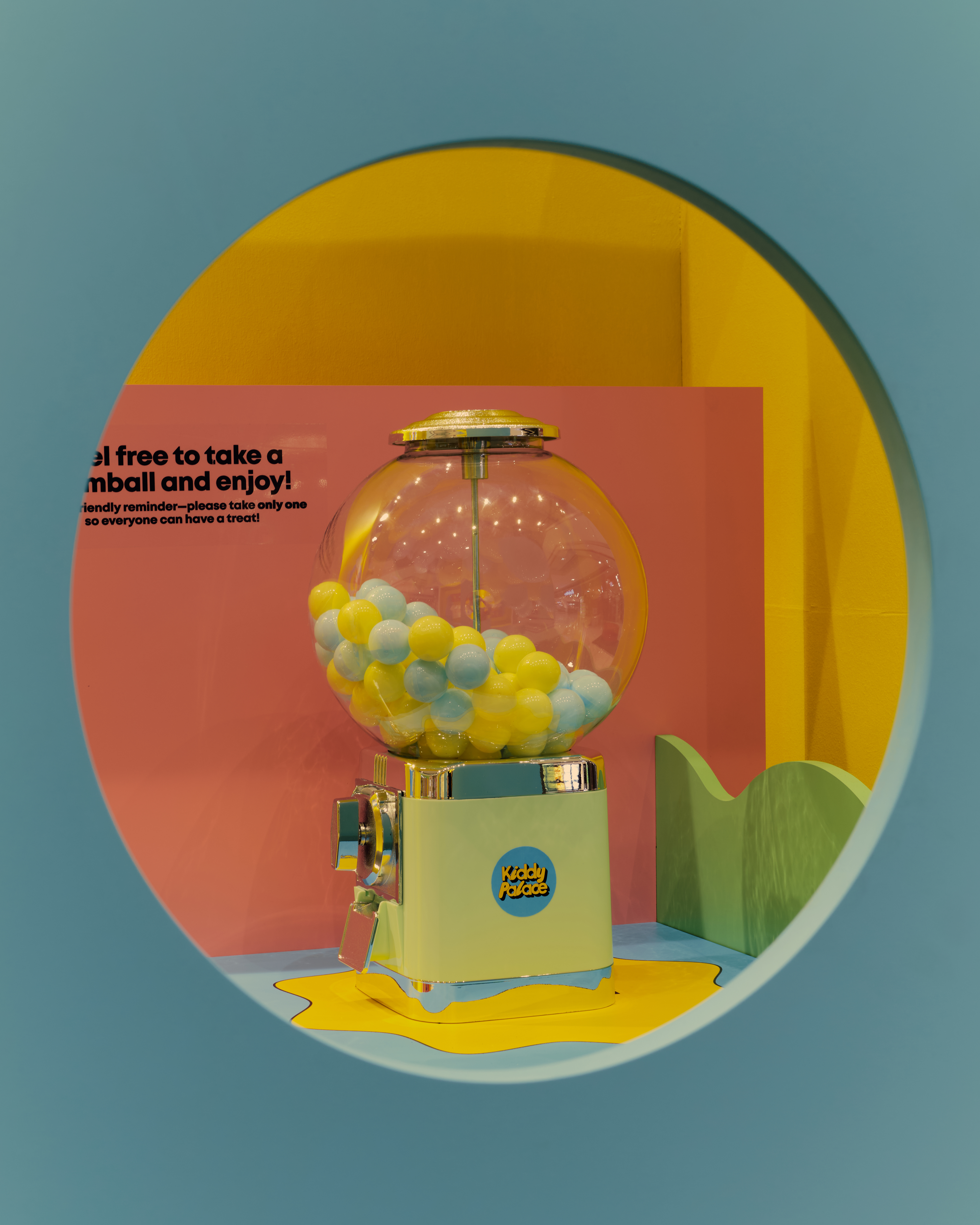
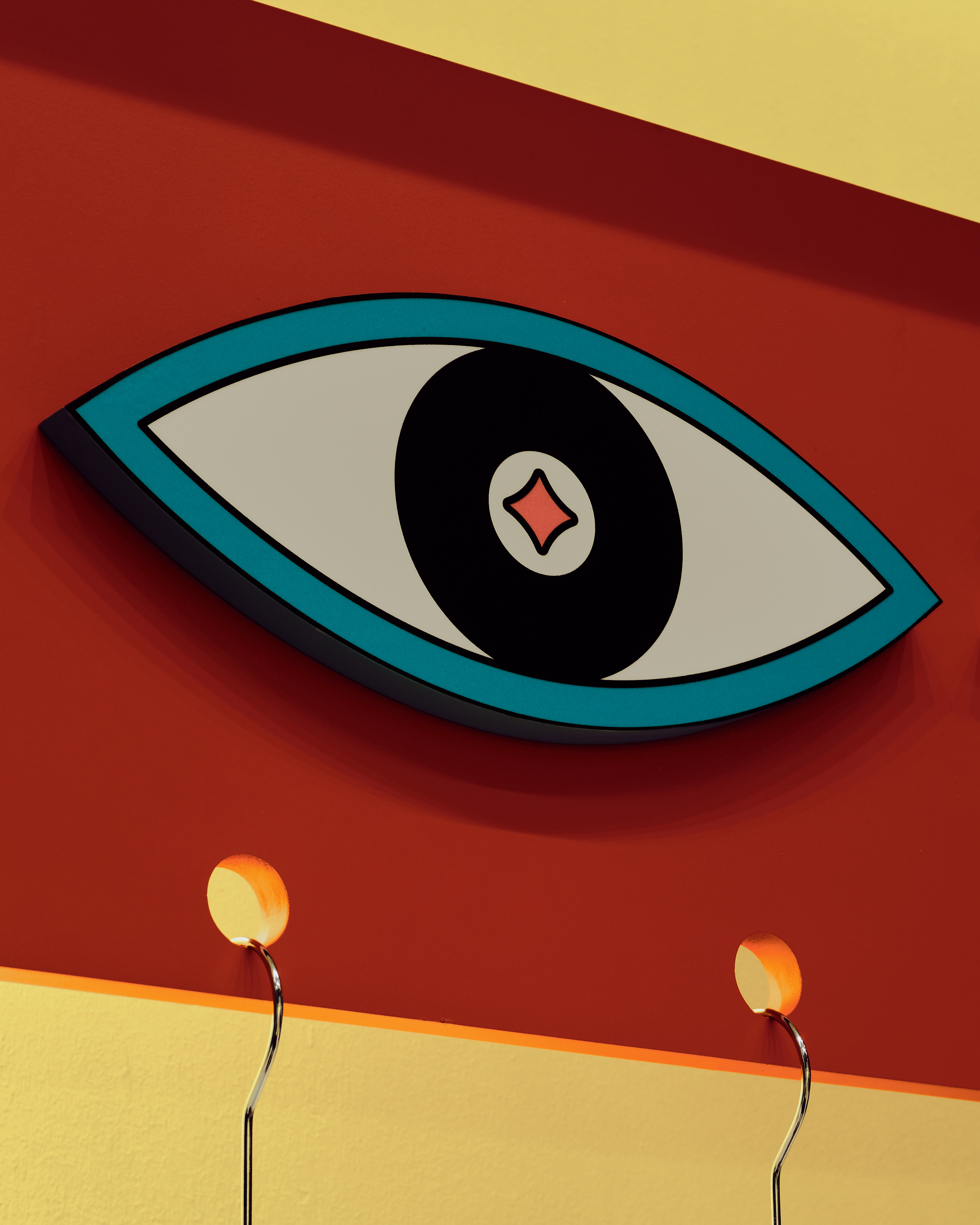
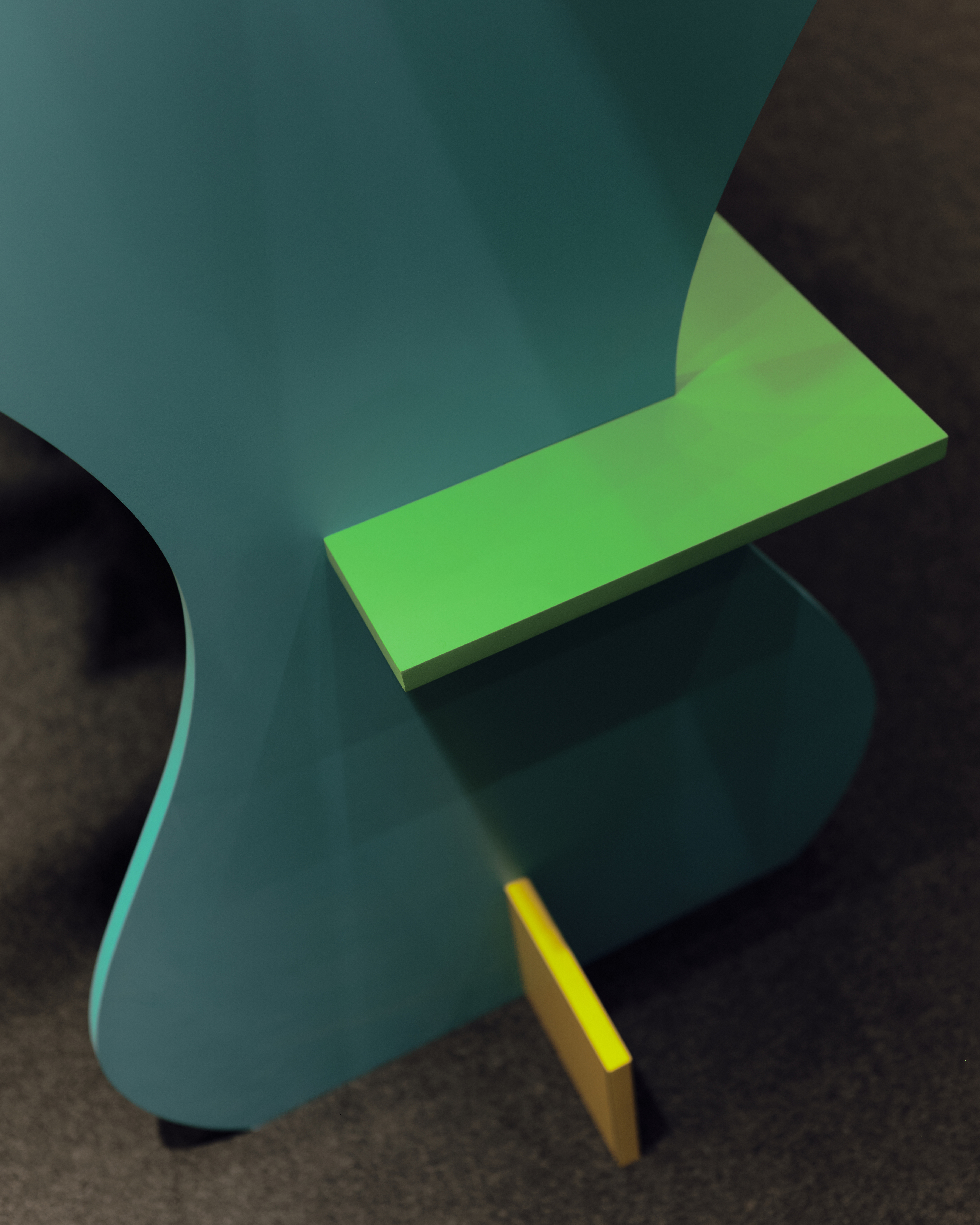

The modular components were designed to be interlocked, adaptable, and reusable, supporting flexibility across future activations. A central fishbowl installation introduced a terrarium-like focal point, while surrounding displays created a miniature, immersive environment, reinforcing the idea of play as discovery and imagination.


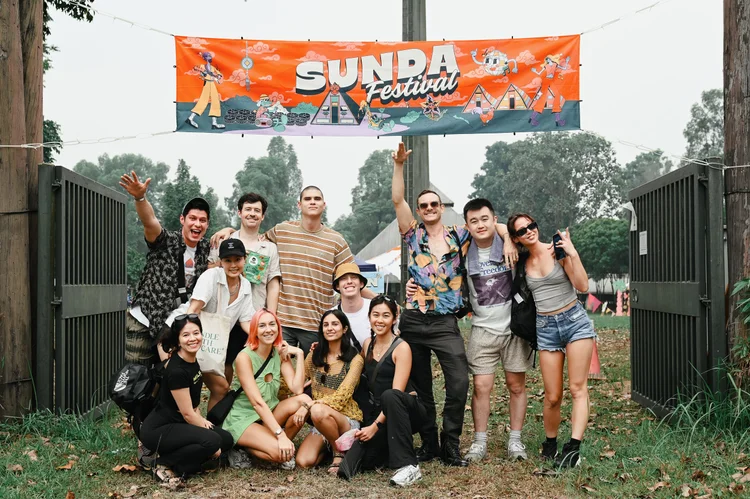
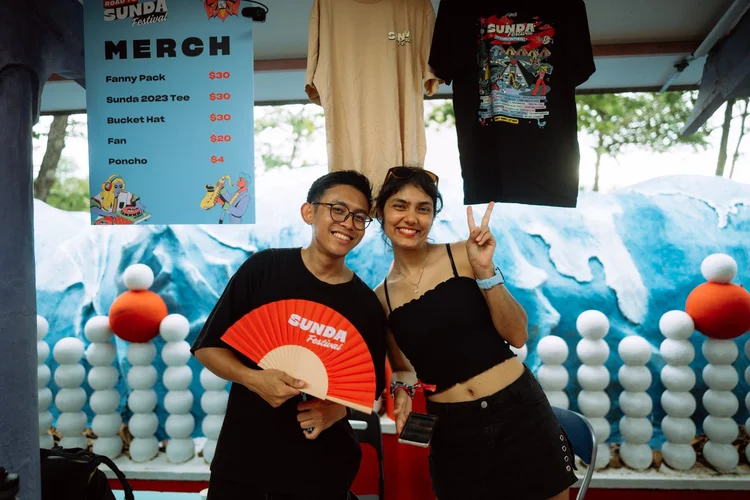
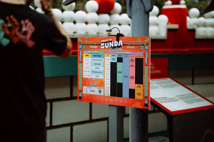
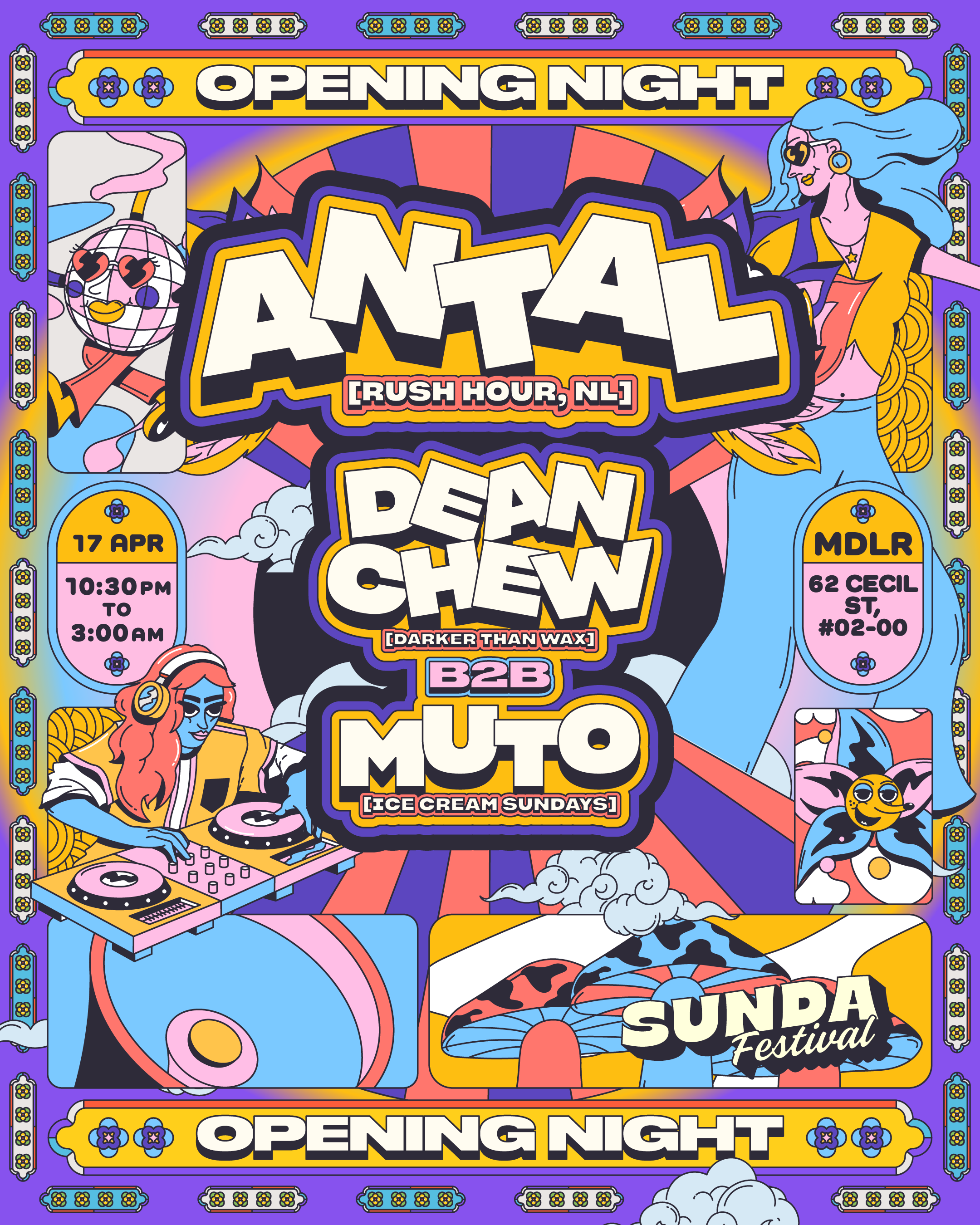
Events /
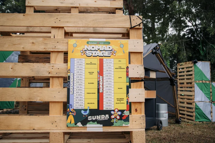
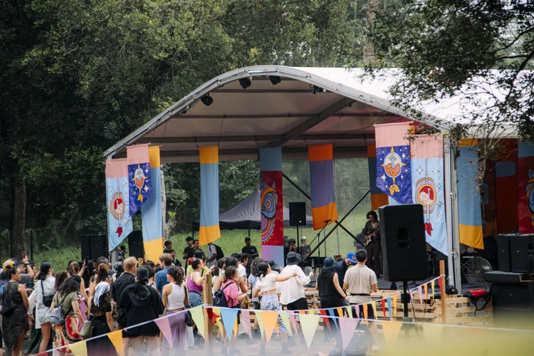
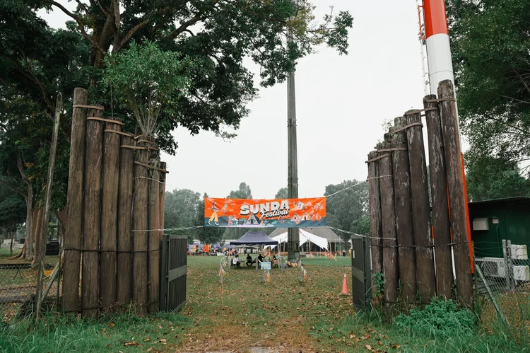
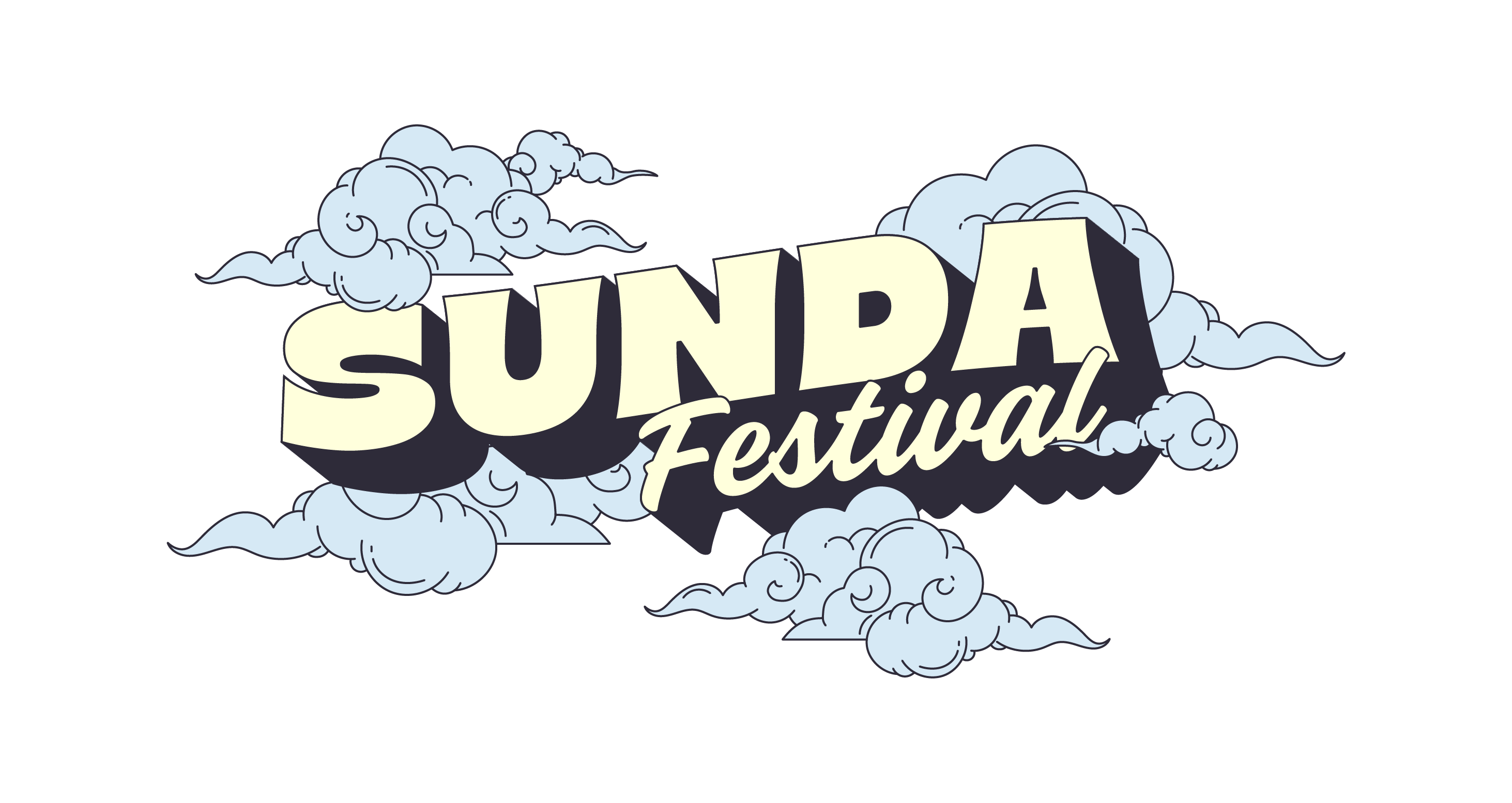
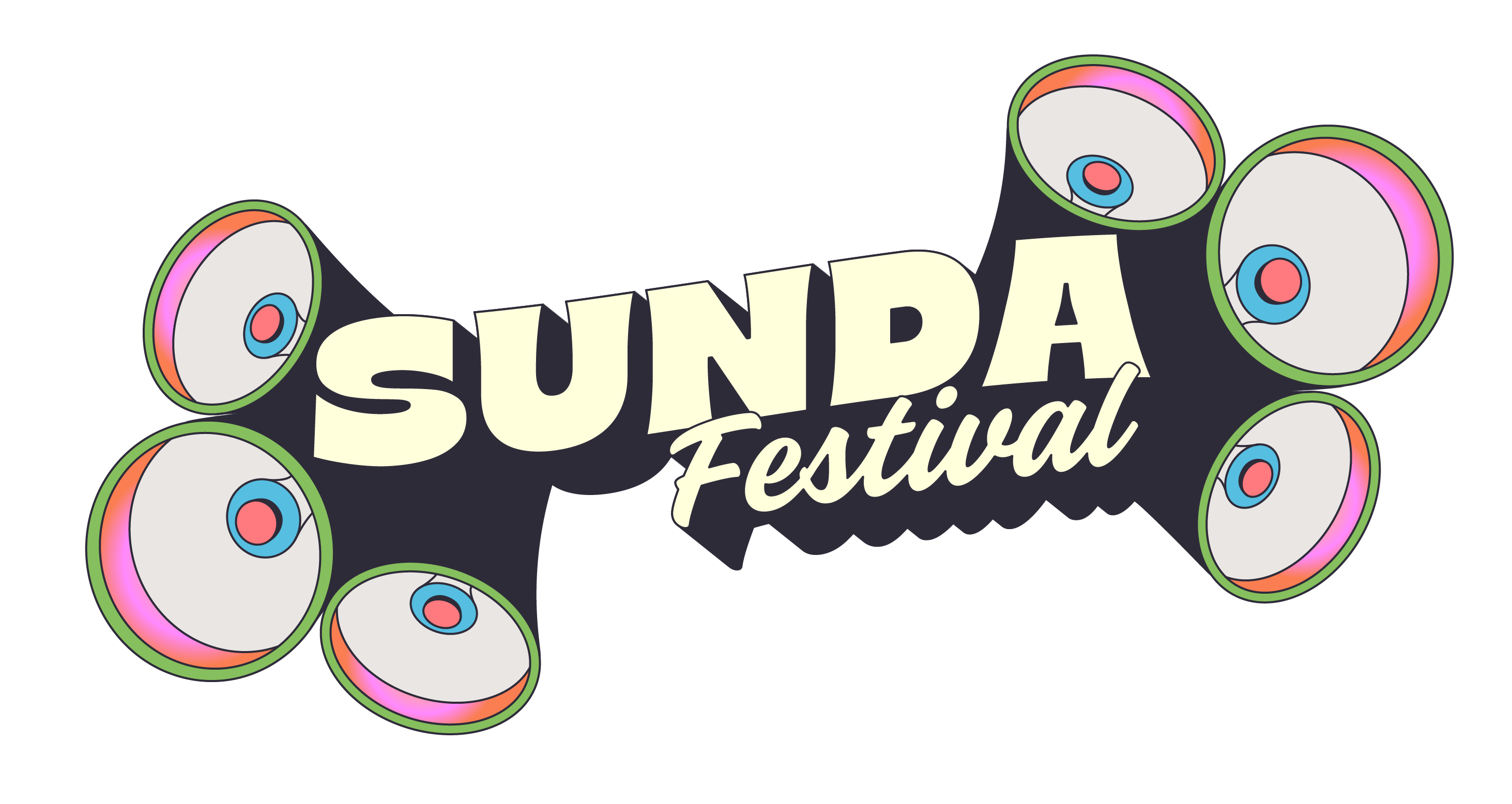
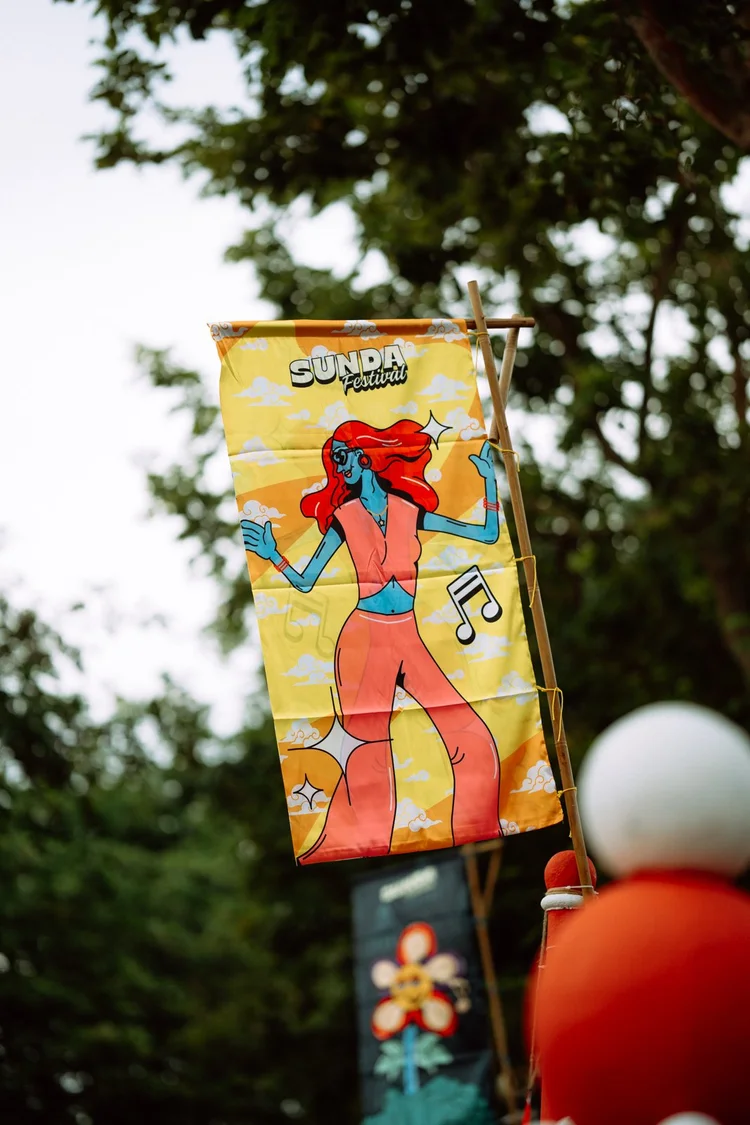
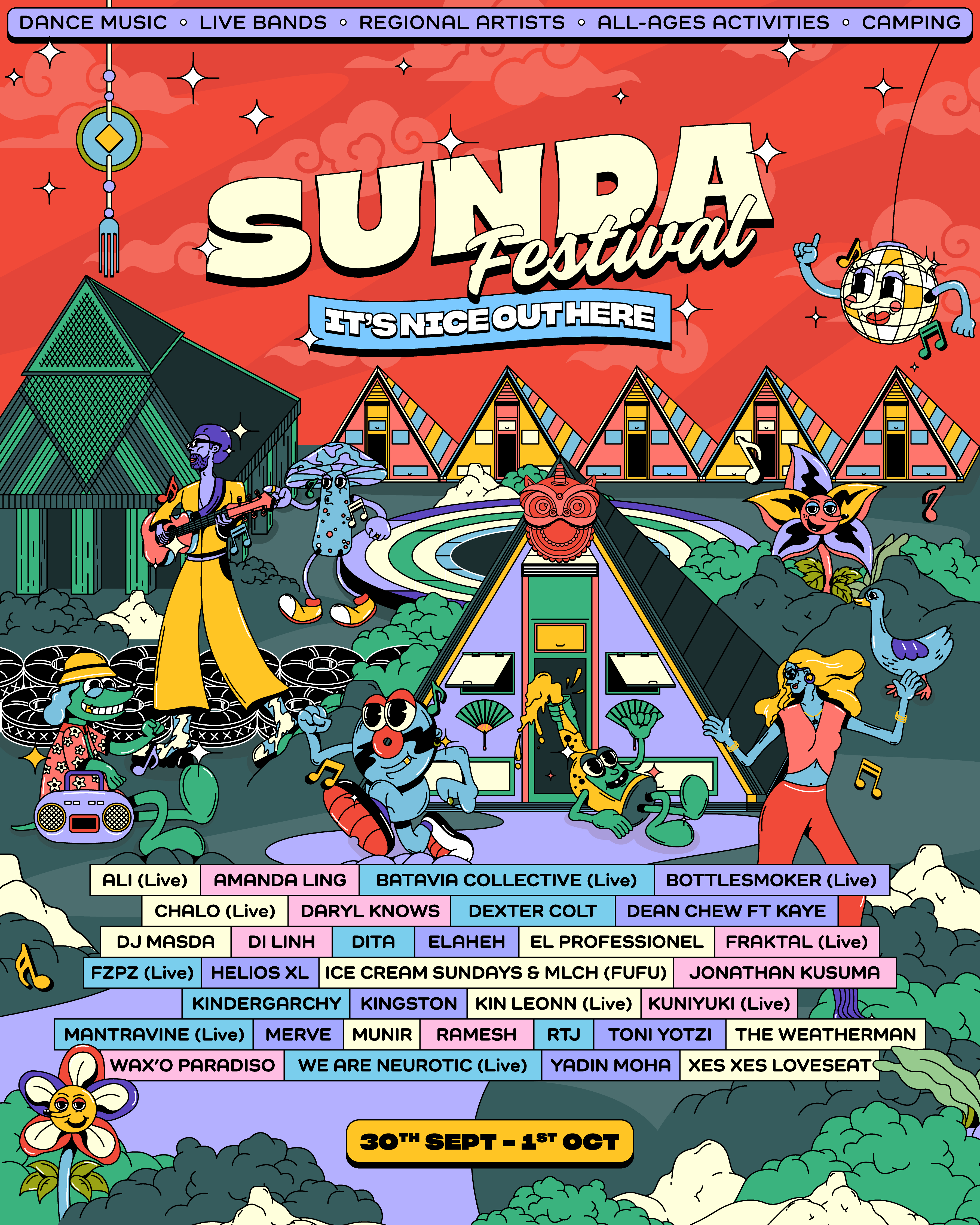
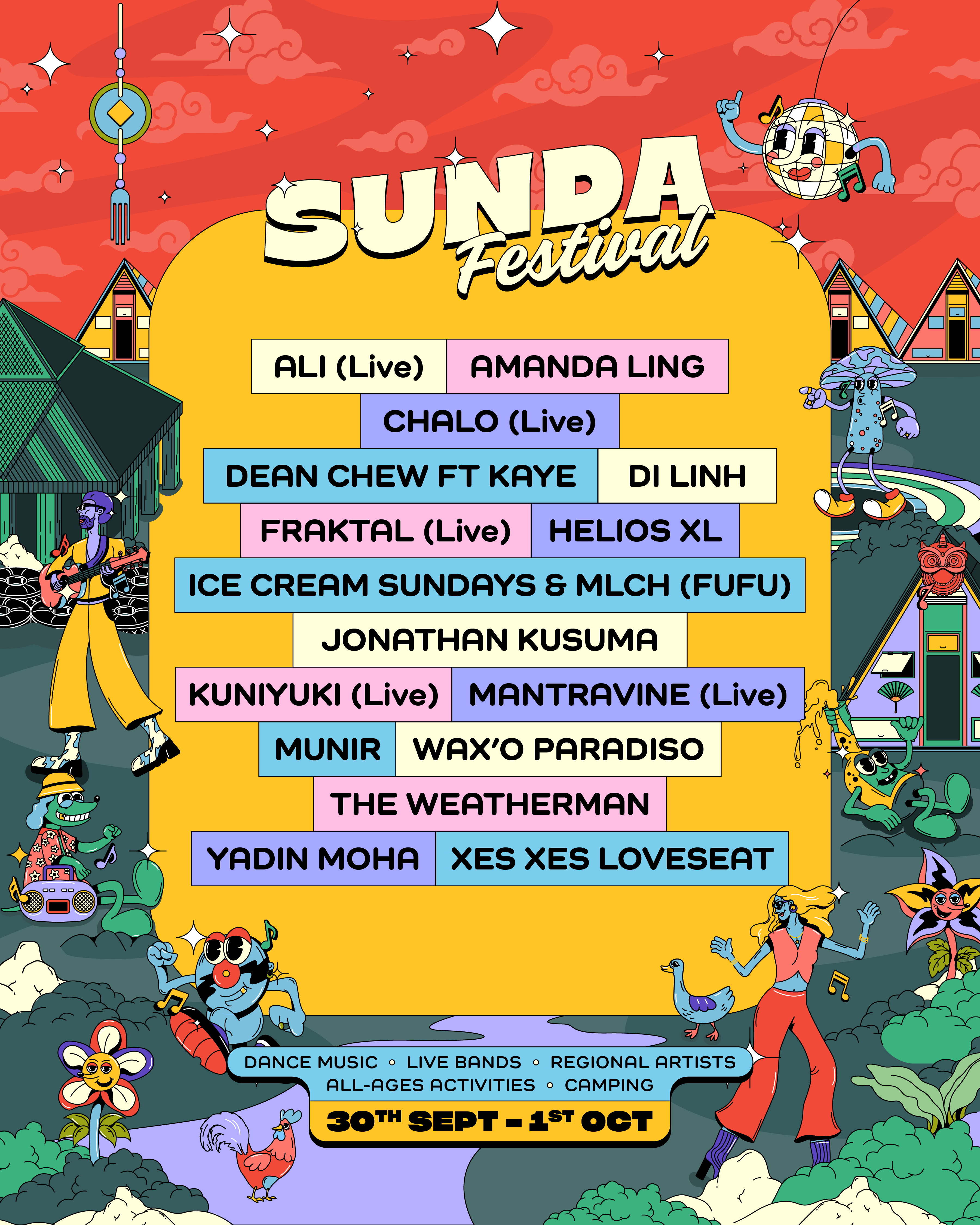
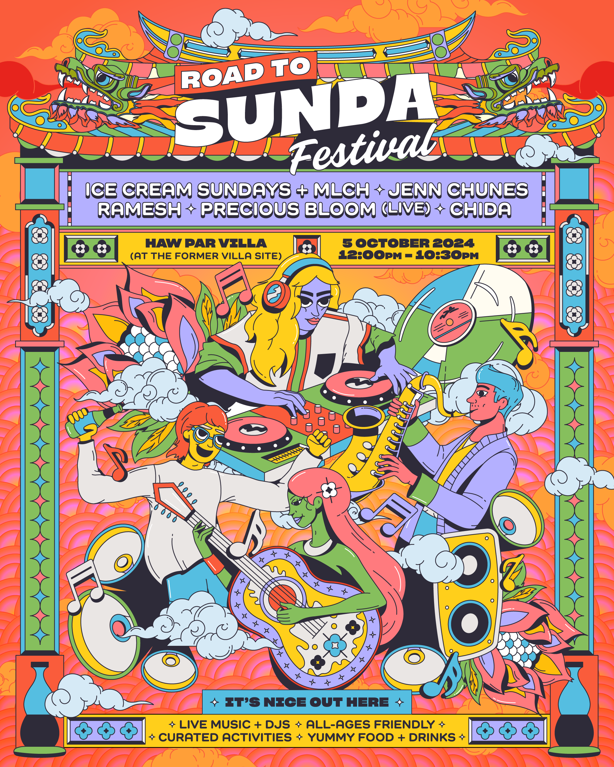
Sunda Festival
Lead Visual Identity & Art Direction
2023–Present
Role: Lead visual identity & art direction
Scope: Concept development, illustration-led system design, character design, environmental graphics, motion, and multi-format rollout
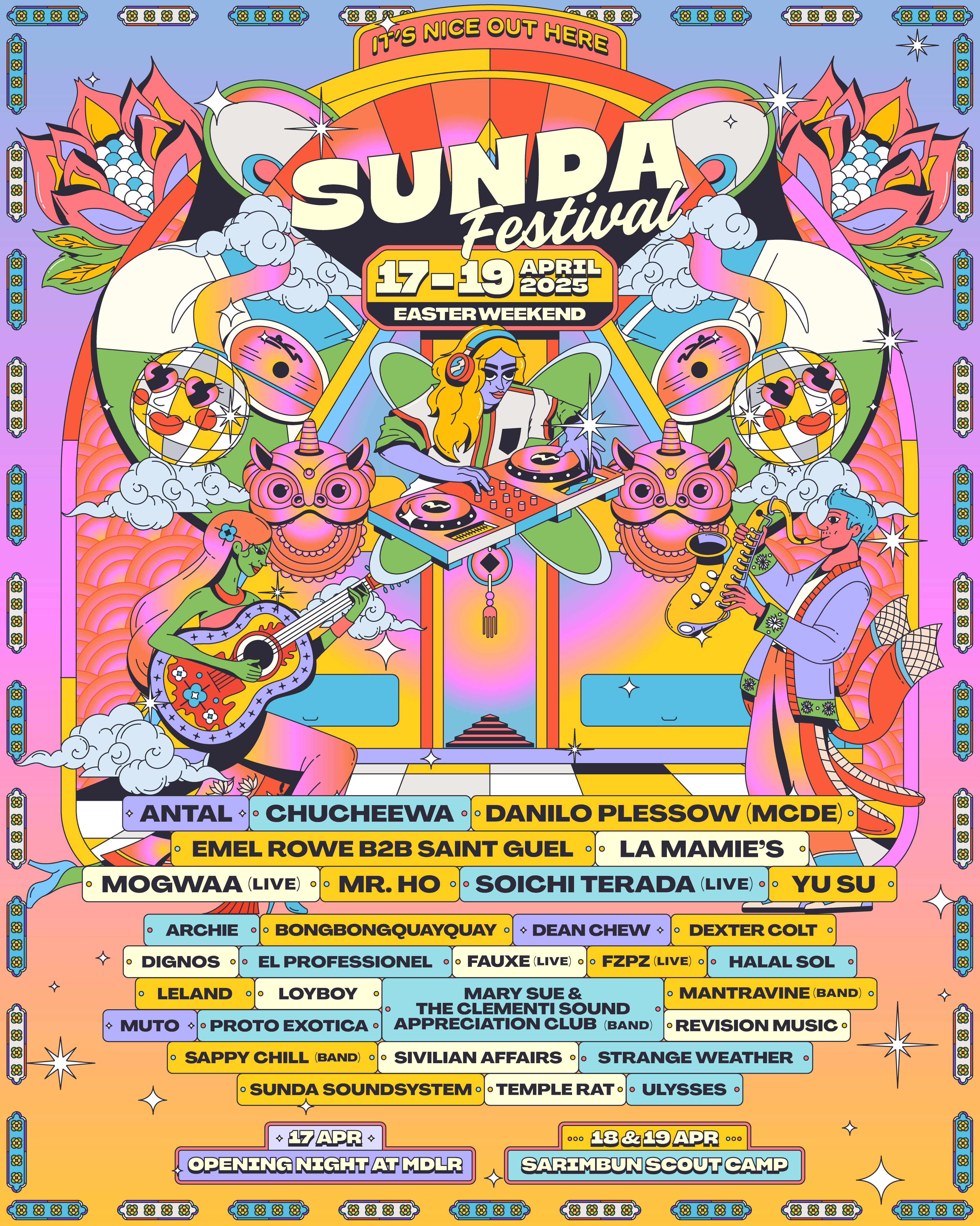
Led the visual identity and creative direction for Sunda Festival, Singapore’s first camping music festival. The project involved developing an illustration-led visual system built around original characters and animated key visuals, forming a distinct world designed to evolve across multiple editions.
CREDITS
Developed in collaboration with the Sunda Festival production and programming teams.
Developed in collaboration with the Sunda Festival production and programming teams.
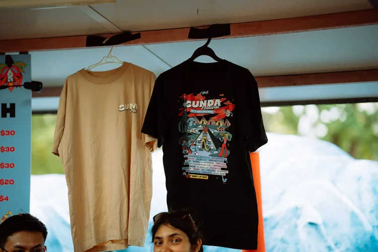
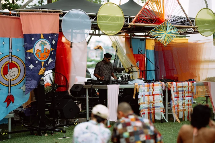


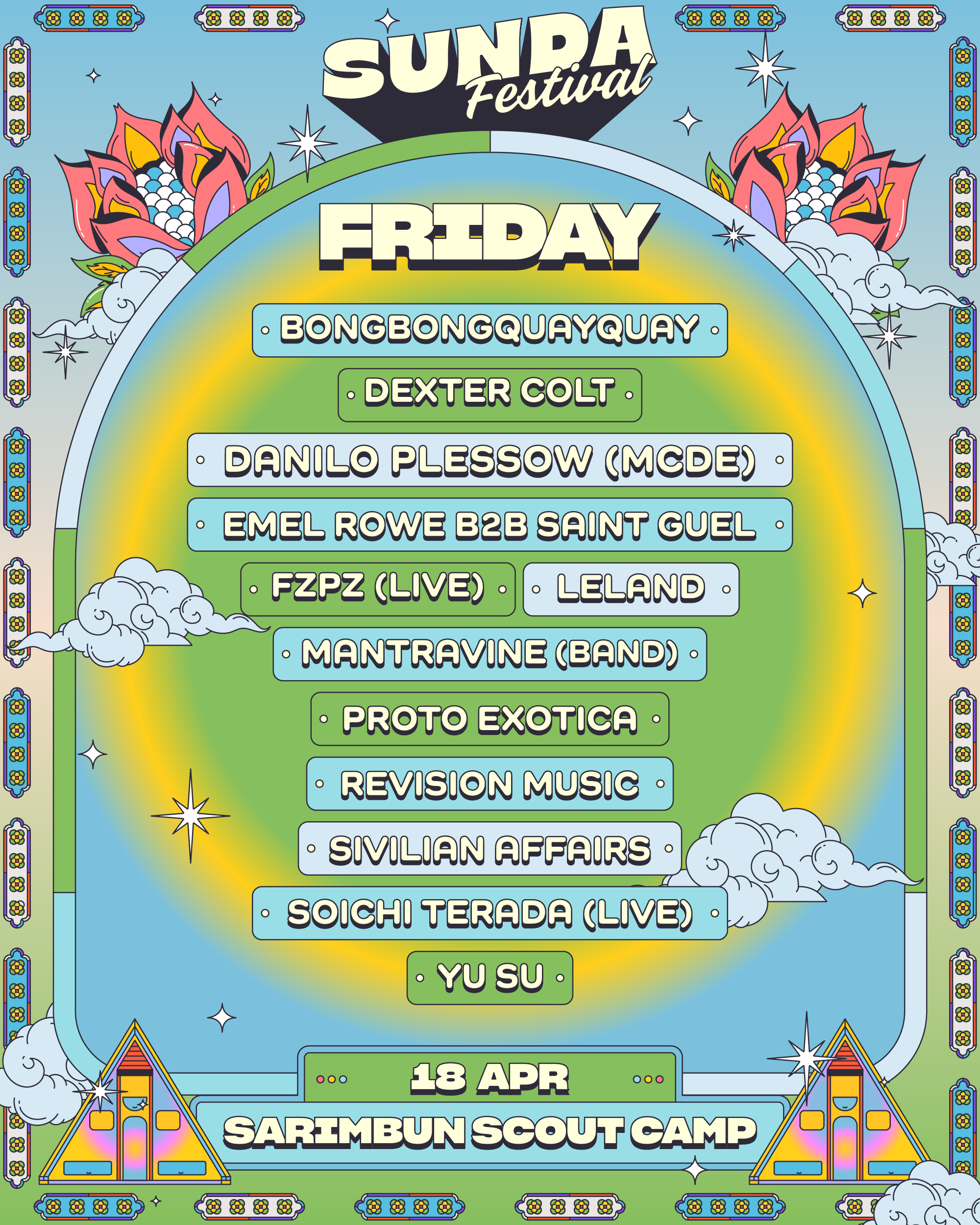
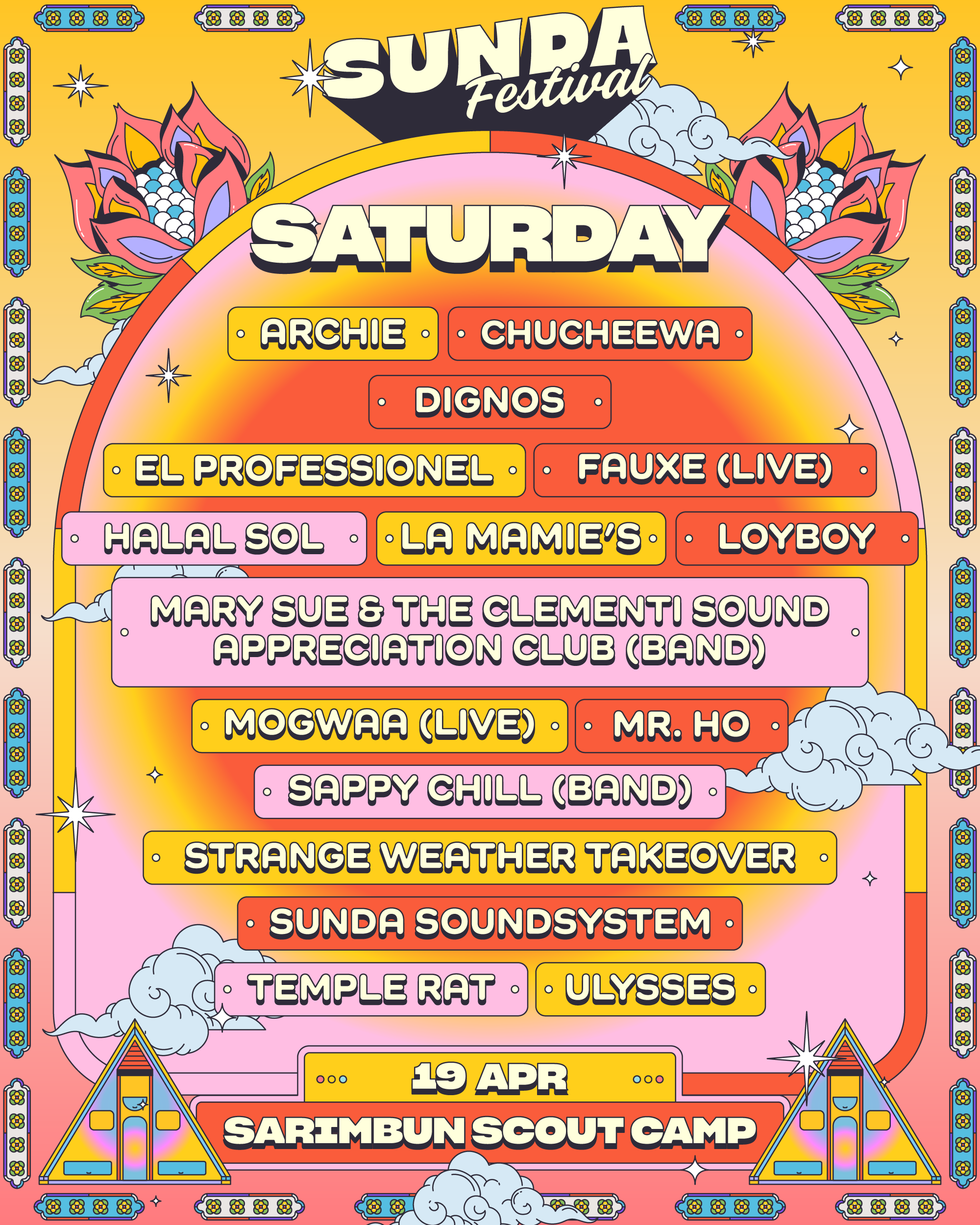
The identity was conceived as a flexible, modular system, allowing it to scale seamlessly across posters, social content, stage visuals, merchandise, wayfinding, and on-site environments while remaining cohesive and recognisable. Each iteration expanded on the core visual language, introducing new characters, colour palettes, and compositions while maintaining continuity across the festival’s branding.
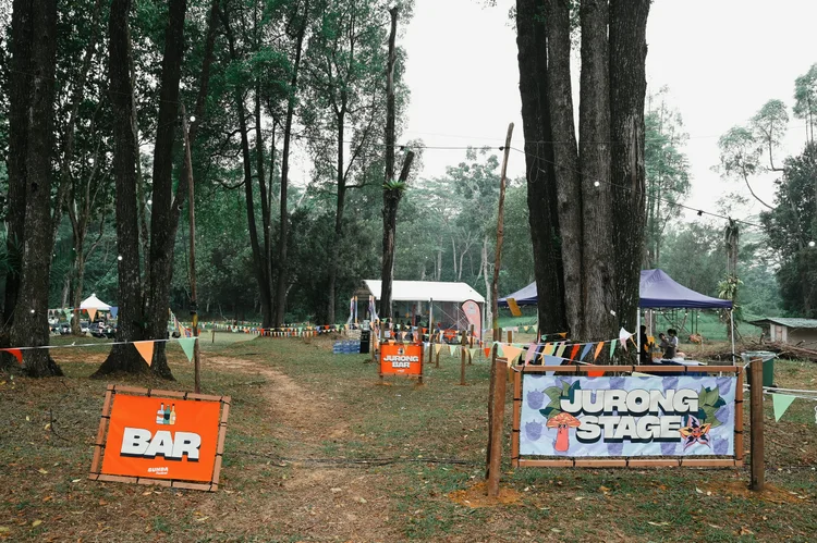
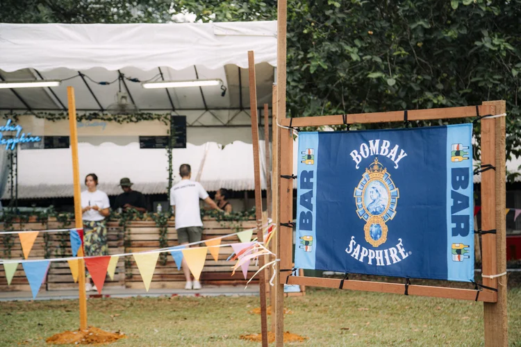
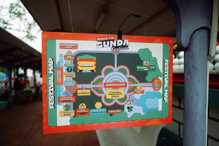
Custom iconography was developed specifically for on-site signage and wayfinding, supporting clarity and consistency across the festival grounds. I also designed one of the main stage environments for the first edition, alongside posters and visual assets for offshoots including afterparties and regional takeovers.
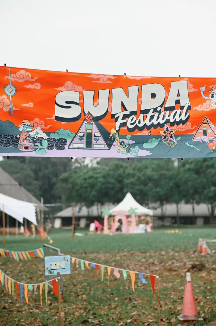
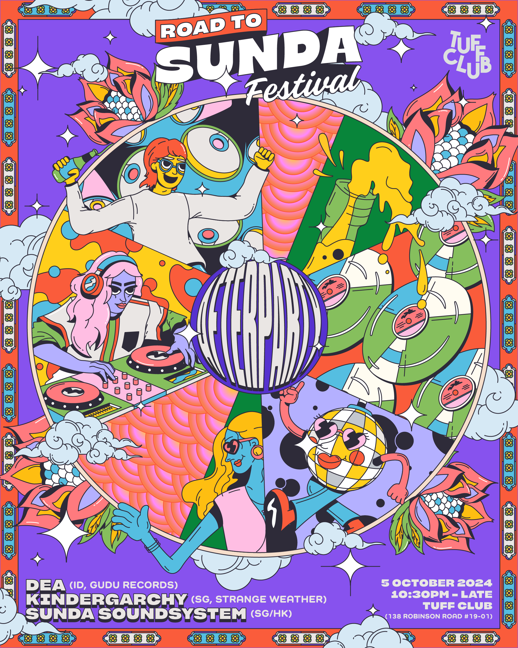
For Road to Sunda (2024), a site-responsive visual system was developed using Haw Par Villa’s architectural borders as a framing device. This system was later adapted for the main festival at Sarimbun Camp in 2025, retaining the same characters while evolving layouts and environments to suit each context. The identity supported a multi-day, multi-stage festival with numerous artists, partners, and public-facing touchpoints.
Rooted in playfulness, community, and a sense of escape, the visual direction balances bold graphic expression with clarity and adaptability, positioning Sunda as a long-term cultural platform rather than a one-off event.

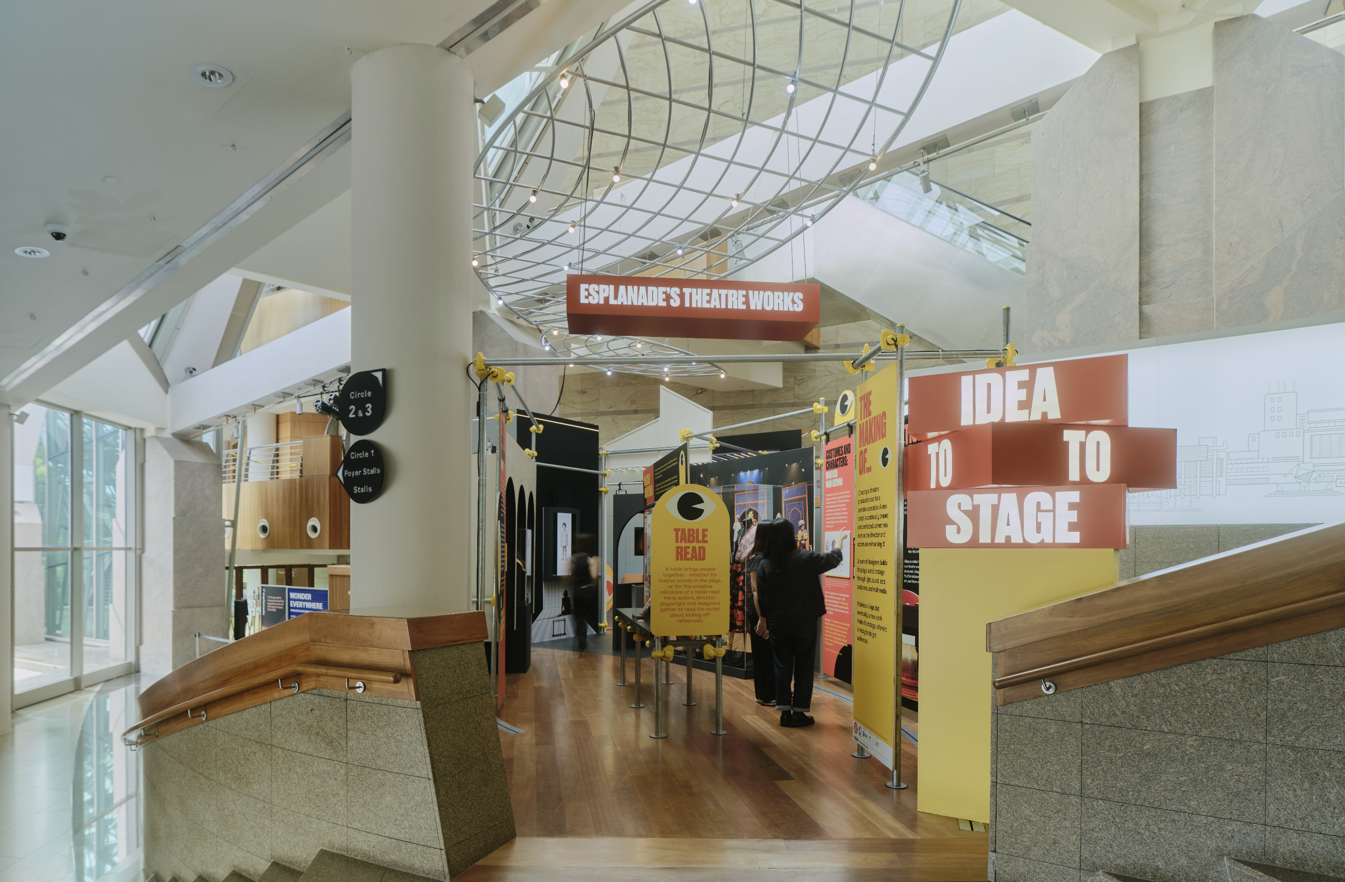
Spatial /
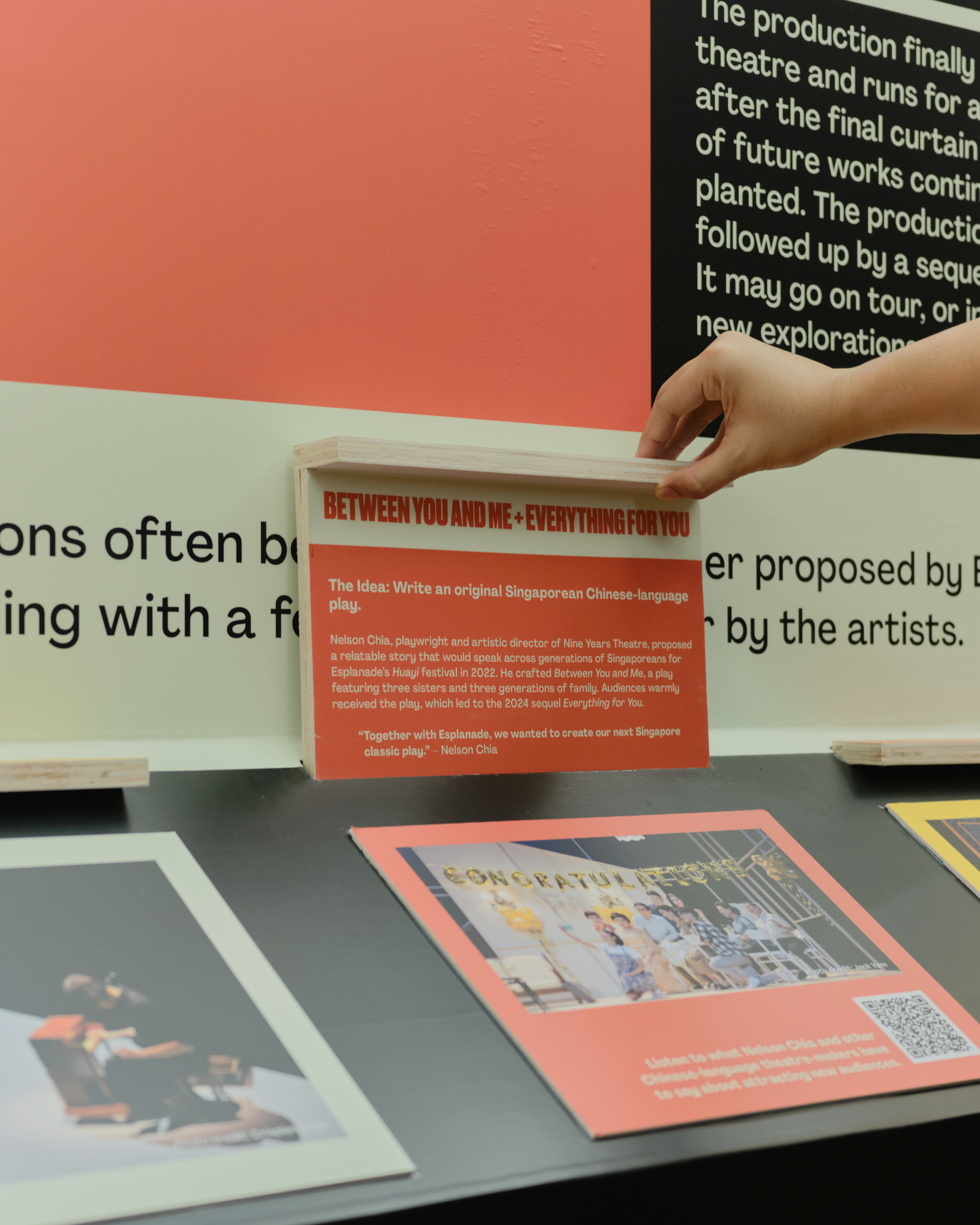
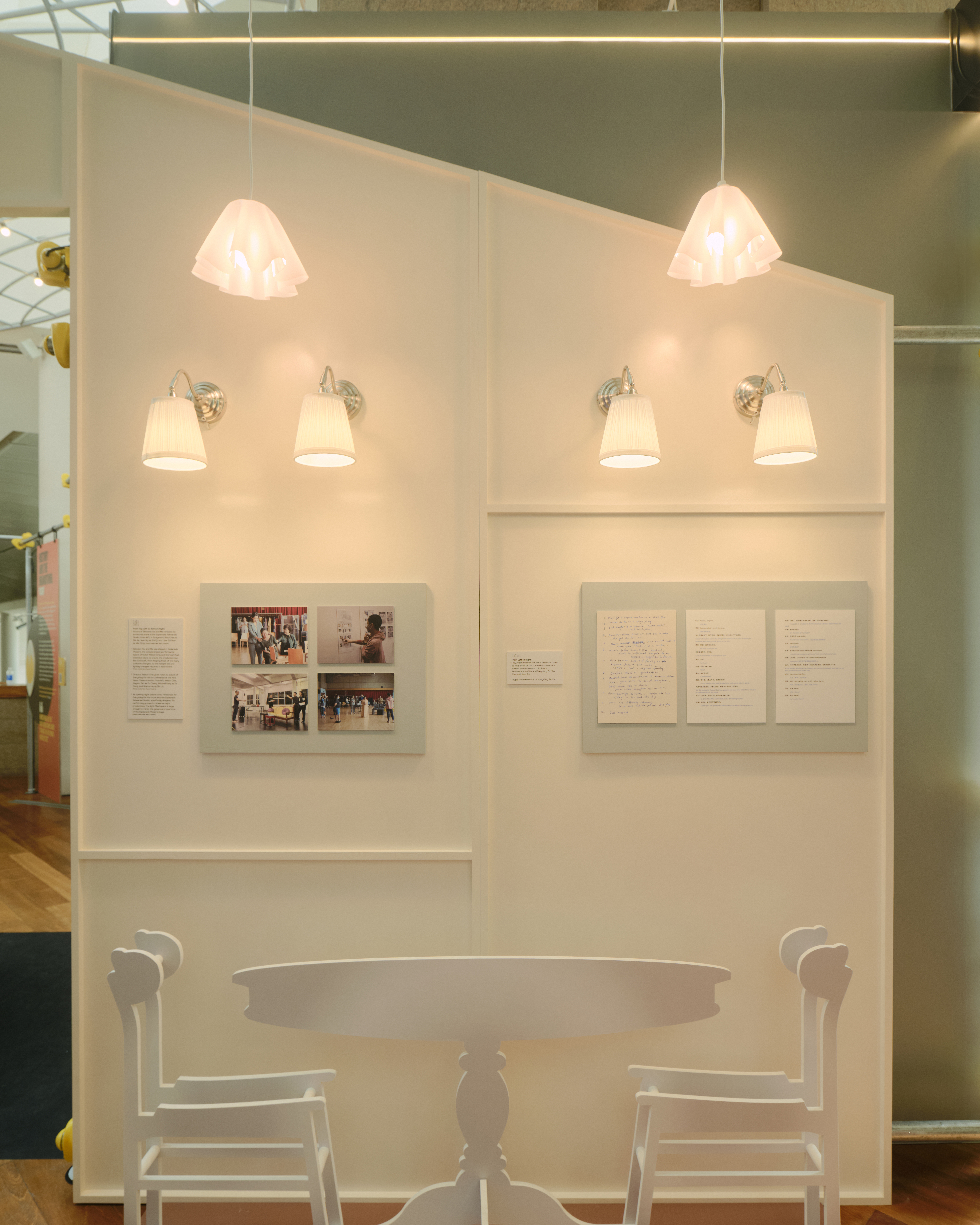
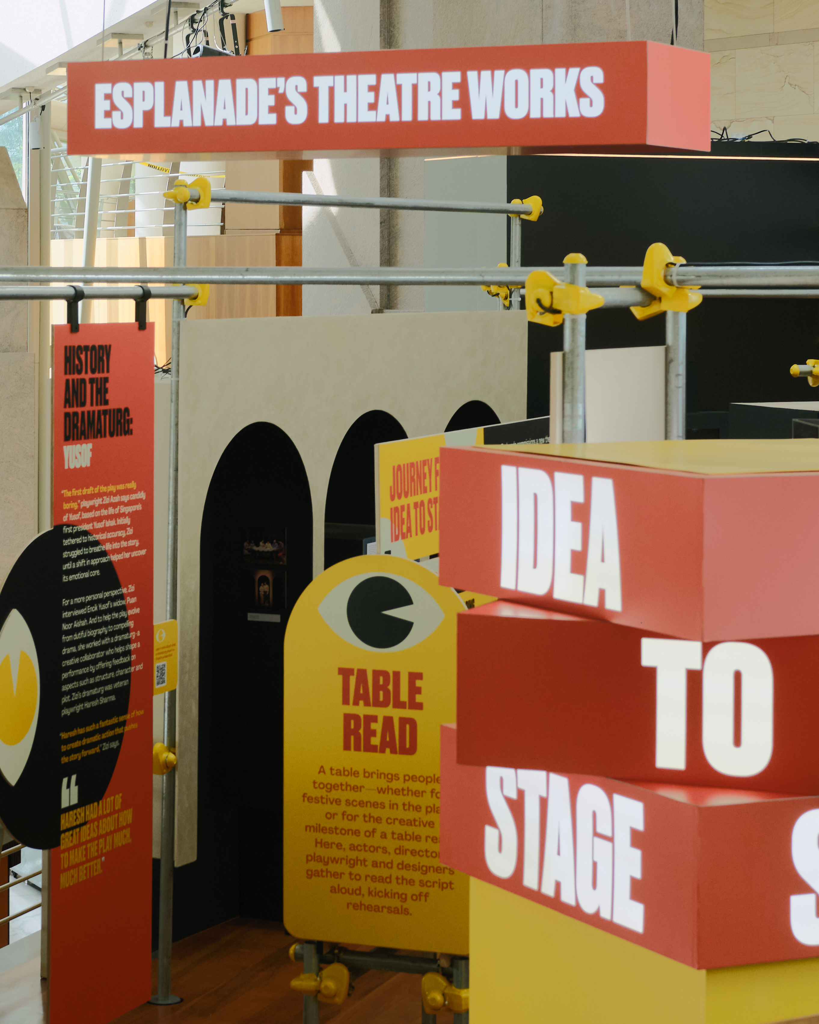
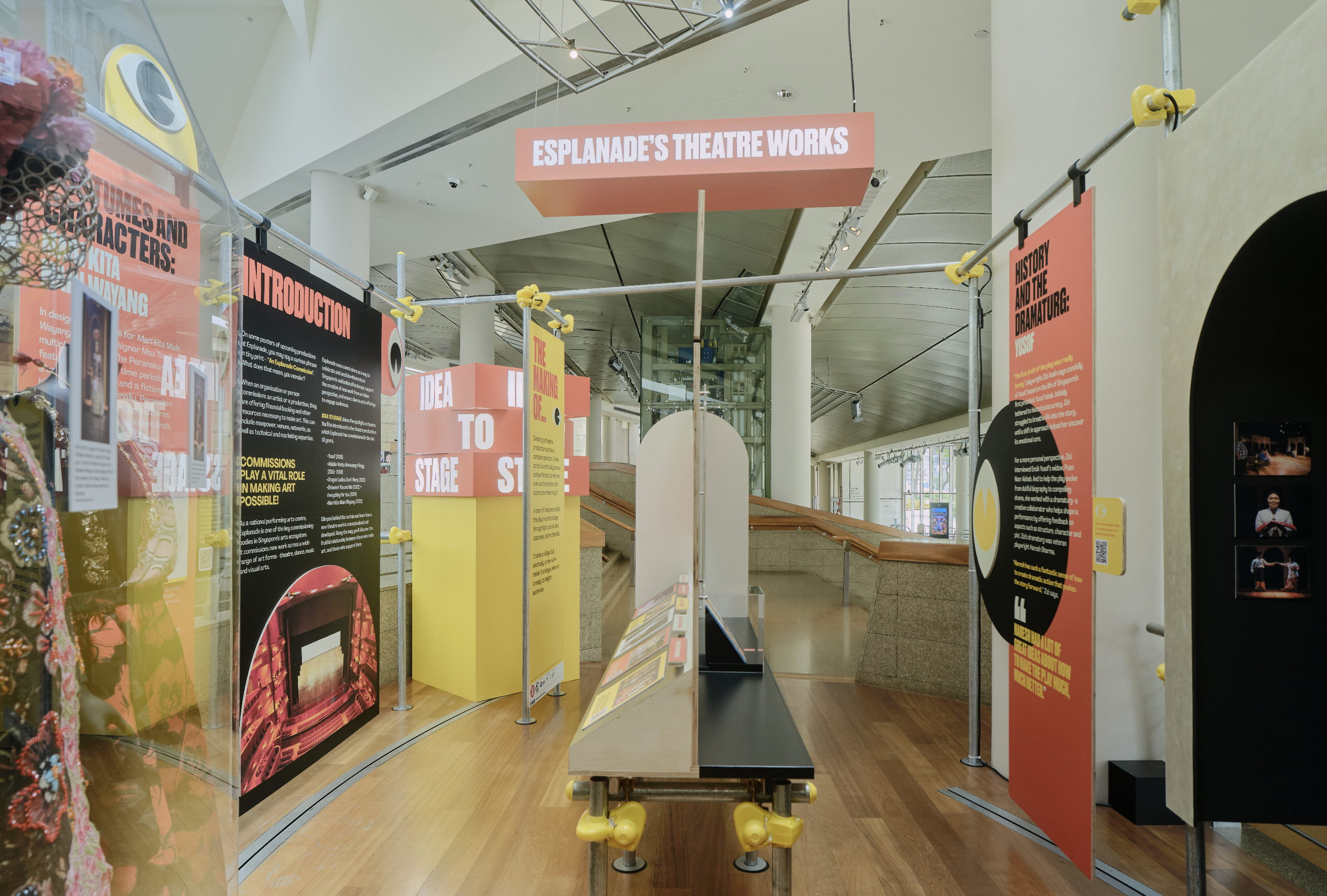
Esplanade –
Idea to Stage
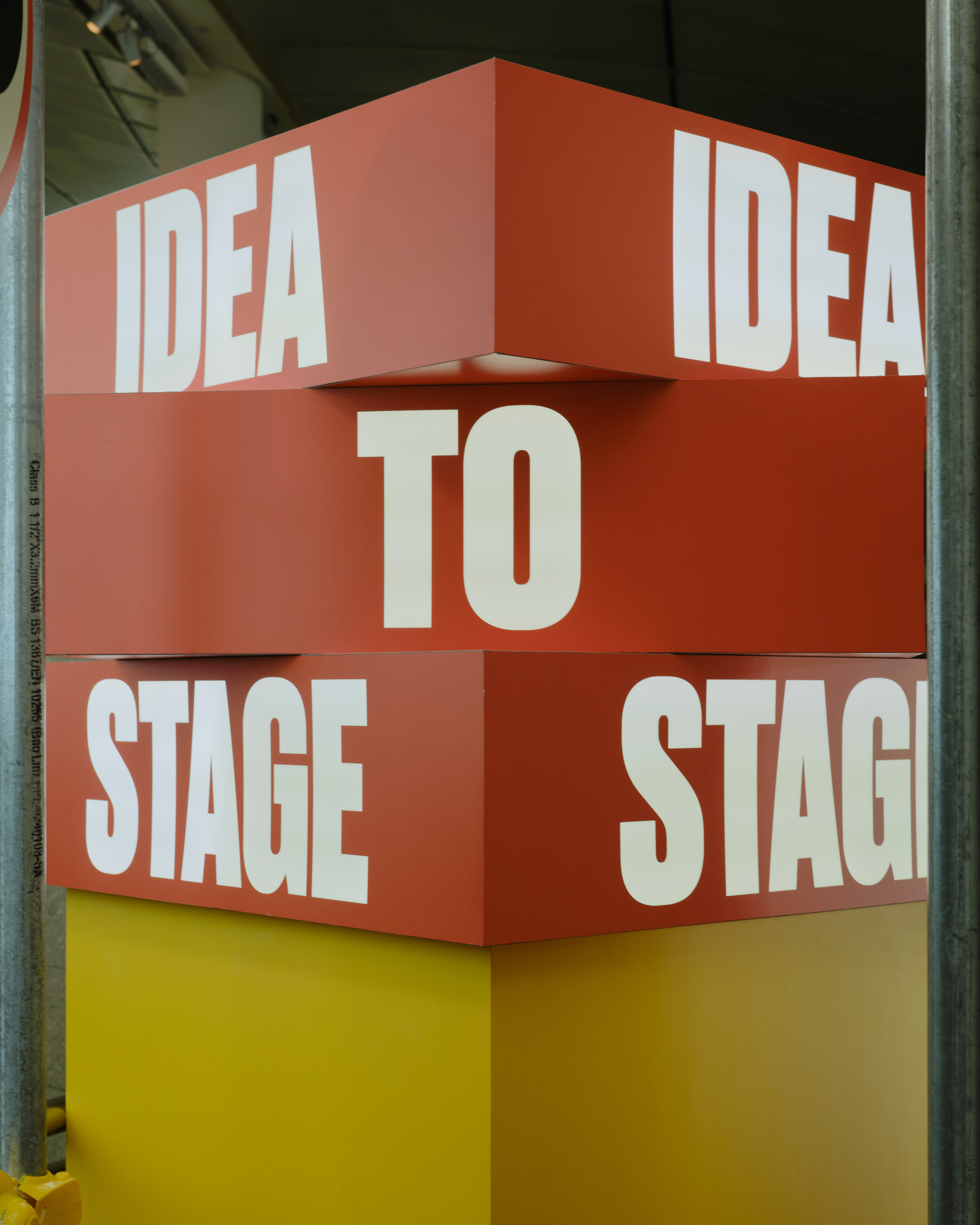
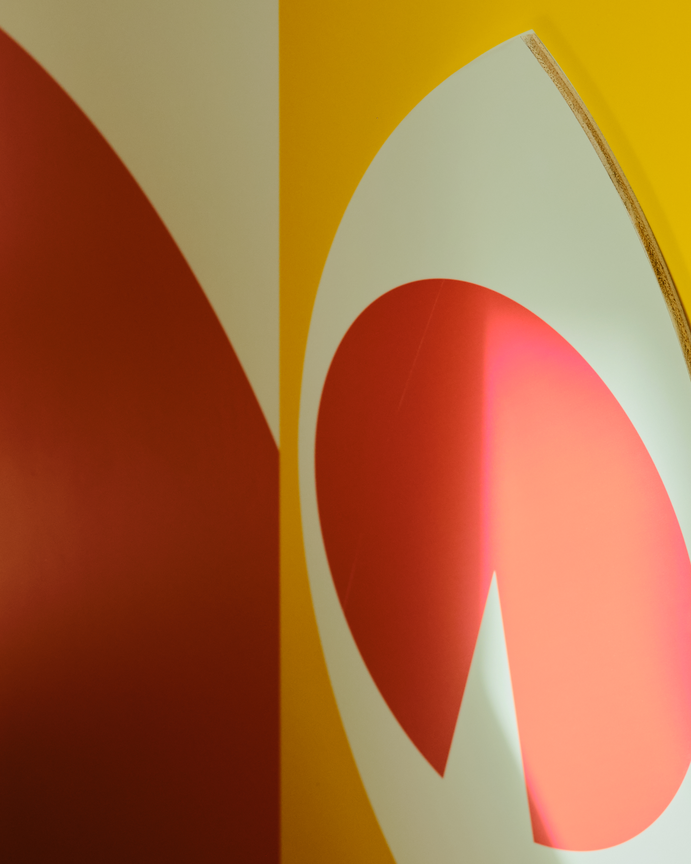
Exhibition Identity & Environmental Graphics
Client: Esplanade – Theatres on the Bay
Year: 2025–2027
Role: Visual identity & exhibition graphics
Scope: Environmental graphics, print, and digital touchpoints
Client: Esplanade – Theatres on the Bay
Year: 2025–2027
Role: Visual identity & exhibition graphics
Scope: Environmental graphics, print, and digital touchpoints
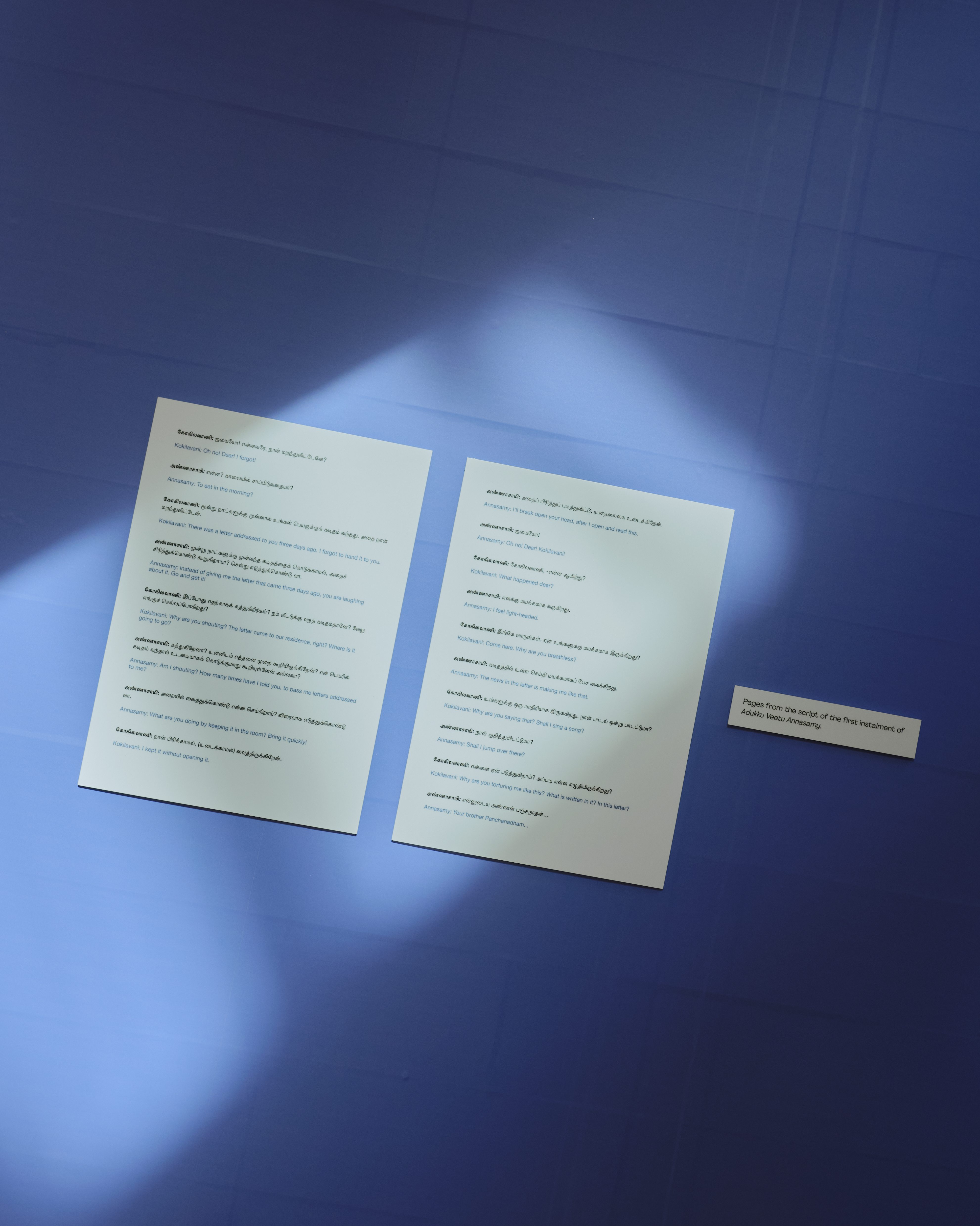
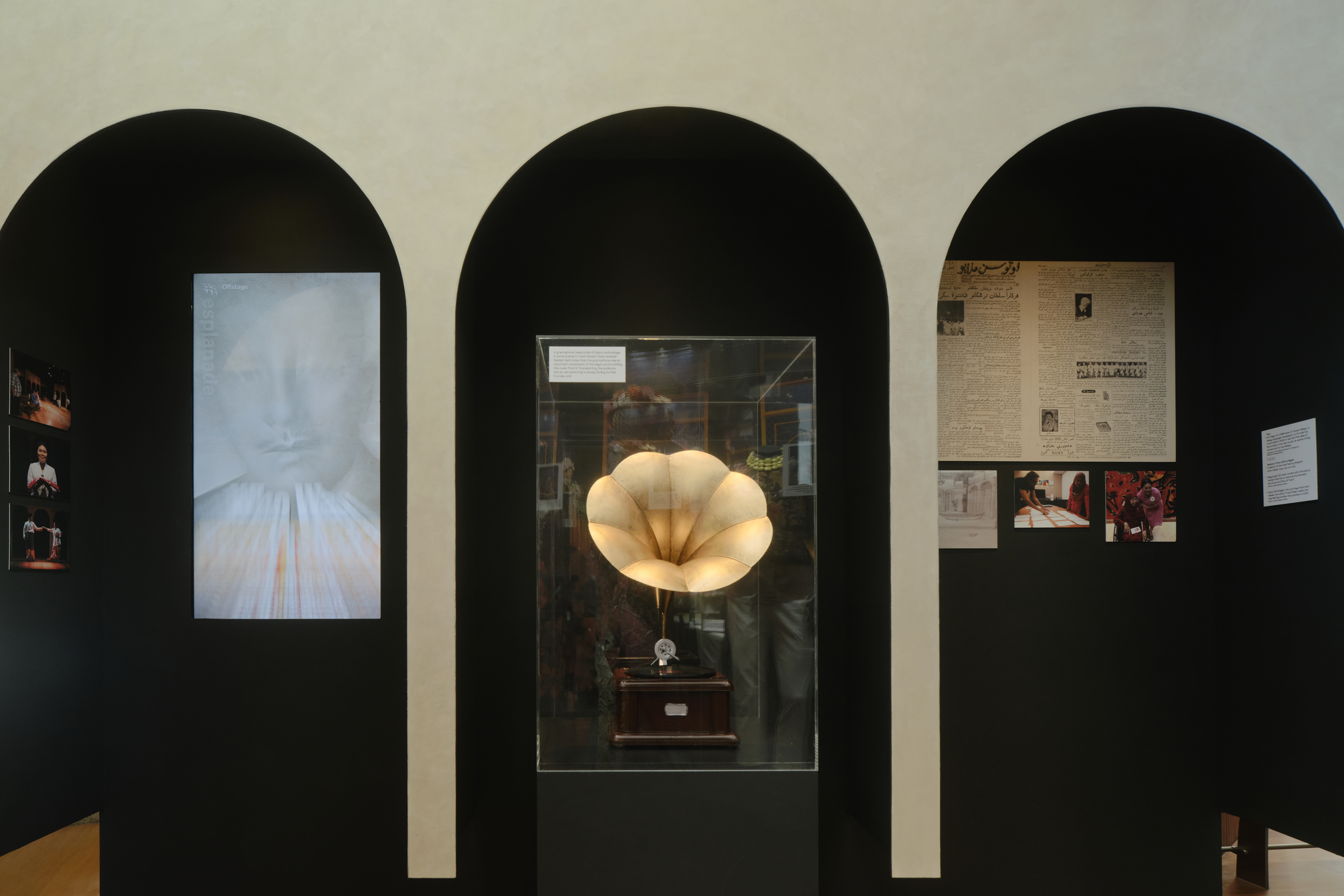
Developed the visual identity and exhibition graphics for Idea to Stage, Esplanade’s major theatre exhibition exploring the creative process behind stage productions.
The project translated archival material, interviews, and theatrical artefacts into a cohesive visual system spanning environmental graphics, print, and digital applications. The identity was designed to support layered storytelling, guiding visitors through complex narratives while remaining clear, accessible, and legible within a public exhibition context.
Working closely with spatial collaborators, the system was developed to be flexible and durable, allowing it to adapt across changing content, layouts, and formats over a multi-year exhibition run, while maintaining a consistent visual language throughout.
CREDITS
Spatial design collaboration: Amirul Nazree
Project management & fabrication: GreenQubes
Project documentation: Samuel Foo
Spatial design collaboration: Amirul Nazree
Project management & fabrication: GreenQubes
Project documentation: Samuel Foo
Events /
Spotify Lounge
Event Branding, Illustration & Spatial Graphics
Client: Spotify Asia
Year: 2022
Developed branding, graphic assets, and spatial applications for Spotify Lounge, an industry-facing event presented by Spotify Asia as part of the Music Matters showcase.
The project involved translating Spotify’s brand language into a cohesive event environment, spanning key artwork, invitations, menus, environmental graphics, and lighting applications.
On-site deliverables included a large-scale photo booth installation, a wallpaper feature highlighting regional Spotify artists, illuminated installations, and custom gobo lighting, designed to activate the space and support guest interaction.
The event brought together regional and international artists alongside music industry professionals, requiring fast-paced execution and close coordination across production, fabrication, and on-site teams to ensure consistency and clarity across all touchpoints.
Key Artwork:

CREDITS
Assisted by Jasmine Ho
Event photos by Aloysius lim and Jiawen