All Works – Brand Identity ⊹ Events & Spatial ⊹ Editorial & Publishing ⊹ Illustration ⊹ Posters & Objects
In-house / Studio – Paramount International ⊹ Bandwagon Asia
Featured Work /
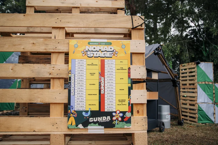
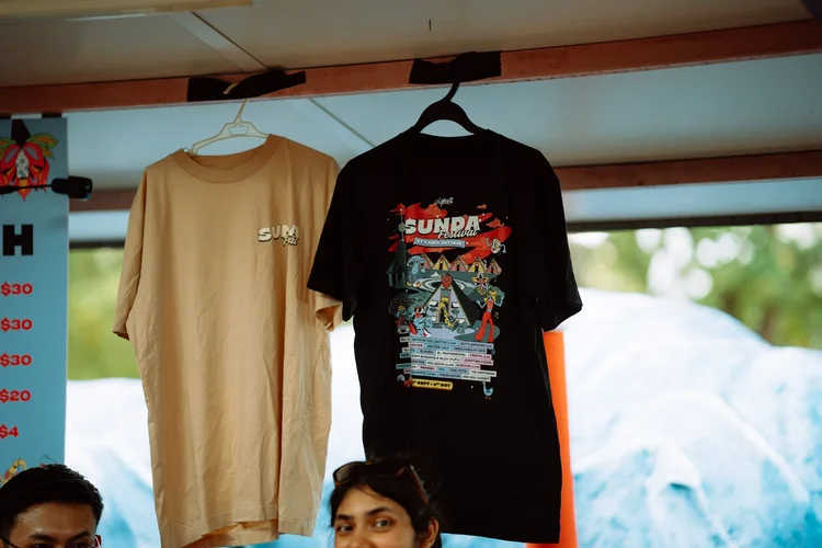
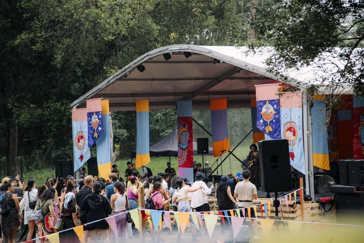
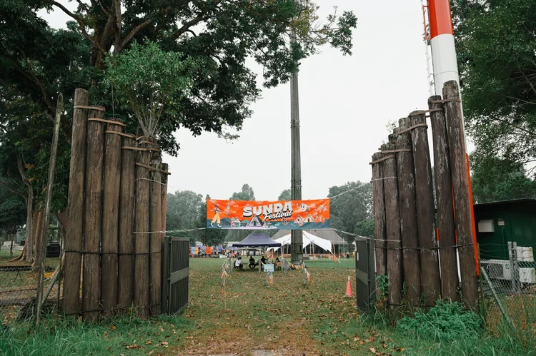
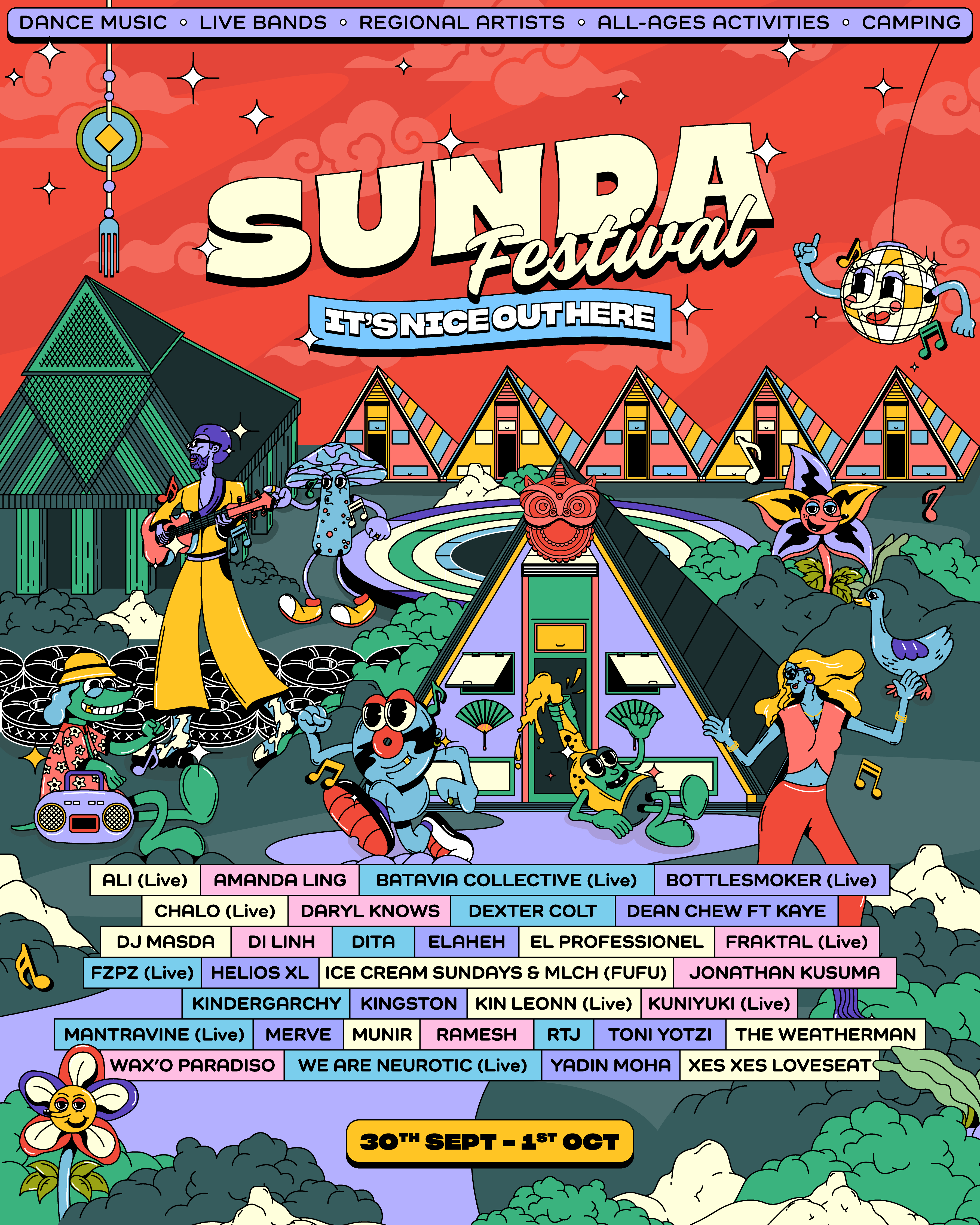
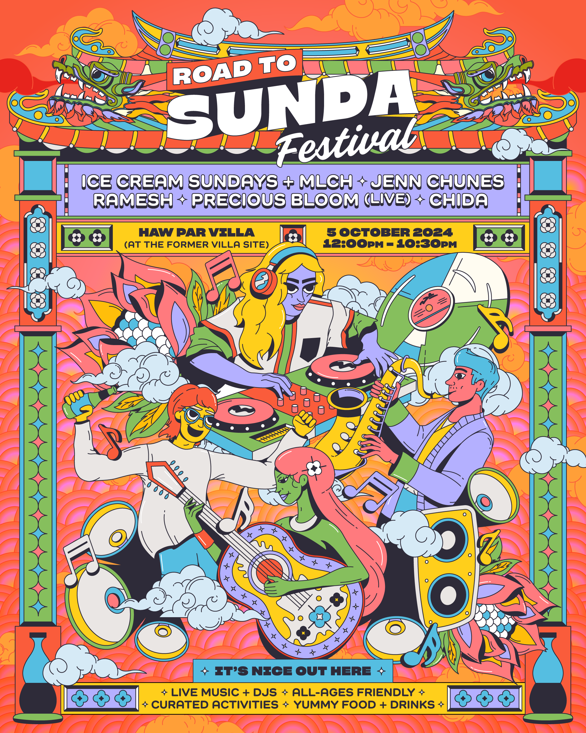
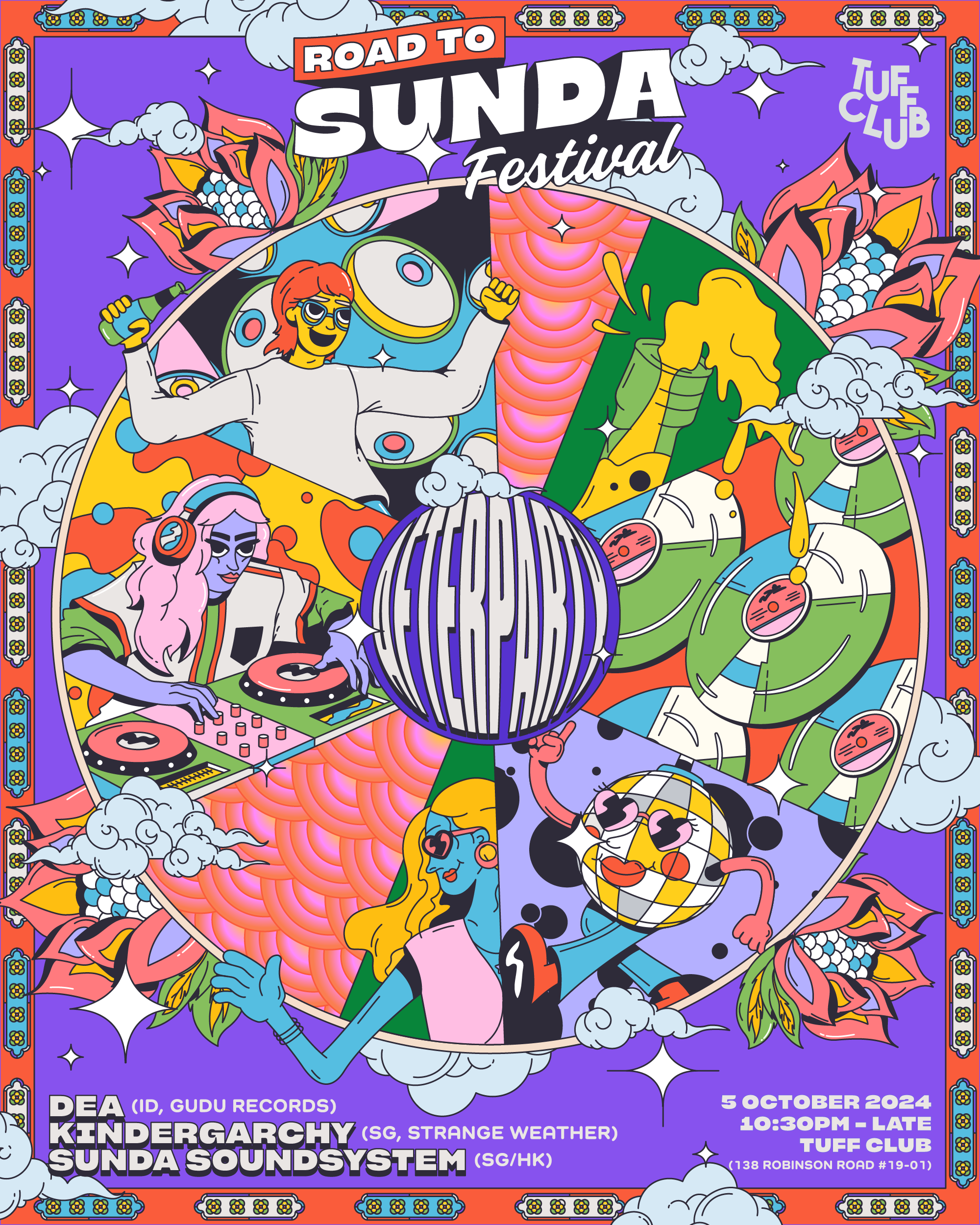
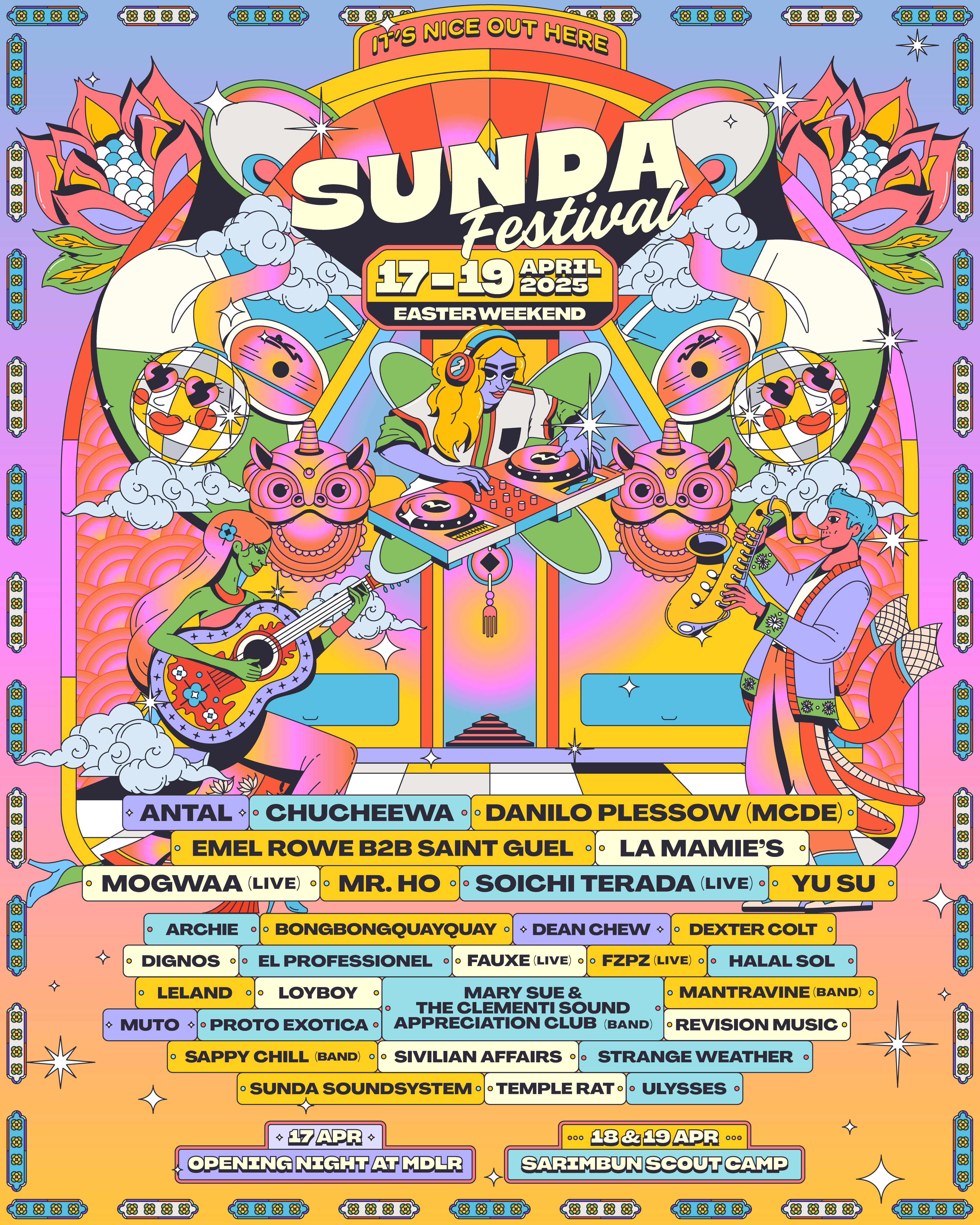
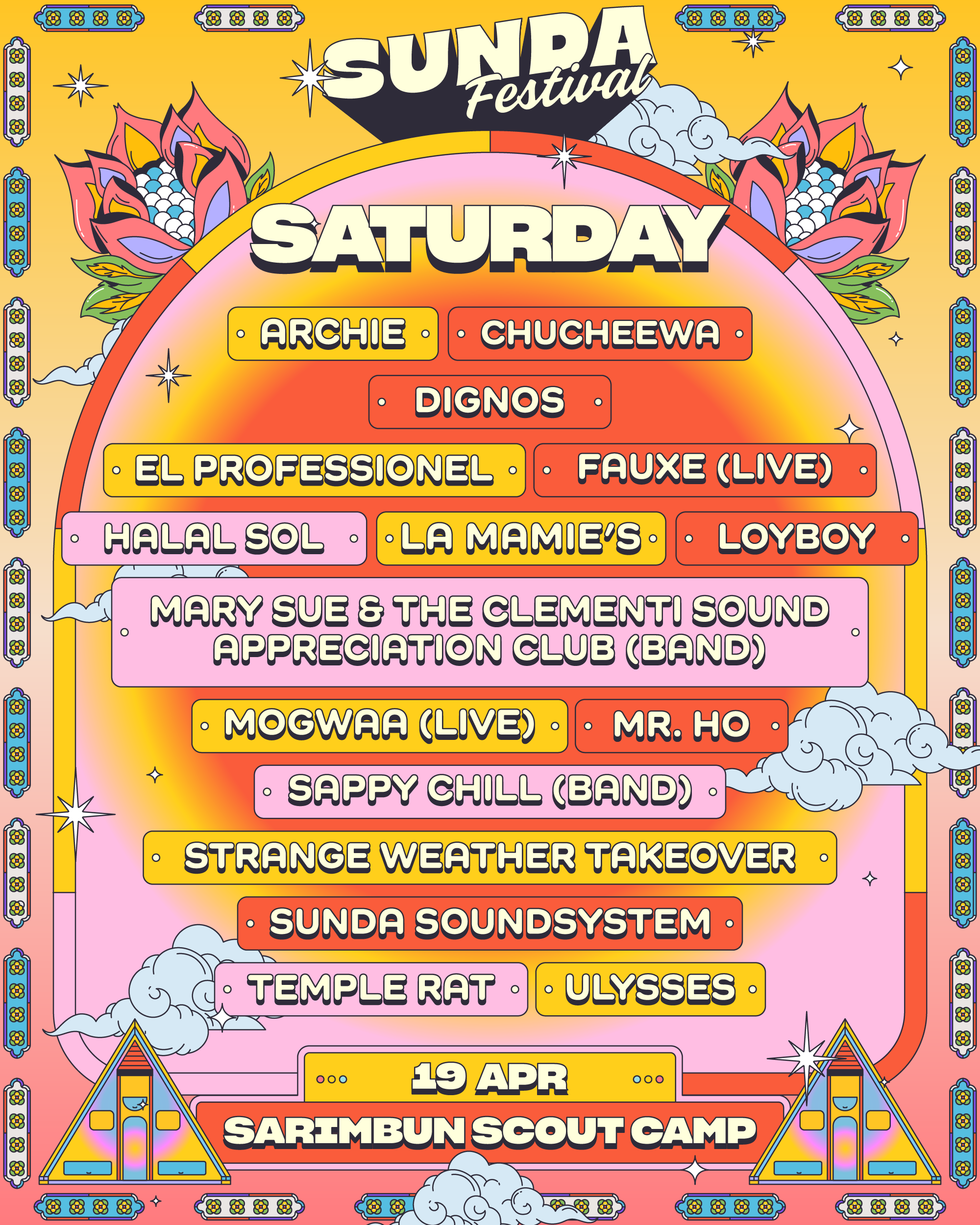
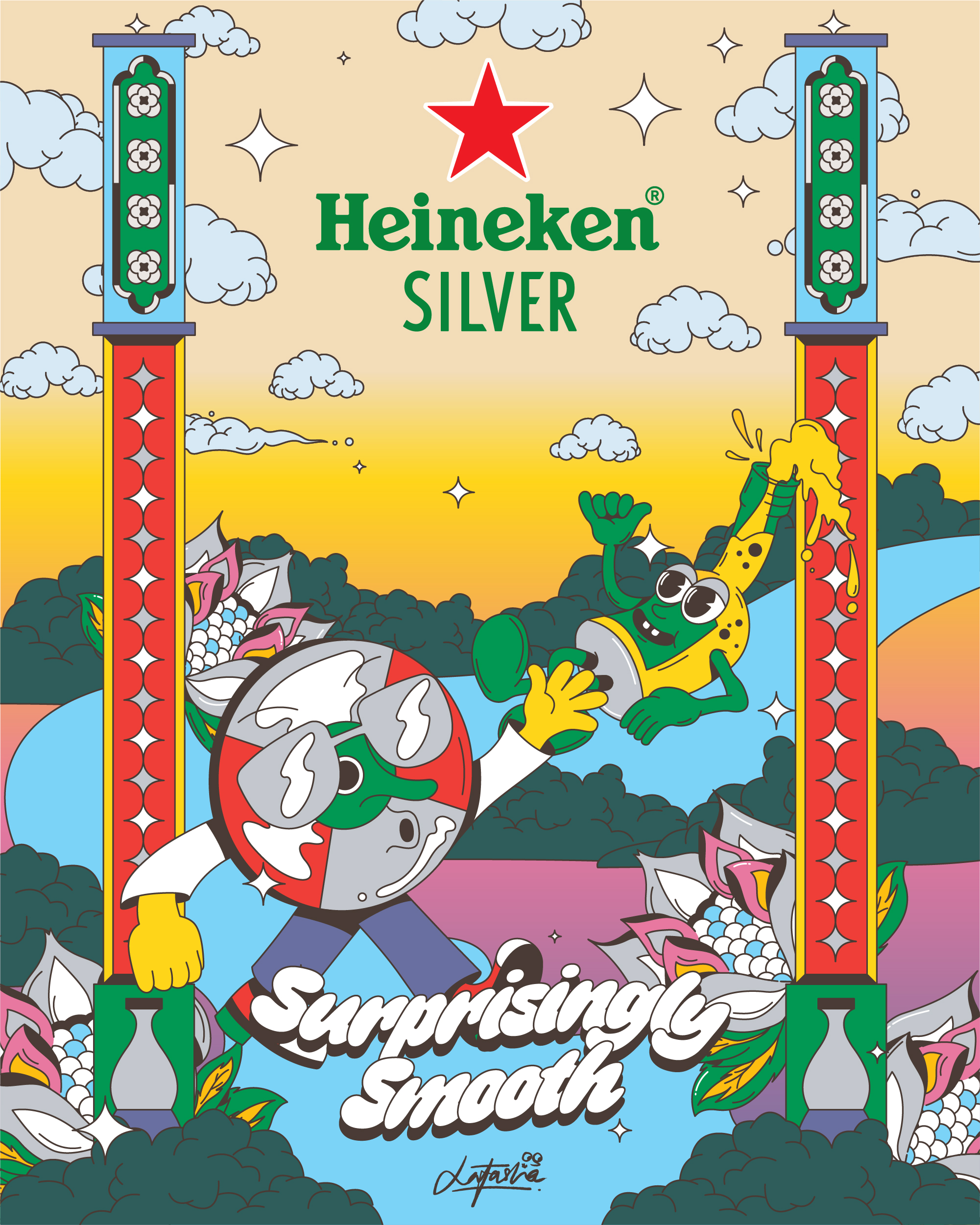
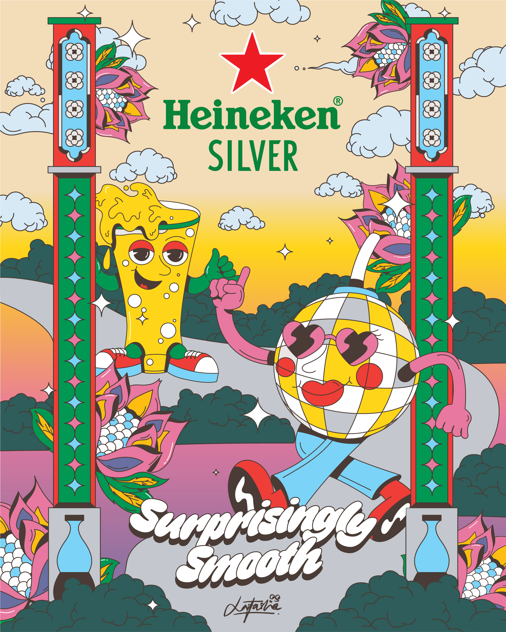
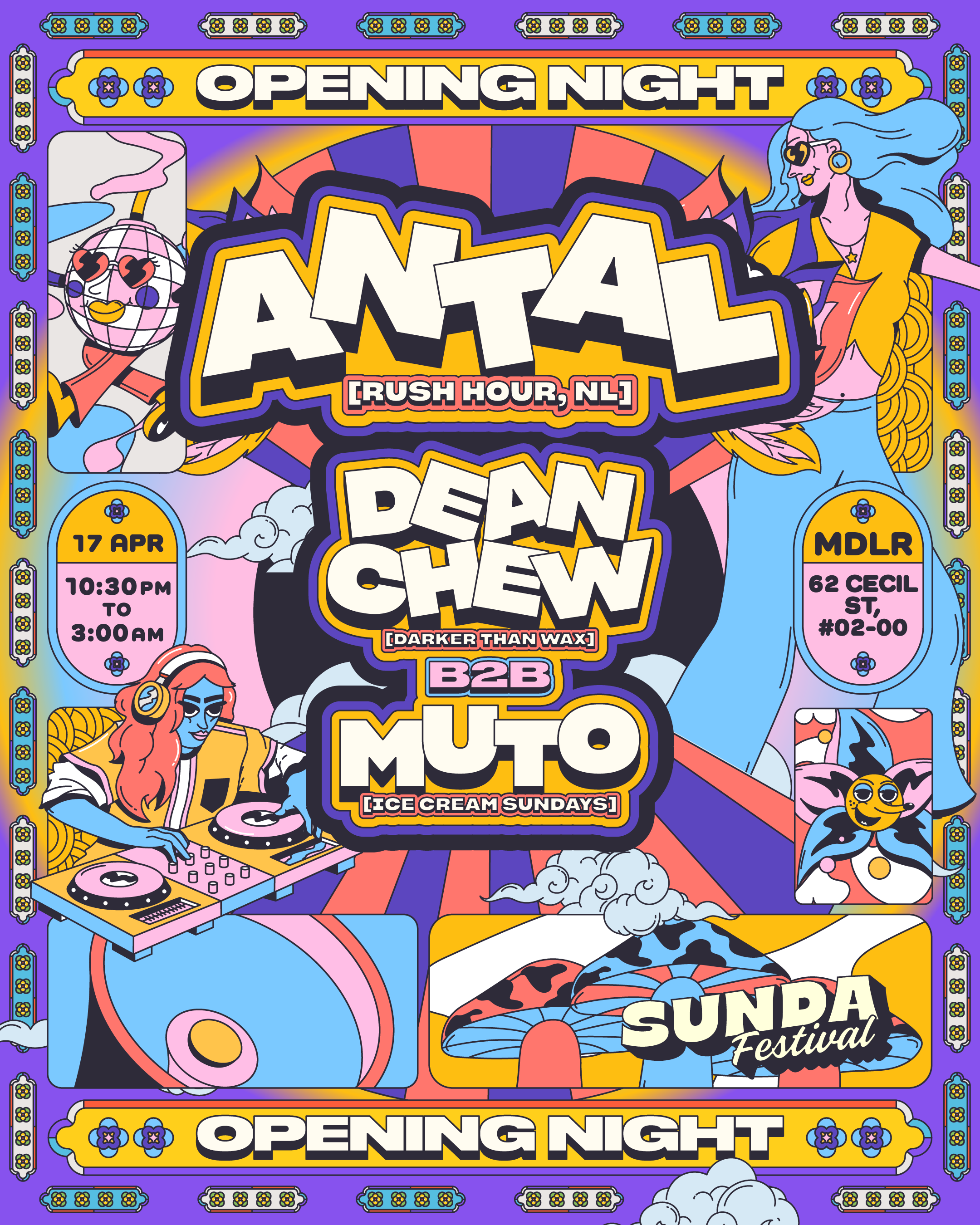
Sunda Festival
Lead Visual Identity & Art Direction
2023–Present
Role: Lead visual identity & art direction
Scope: Concept development, illustration-led system design, character design, environmental graphics, motion, and multi-format rollout
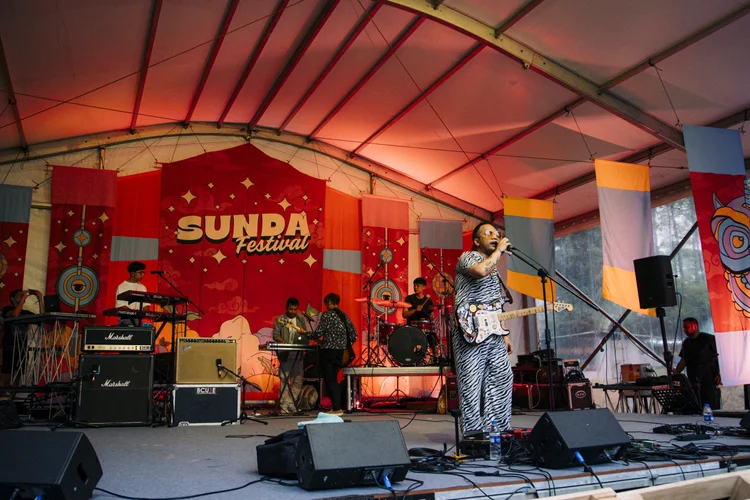
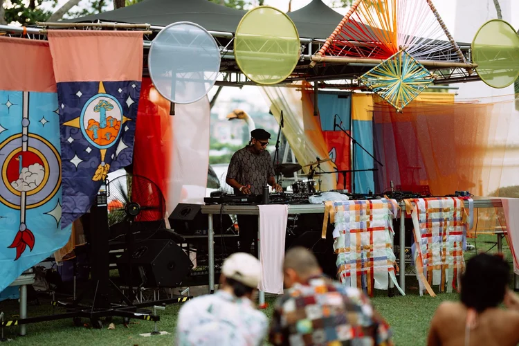
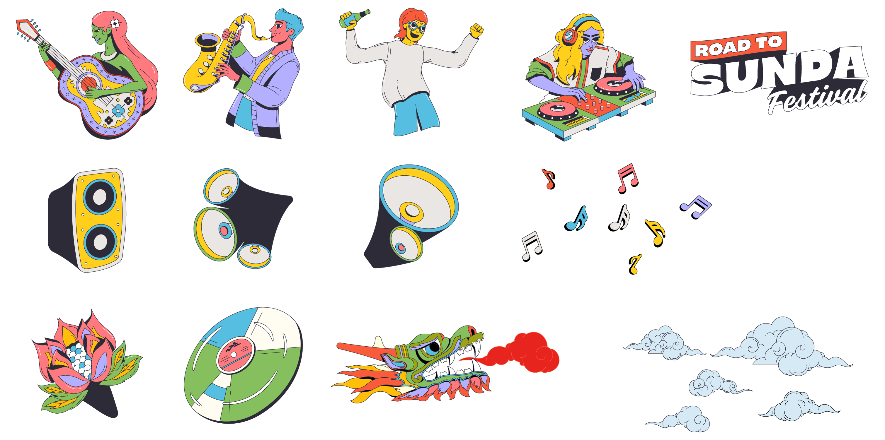
Led the visual identity and creative direction for Sunda Festival, Singapore’s first camping music festival. The project involved developing an illustration-led visual system built around original characters and animated key visuals, forming a distinct world designed to evolve across multiple editions.
CREDITS
Developed in collaboration with the Sunda Festival production and programming teams.
Developed in collaboration with the Sunda Festival production and programming teams.
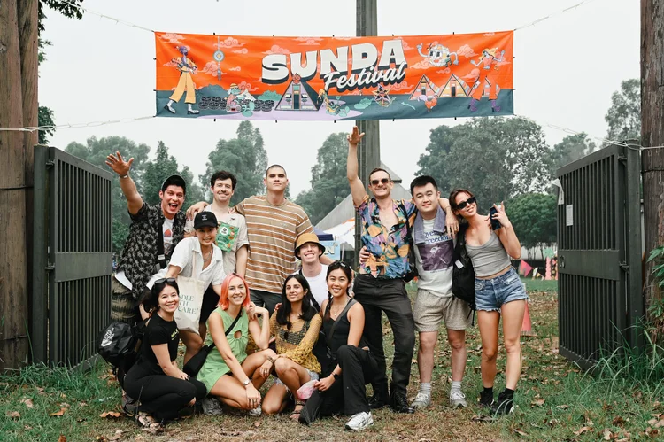
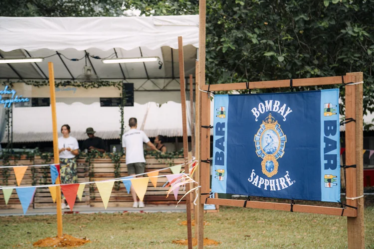
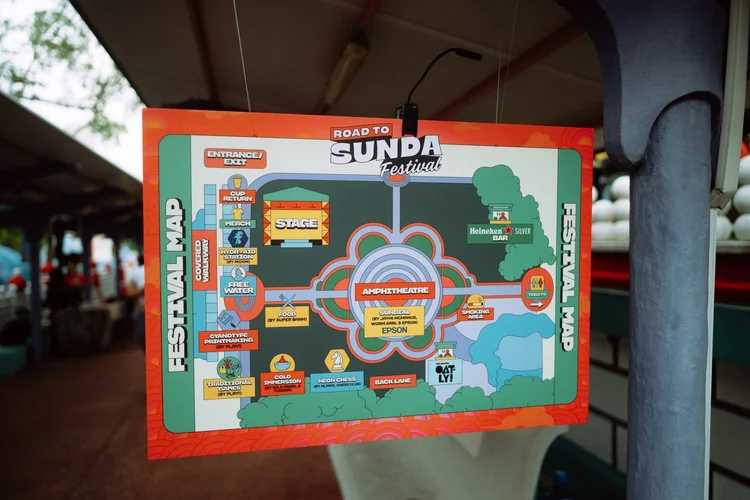
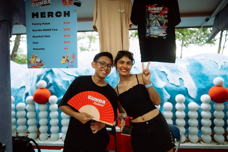


The identity was conceived as a flexible, modular system, allowing it to scale seamlessly across posters, social content, stage visuals, merchandise, wayfinding, and on-site environments while remaining cohesive and recognisable. Each iteration expanded on the core visual language, introducing new characters, colour palettes, and compositions while maintaining continuity across the festival’s branding.
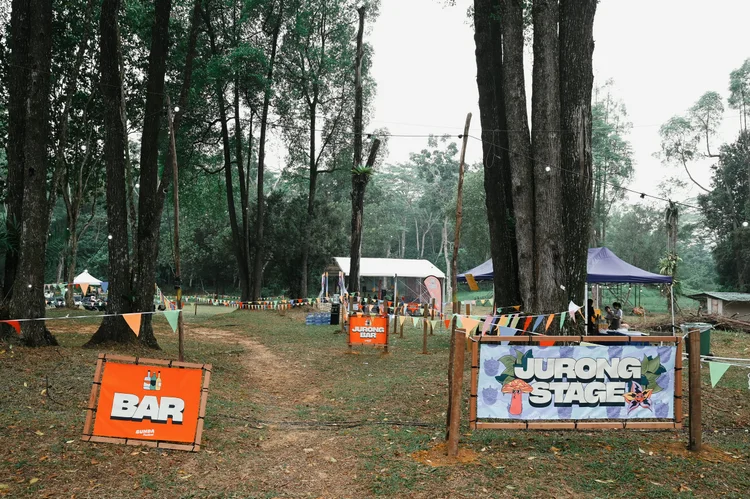
Custom iconography was developed specifically for on-site signage and wayfinding, supporting clarity and consistency across the festival grounds. I also designed one of the main stage environments for the first edition, alongside posters and visual assets for offshoots including afterparties and regional takeovers.
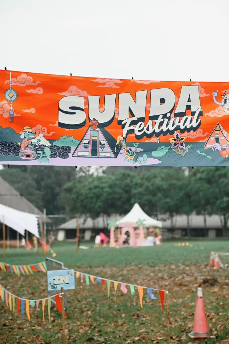
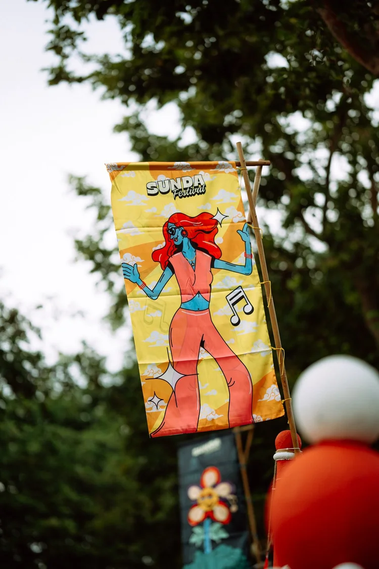
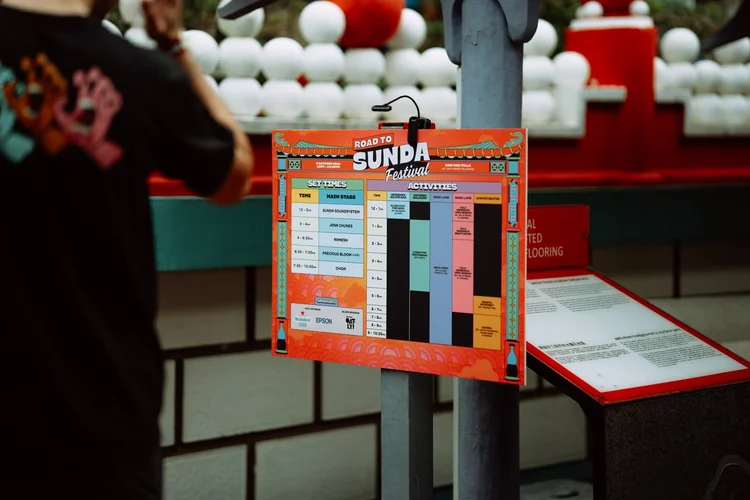
For Road to Sunda (2024), a site-responsive visual system was developed using Haw Par Villa’s architectural borders as a framing device. This system was later adapted for the main festival at Sarimbun Camp in 2025, retaining the same characters while evolving layouts and environments to suit each context. The identity supported a multi-day, multi-stage festival with numerous artists, partners, and public-facing touchpoints.
Rooted in playfulness, community, and a sense of escape, the visual direction balances bold graphic expression with clarity and adaptability, positioning Sunda as a long-term cultural platform rather than a one-off event.


Featured Work /
Nike By You
Typography, Illustration & In-store Experience
Client: Nike Year: 2023-2024
Role: Creative concept, typography & illustration
Scope: Retail experience, product personalisation, in-store activation, and social amplification
Selected as one of three artists for an exclusive Nike By You collaboration at Nike’s Asia flagship store. The project involved developing a bold, typography-driven collection that reinterpreted Nike’s iconic Futura typeface through a playful, 90s-inspired lens, while remaining grounded in the brand’s established visual codes.
The work was designed to live across in-store customisation, physical products, and social amplification, enabling customers to personalise and wear the designs on-site. Illustration and typography were treated as both functional and expressive elements within the retail environment, balancing brand consistency with creative experimentation.
By working within Nike’s existing system rather than outside of it, the project demonstrates an approach to brand collaboration that prioritises fluency, restraint, and clarity, extending the Nike By You experience through participation, craft, and personal expression.
Artist Statement
“I would describe myself as a versatile artist. Wearing multiple hats in the creative and music industry, I’ve dedicated my life to exploring the realms of good frequency and melody and incorporating it into my art, leading to a diverse body of work that spans various creative disciplines.”
About Natasha’s collection:
“The inspiration behind my Nike Orchard Road collection is rooted in a deep appreciation for Nike’s iconic brand identity, driven by a desire to infuse it with a distinctive and contemporary personality that resonates with both the brand and its audience. It’s about capturing the essence of Nike’s spirit of innovation and pushing boundaries through typography.”
Featured Work /
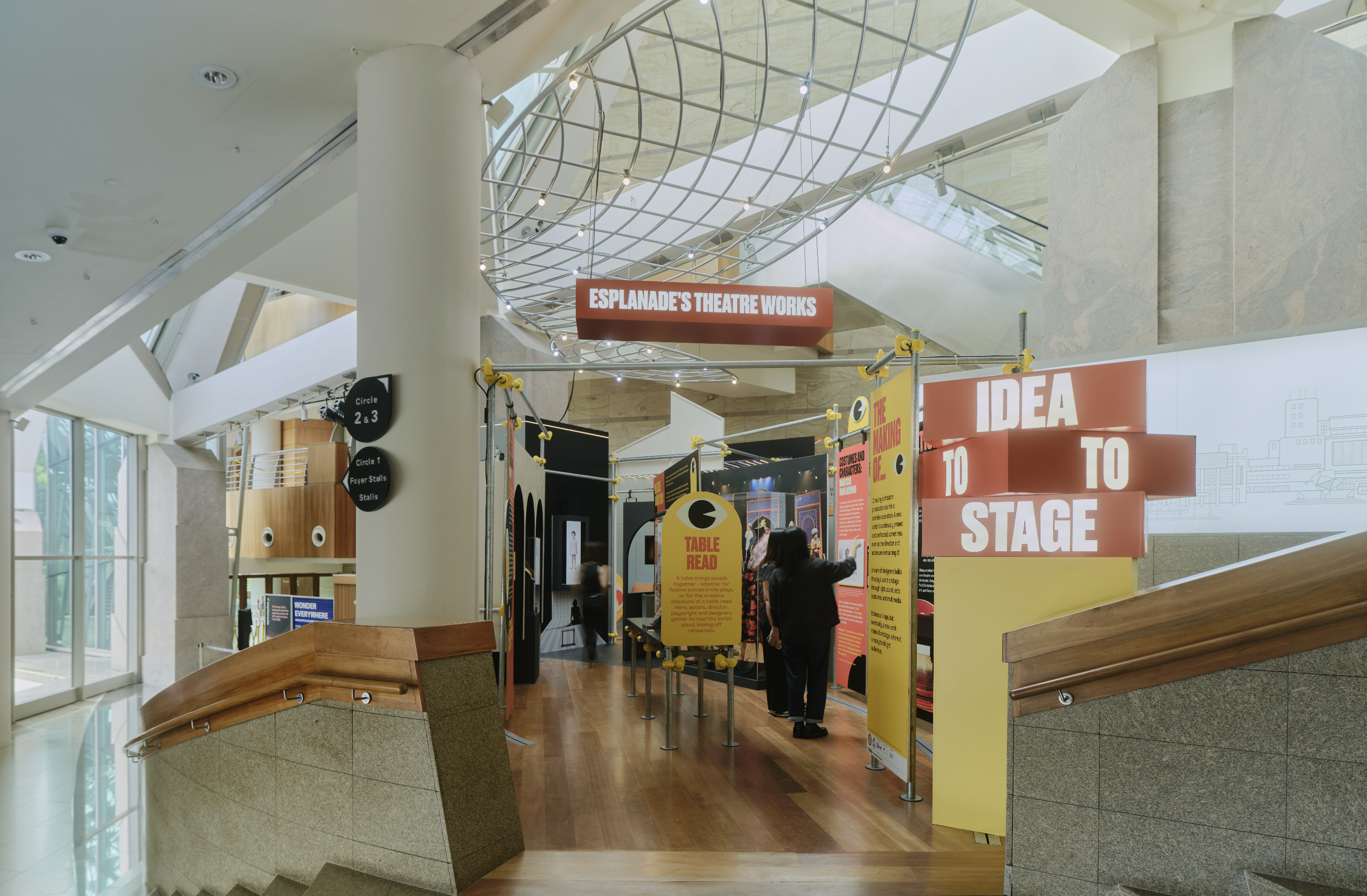
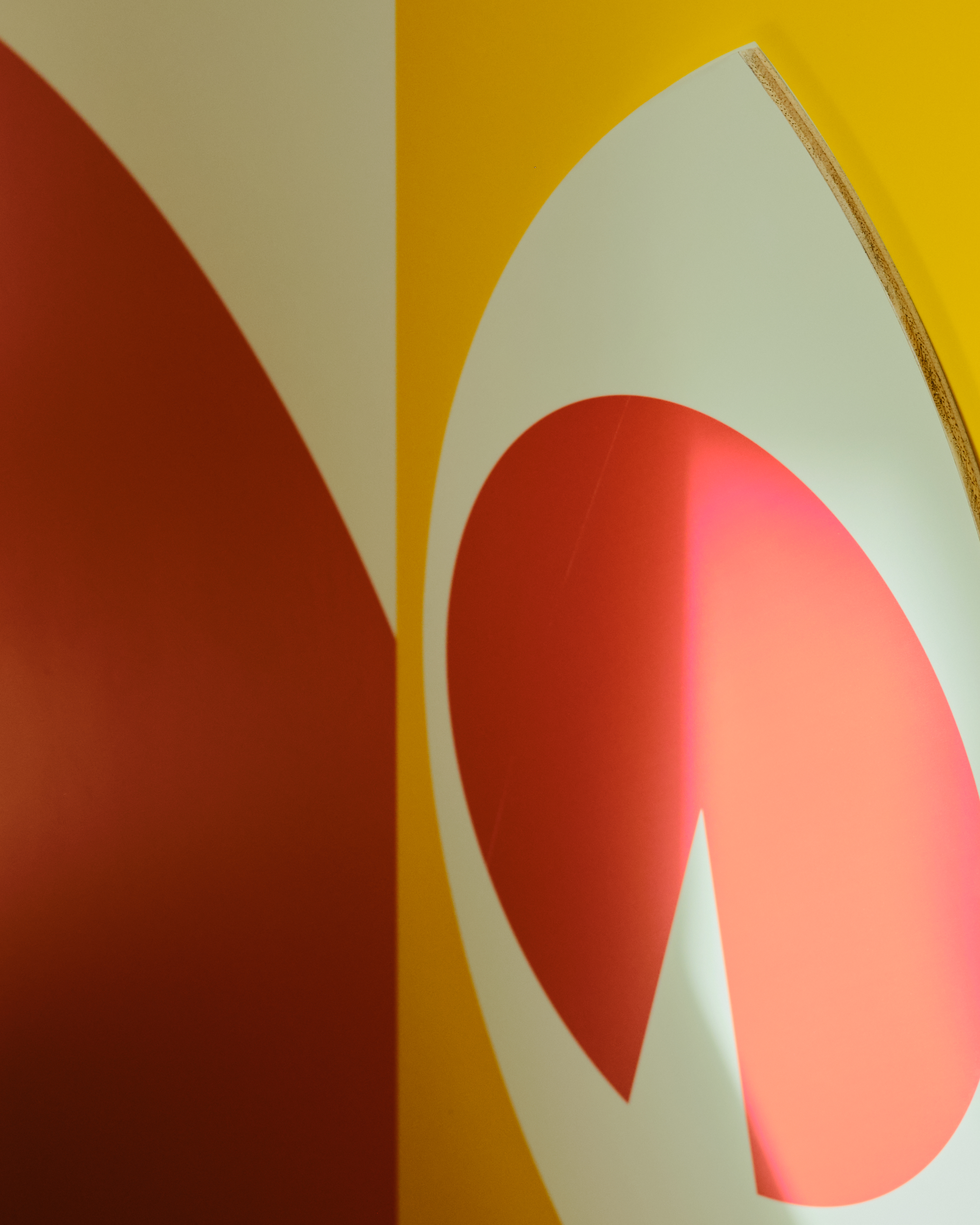
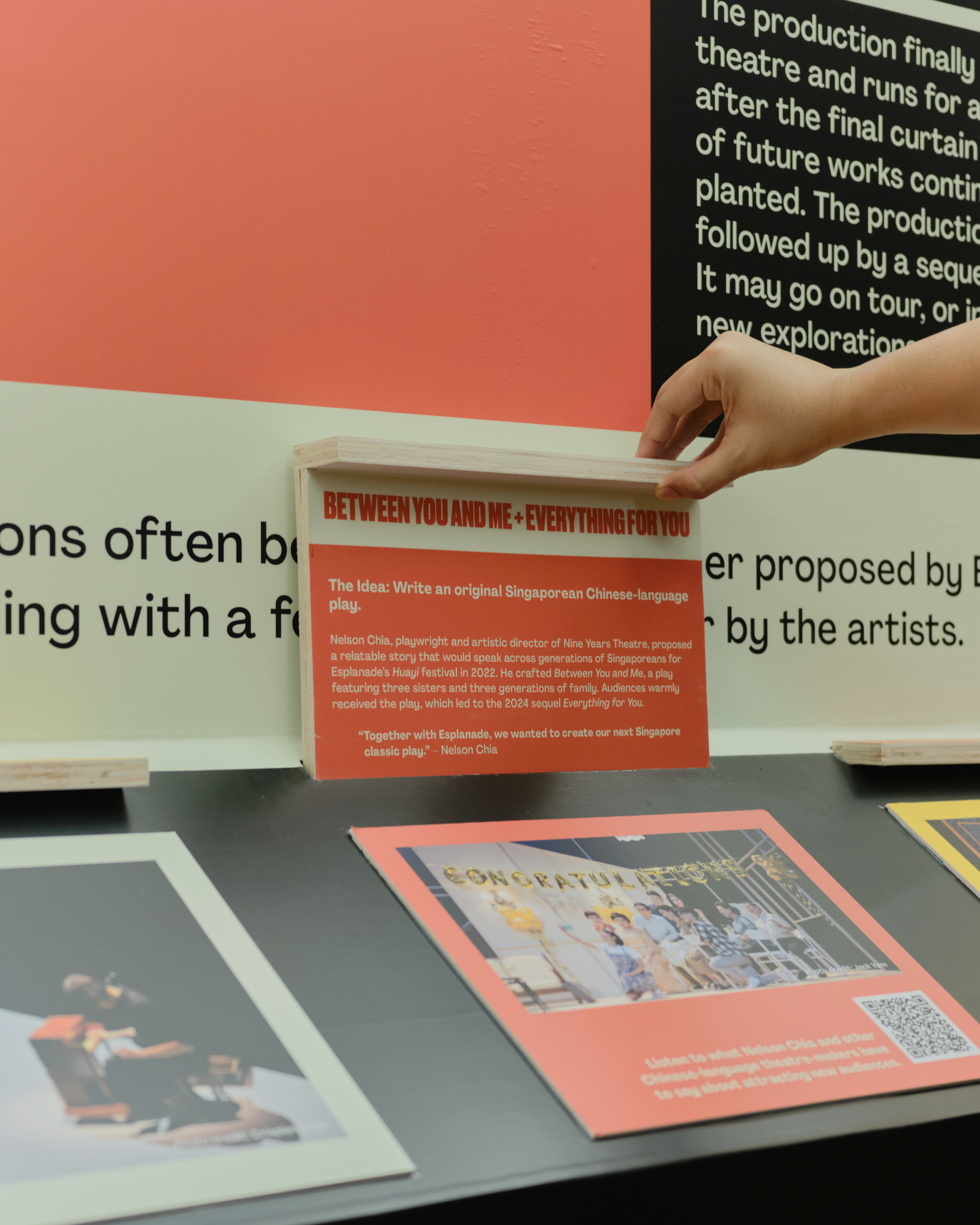
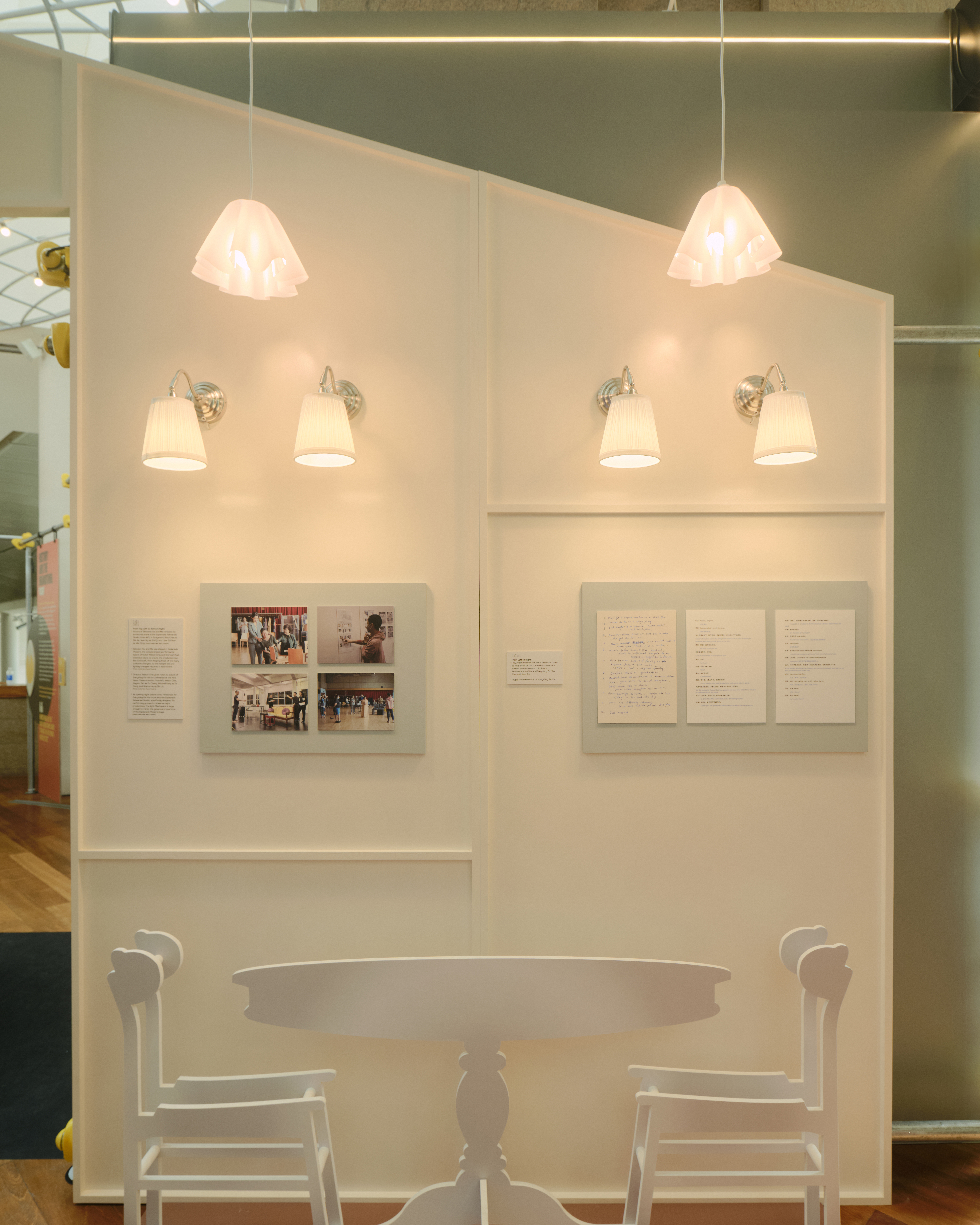
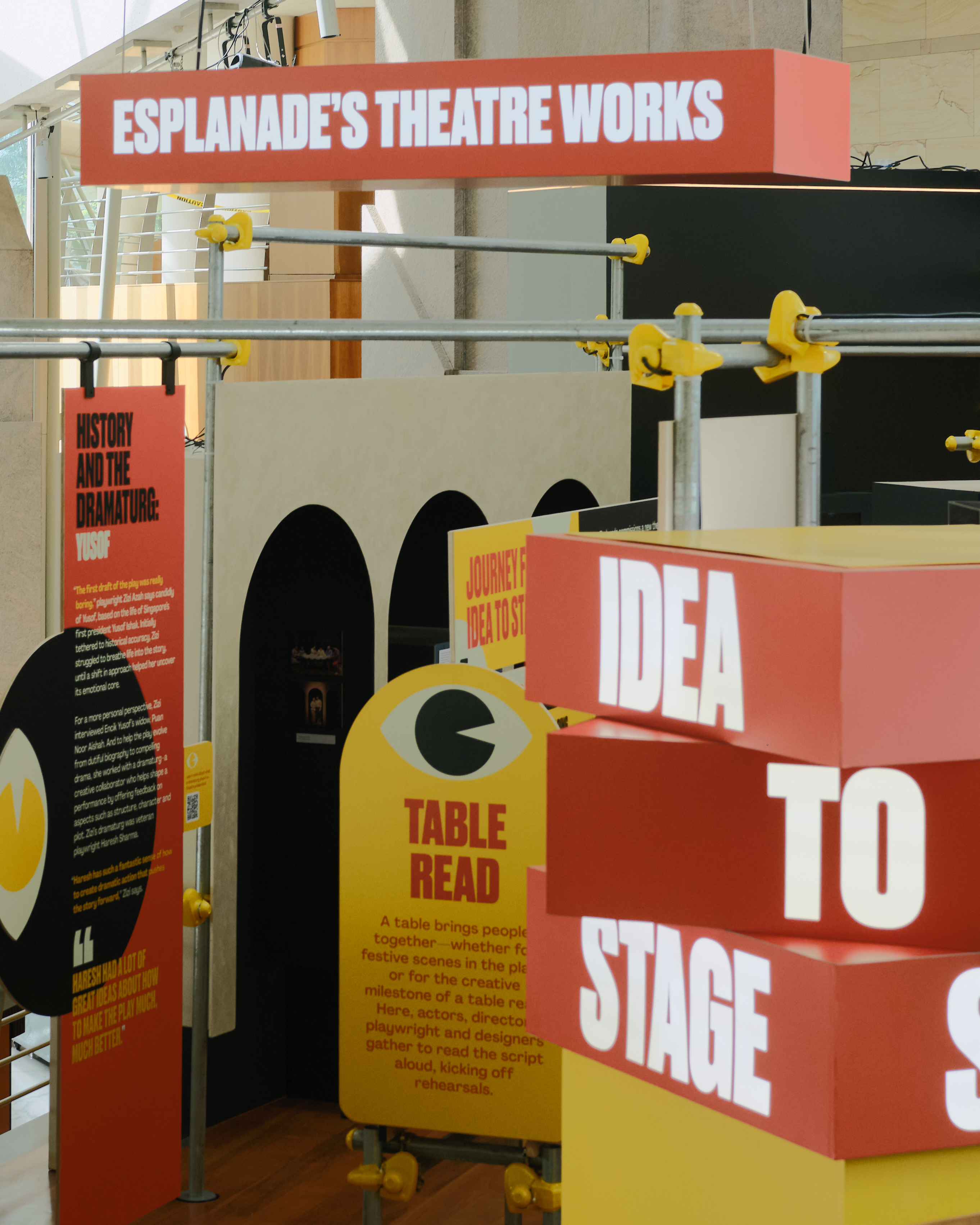
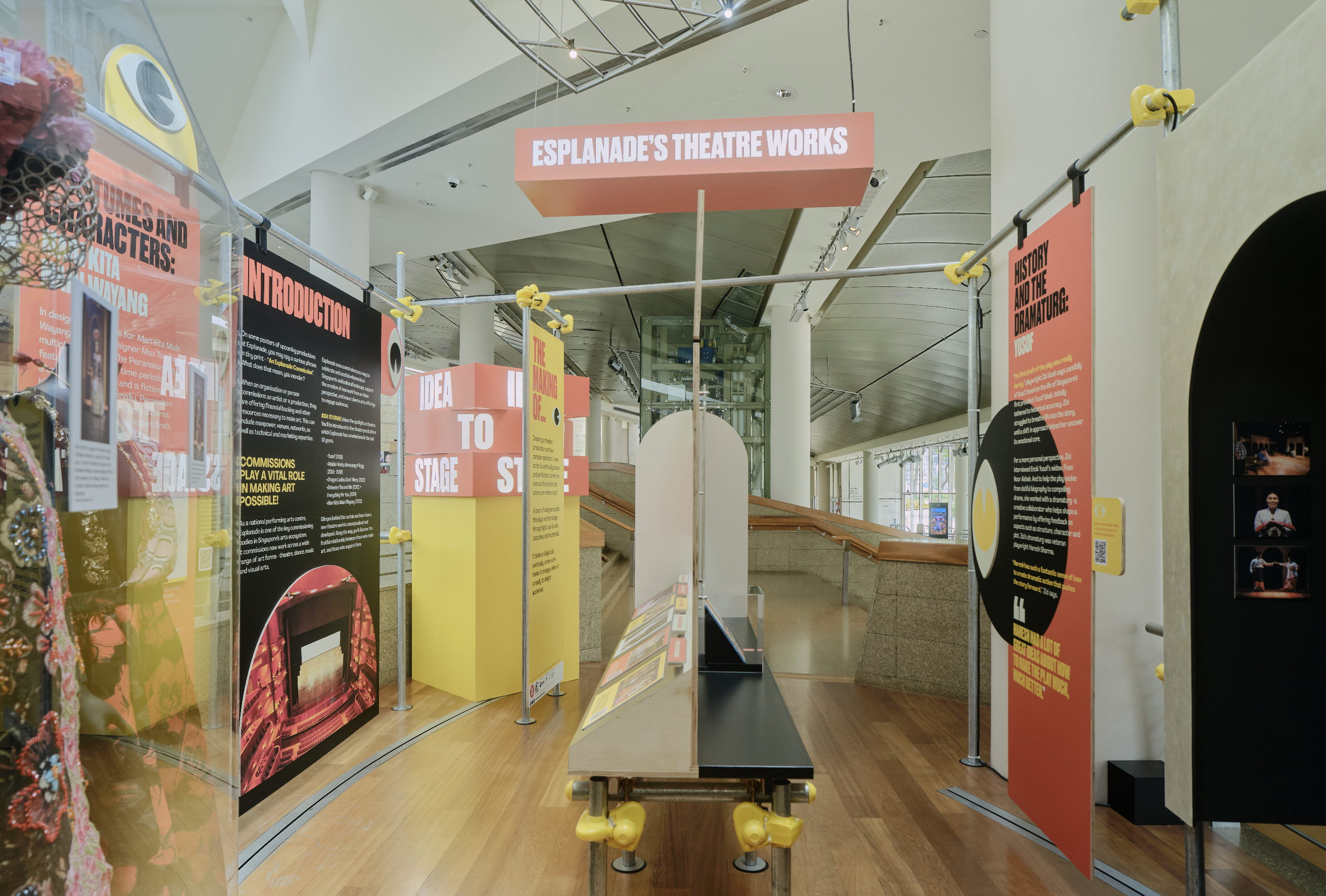
Esplanade –
Idea to Stage
Exhibition Identity & Environmental Graphics
Client: Esplanade – Theatres on the Bay
Year: 2025–2027
Role: Visual identity & exhibition graphics
Scope: Environmental graphics, print, and digital touchpoints
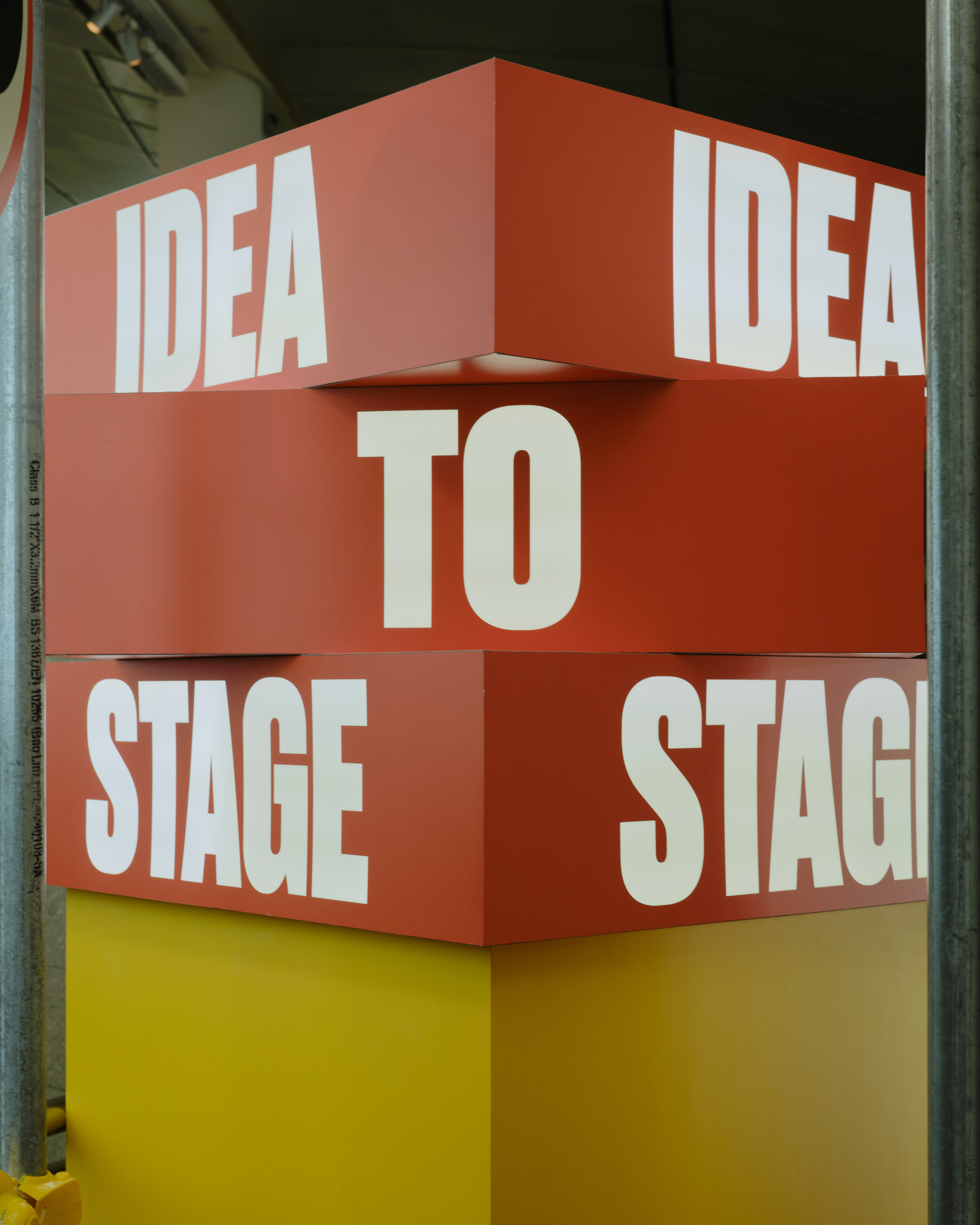
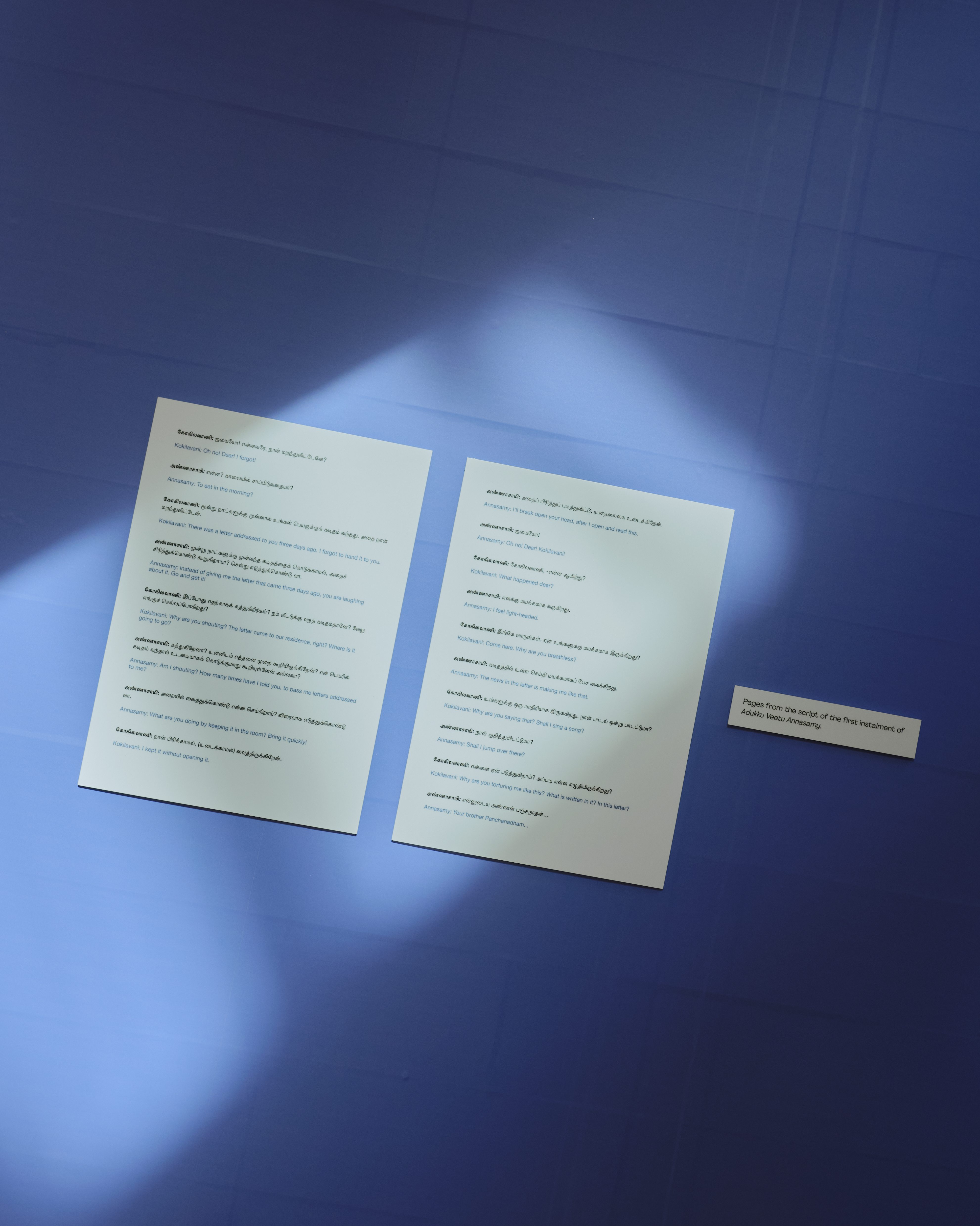
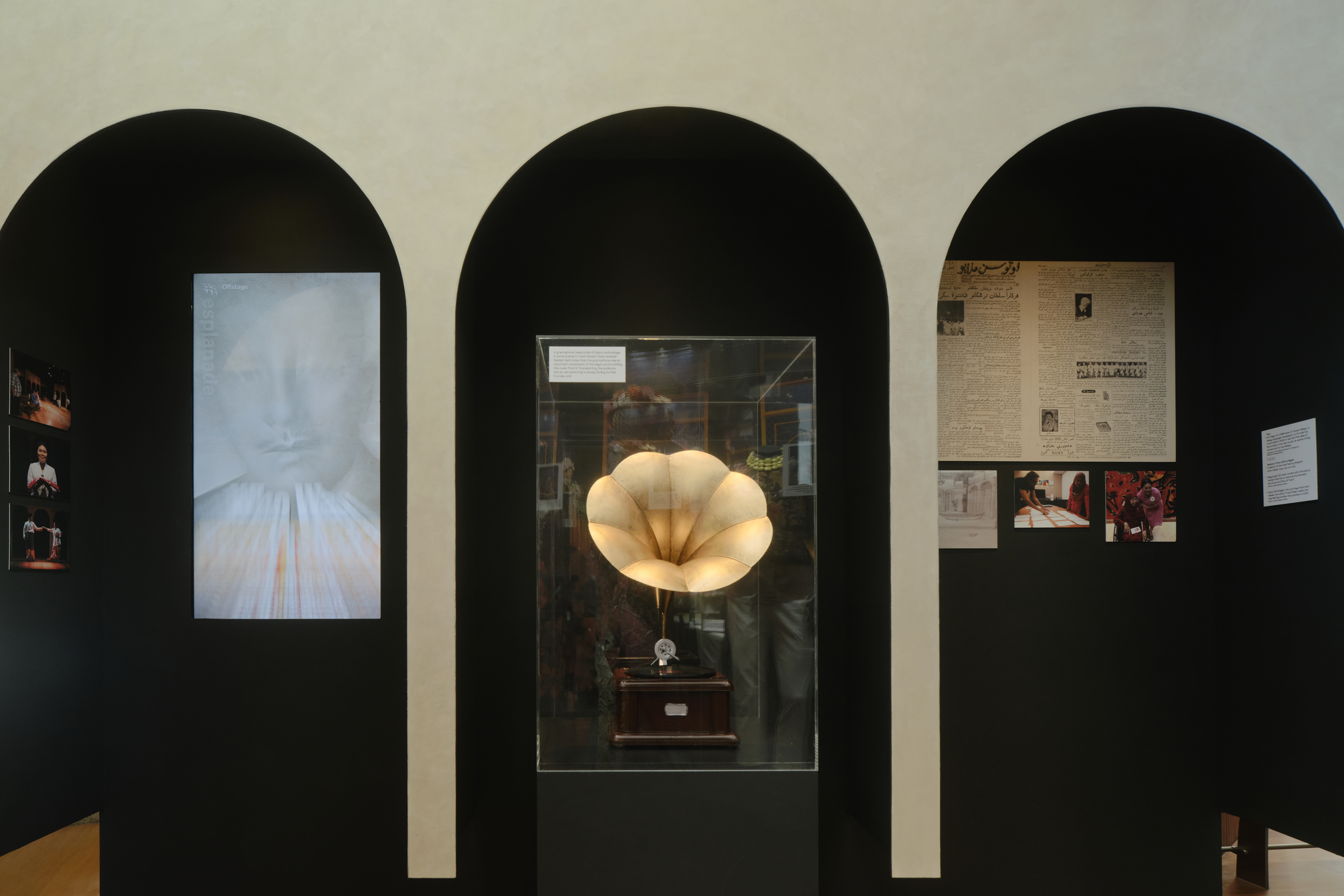
Developed the visual identity and exhibition graphics for Idea to Stage, Esplanade’s major theatre exhibition exploring the creative process behind stage productions.
The project translated archival material, interviews, and theatrical artefacts into a cohesive visual system spanning environmental graphics, print, and digital applications. The identity was designed to support layered storytelling, guiding visitors through complex narratives while remaining clear, accessible, and legible within a public exhibition context.
Working closely with spatial collaborators, the system was developed to be flexible and durable, allowing it to adapt across changing content, layouts, and formats over a multi-year exhibition run, while maintaining a consistent visual language throughout.
CREDITS
Spatial design collaboration: Amirul Nazree
Project management & fabrication: GreenQubes
Project documentation: Samuel Foo
Spatial design collaboration: Amirul Nazree
Project management & fabrication: GreenQubes
Project documentation: Samuel Foo
Featured Work /
Singapore’s National Collection on UTme!
Merchandise & Illustration
Client: National Heritage Board × Uniqlo
Commissioned by TSLA
Year: 2024
Designed a T-shirt illustration for Singapore’s National Collection on UTme!, a collaboration between the National Heritage Board and Uniqlo that brings national artefacts into everyday wear.
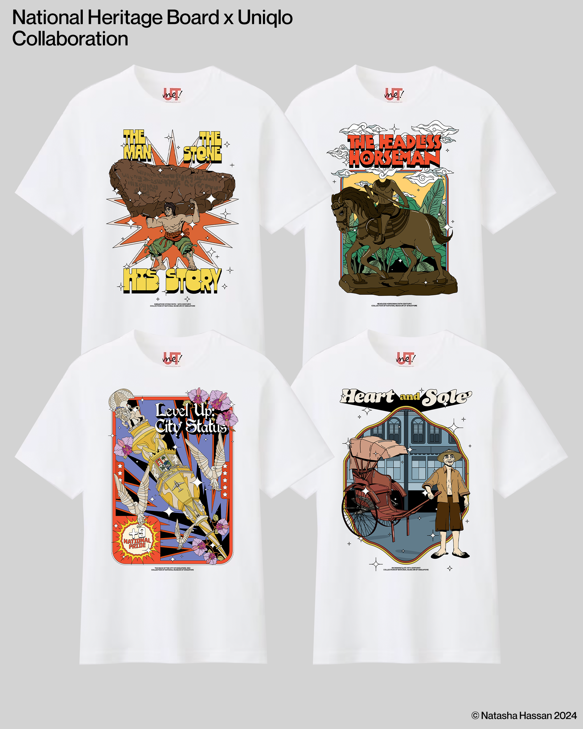
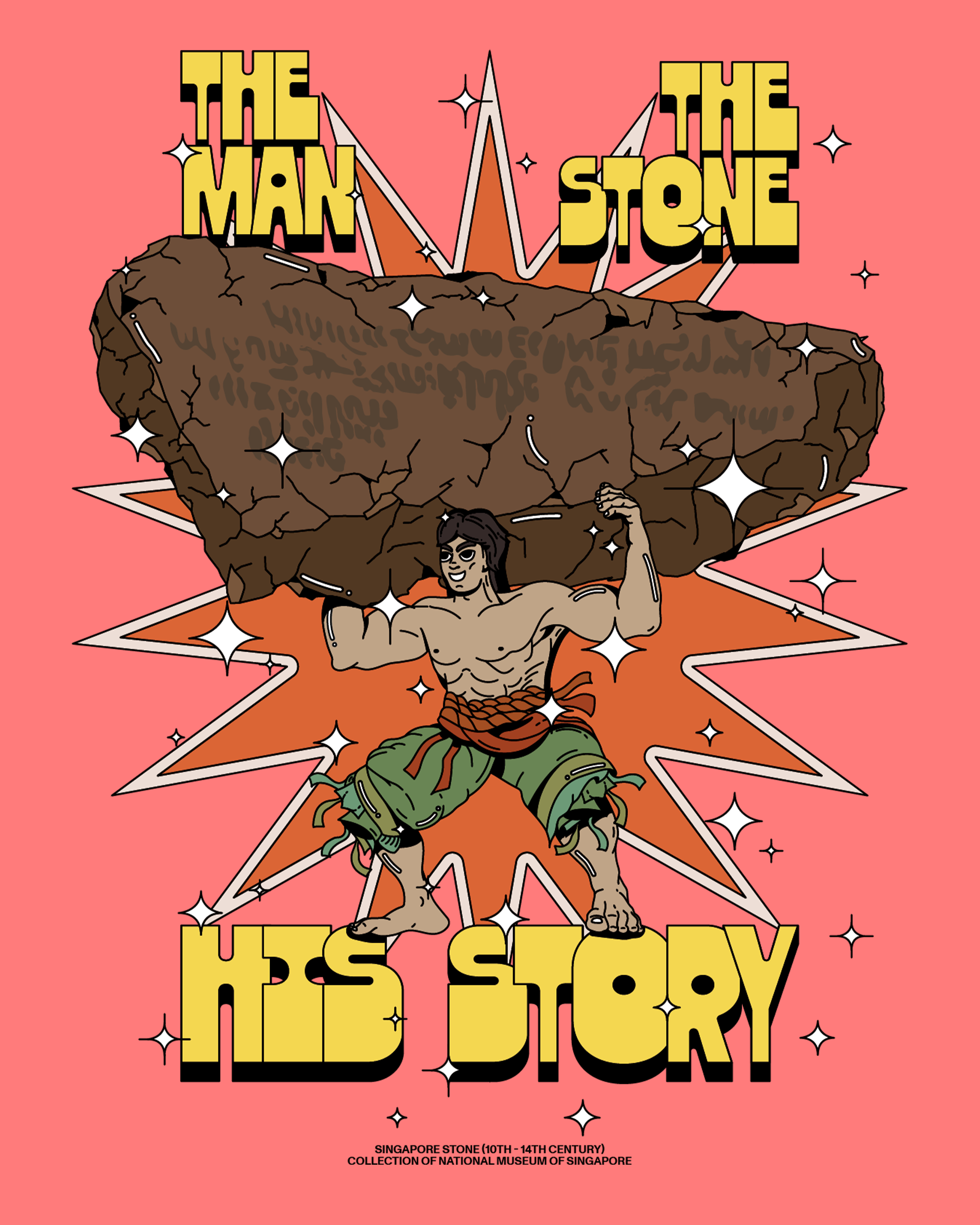
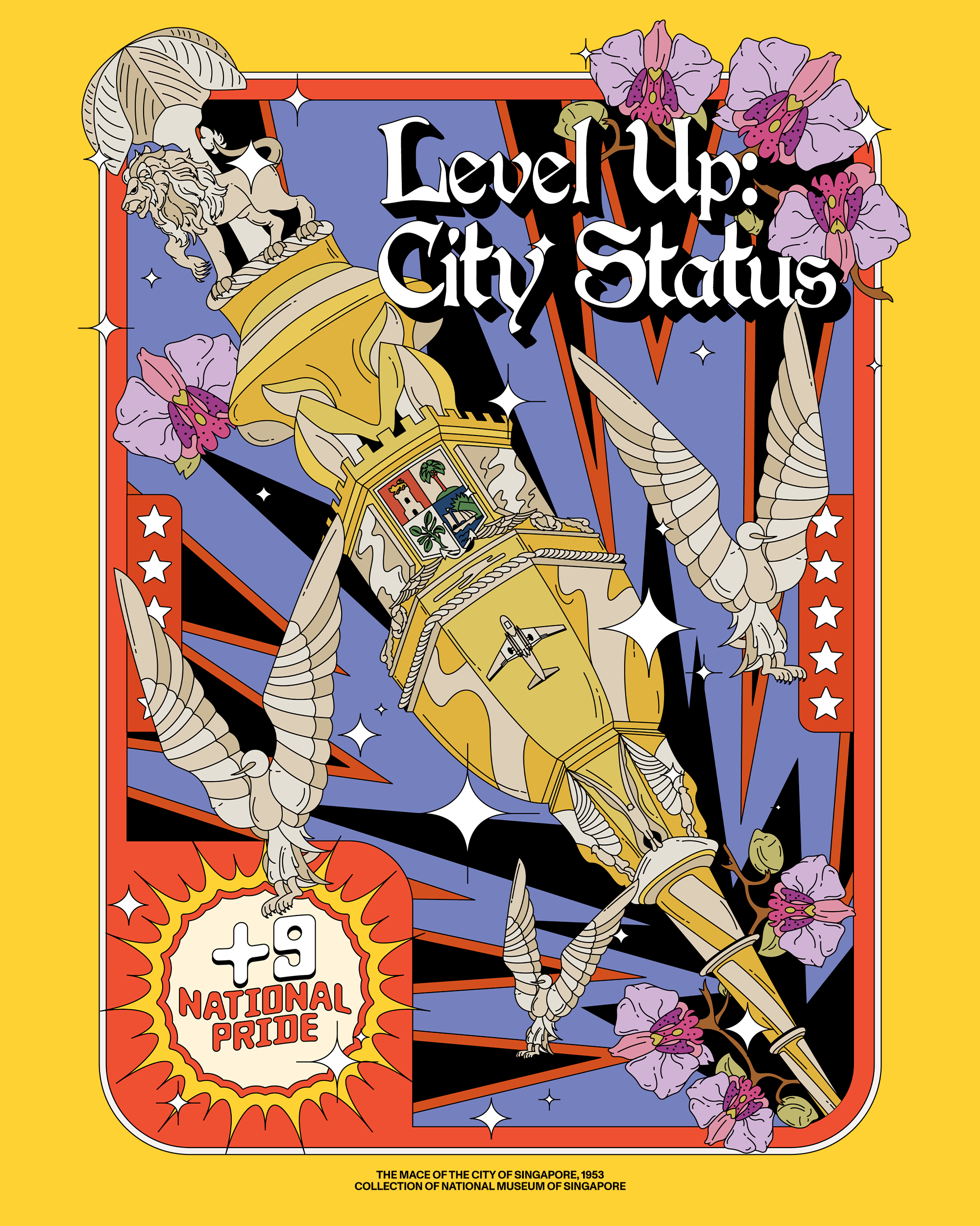
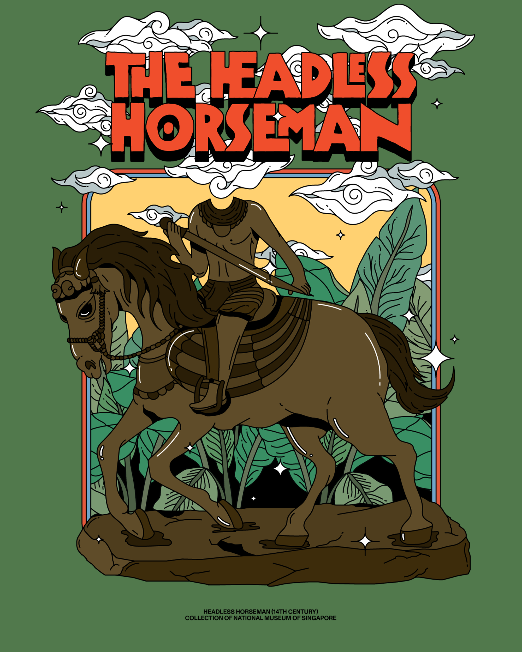
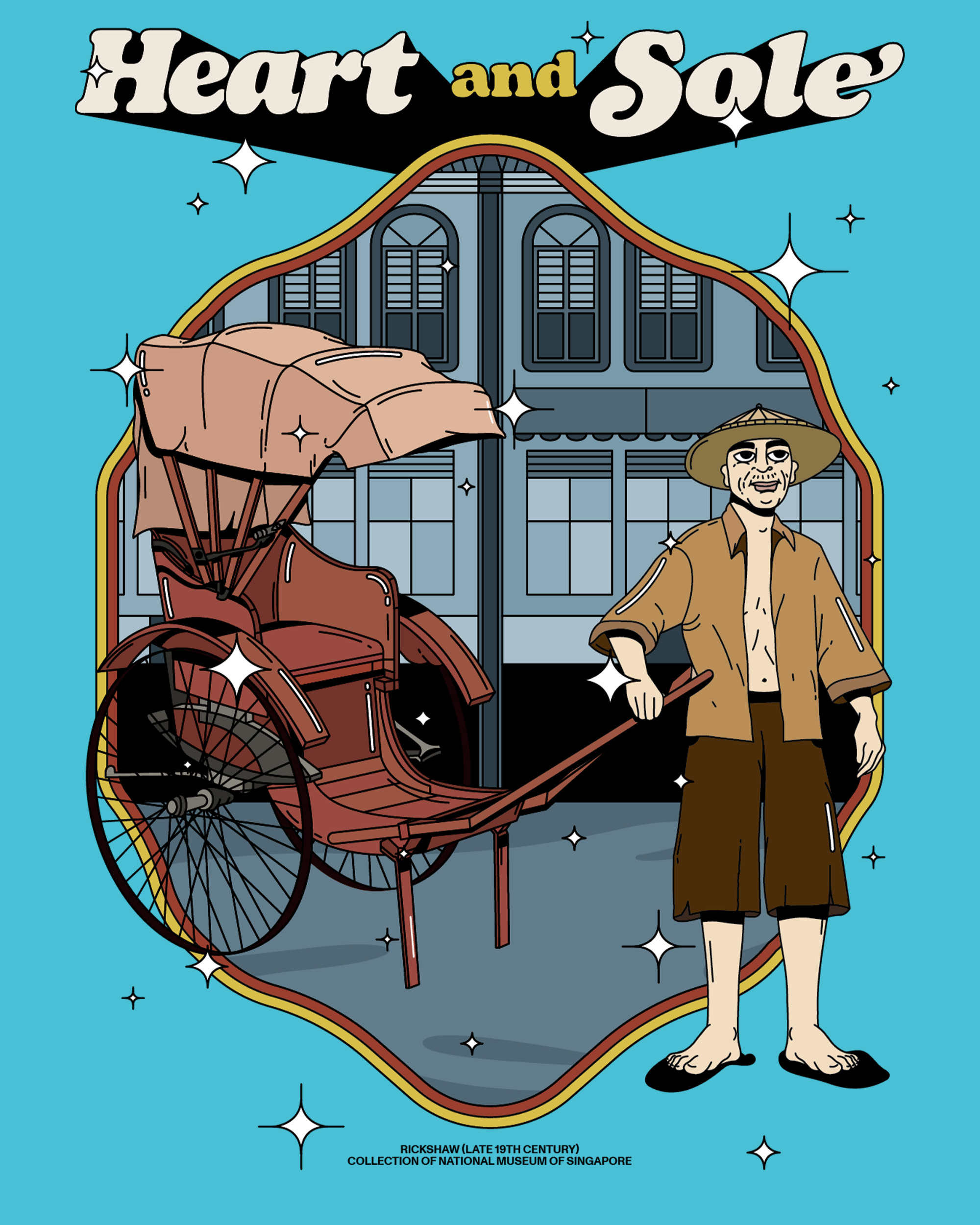
The design draws from the Singapore Stone and the legend of Badang the Magnificent, reinterpreted through a playful, 1960s-inspired visual language. Historical narrative was translated into a contemporary graphic form, balancing cultural reference with accessibility and mass appeal.
Released via Uniqlo’s UTme! customisation platform at Jewel Changi Airport, the project forms part of a longer-term collaboration exploring how heritage objects and stories can be reintroduced through popular culture and design-led merchandise.