All Works – Brand Identity ⊹ Events & Spatial ⊹ Editorial & Publishing ⊹ Illustration ⊹ Posters & Objects
In-house / Studio – Paramount International ⊹ Bandwagon Asia
All Works – Brand Identity ⊹ Events & Spatial ⊹ Editorial & Publishing ⊹ Illustration ⊹ Posters & Objects
In-house / Studio – Paramount International ⊹ Bandwagon Asia
Branding
Branding /
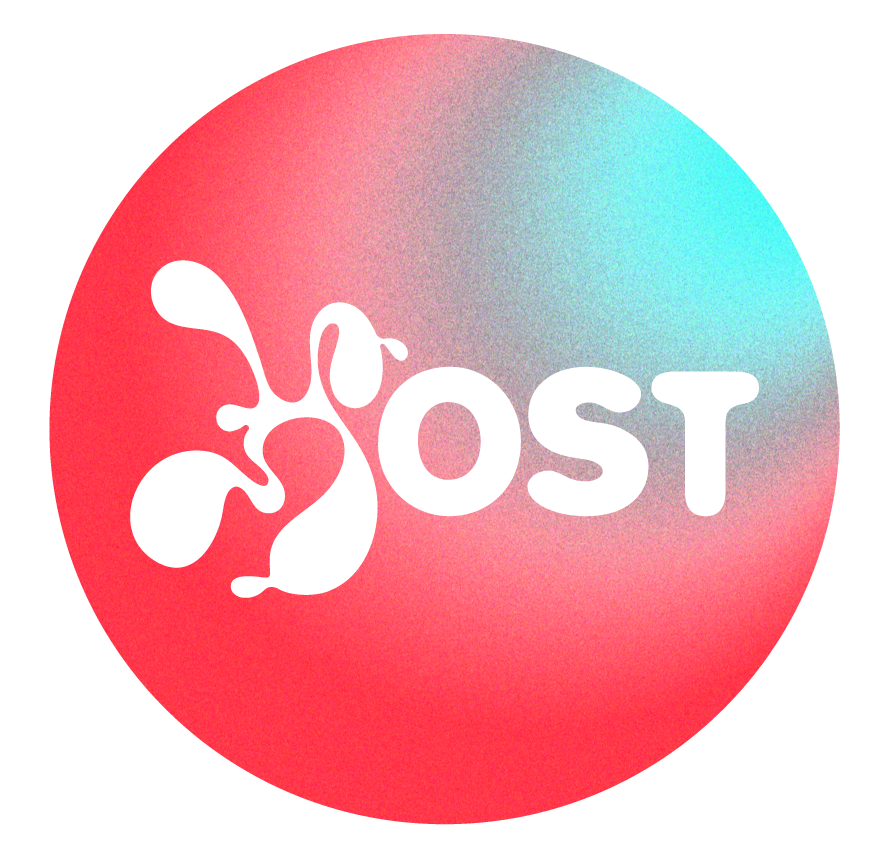
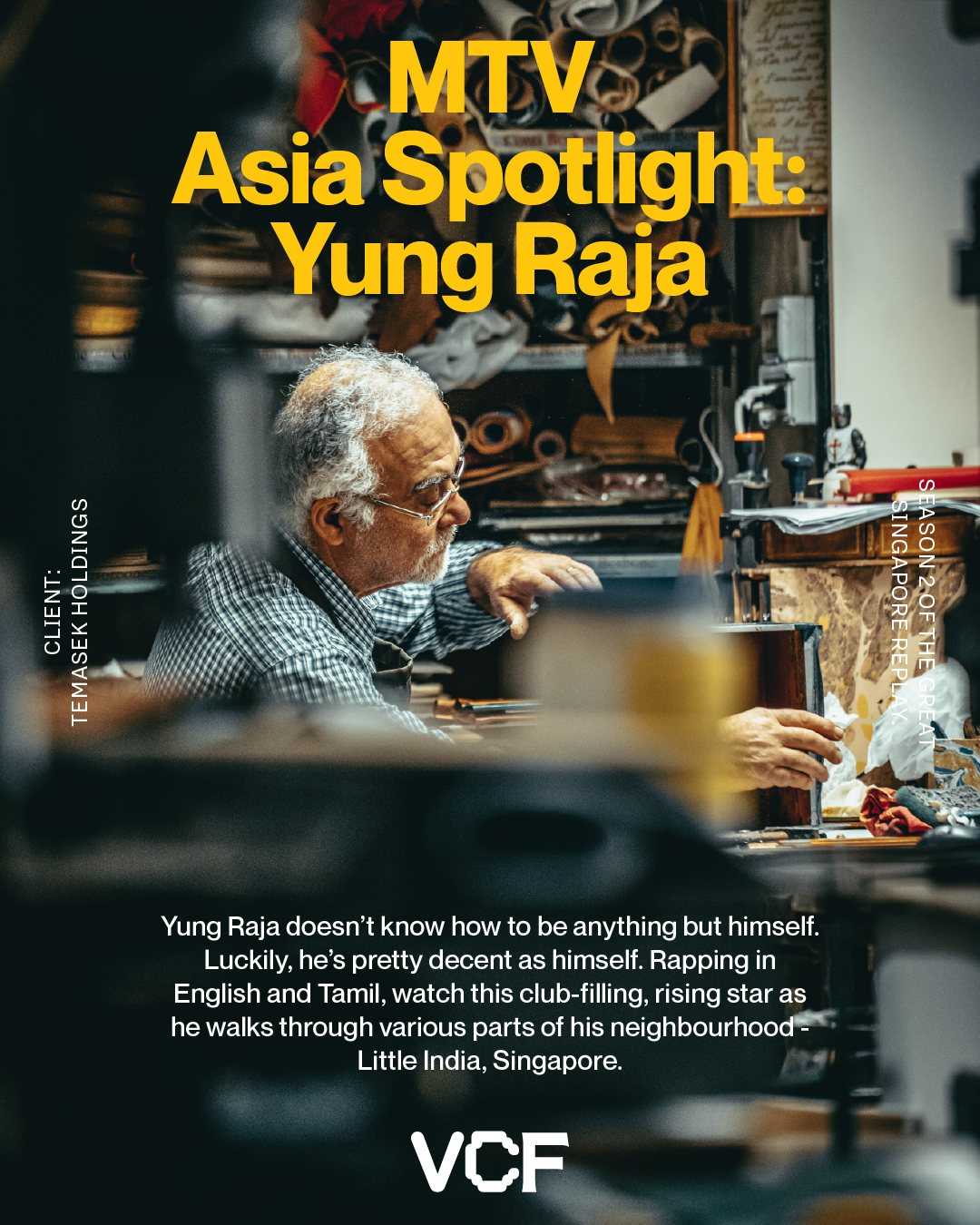
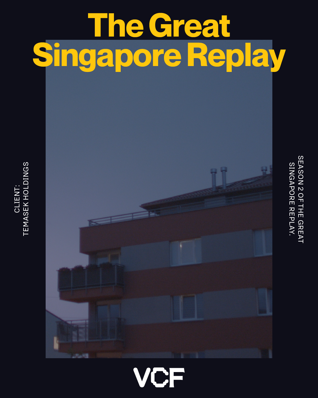
Host
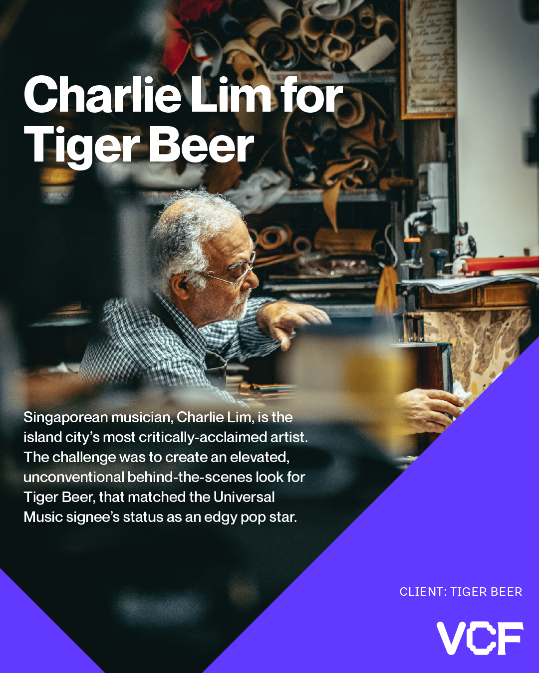
Client: HOST
Year: 2025
Role: Brand identity & art direction
Scope: Visual system, logotype, symbol set, and motion-led applications
Developed the visual identity for HOST, a queer bar and community space in Singapore, conceived as a sanctuary rooted in connection, safety, and shared intimacy.
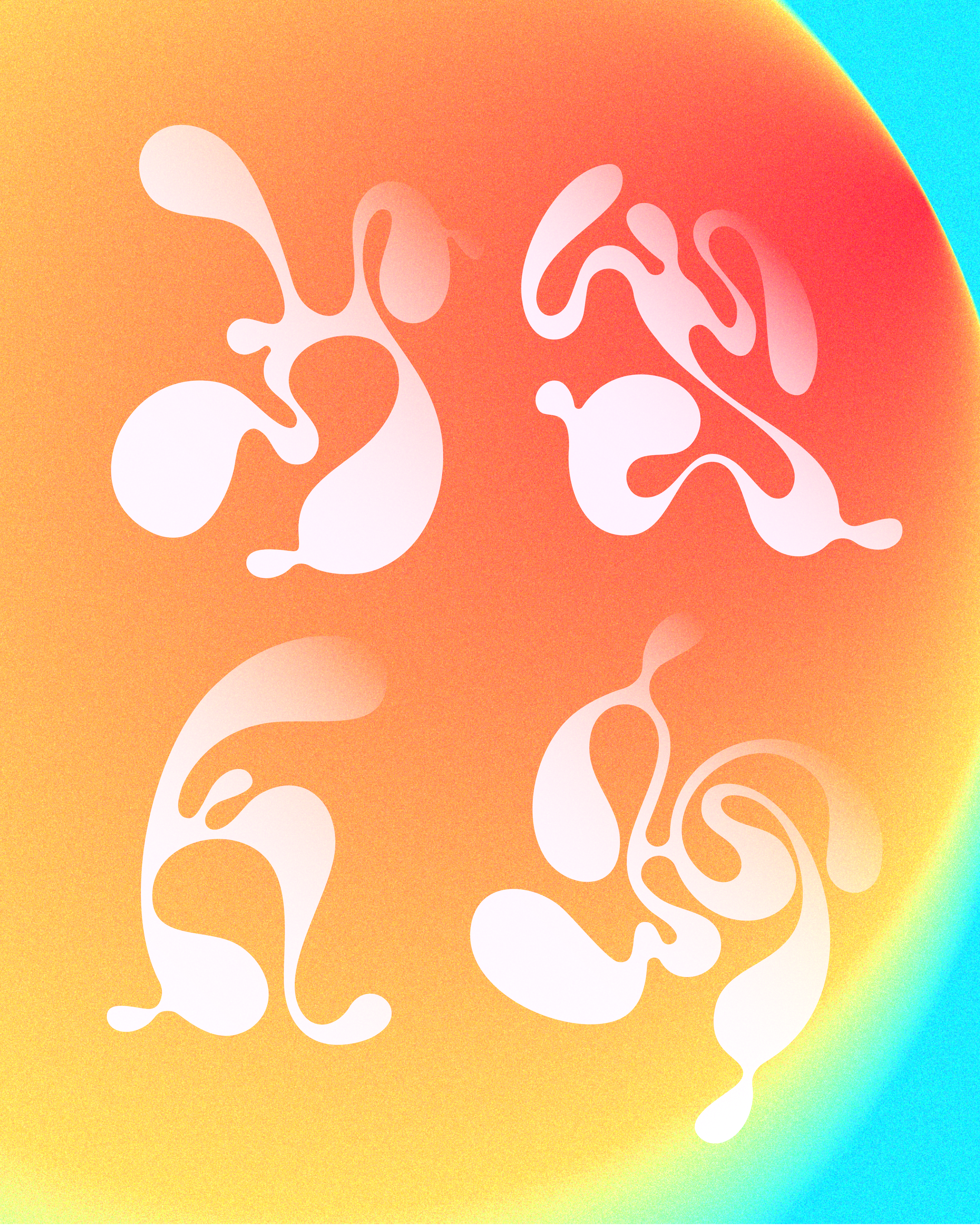
The identity centres on fluid, organic forms and a soft yet expressive typographic system, designed to feel raw, welcoming, and alive. A flexible logo and symbol set was developed to shift across gradients, textures, and motion-led applications, reflecting the emotional and social fluidity of the space itself.
Rather than relying on fixed or rigid brand markers, the system embraces variation and adaptability, allowing HOST’s visual language to evolve across digital, physical, and experiential touchpoints while maintaining a strong, recognisable core. The approach positions the identity as a living system, shaped by community, atmosphere, and use over time.
Logotype Design


Symbols
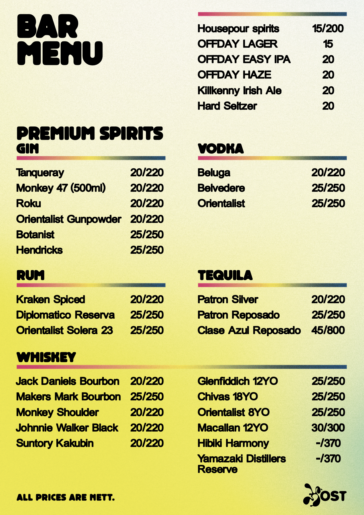
Menu Design
Branding /
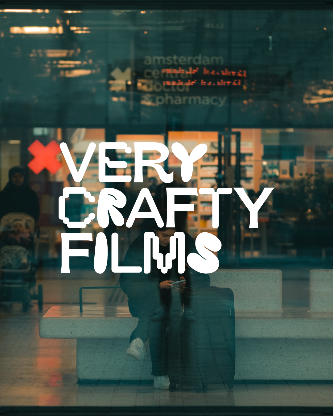
Very Crafty Films
Brand Identity & Art Direction
Client: Very Crafty Films
Year: 2022
Role: Brand identity & art direction
Scope: Visual system, logotype, brand guidelines, and digital applications
Developed the brand identity for Very Crafty Films, a production studio known for its energetic, playful, and experimental approach to storytelling.
The identity was conceived as a flexible system built around bold typography, high-contrast colour palettes, and modular logo variations. A distinctive typographic logotype was developed in multiple weights and dimensional styles, allowing the brand to adapt fluidly across digital platforms, social media, and campaign-led content while maintaining strong recognisability.
Alongside the core identity, a comprehensive set of brand guidelines was created, covering logo usage, colour systems, typography, and social media templates. The system was designed to support fast-moving content production while preserving visual consistency, enabling the brand to scale across formats, collaborations, and platforms without losing its character.
Social Media Adaptations
Logo Design
Branding /
Singapore Community Radio
Brand Identity, Art Direction & Web Design
Client: Singapore Community Radio (SGCR)
Year: 2020
Role: Brand identity, art direction & digital design
Scope: Visual system, programme artwork, social media templates, and website design
Instagram, Facebook
Coverage:
TimeOut
Life in Arppegio
Client: Singapore Community Radio (SGCR)
Year: 2020
Role: Brand identity, art direction & digital design
Scope: Visual system, programme artwork, social media templates, and website design
Instagram, Facebook
Coverage:
TimeOut
Life in Arppegio
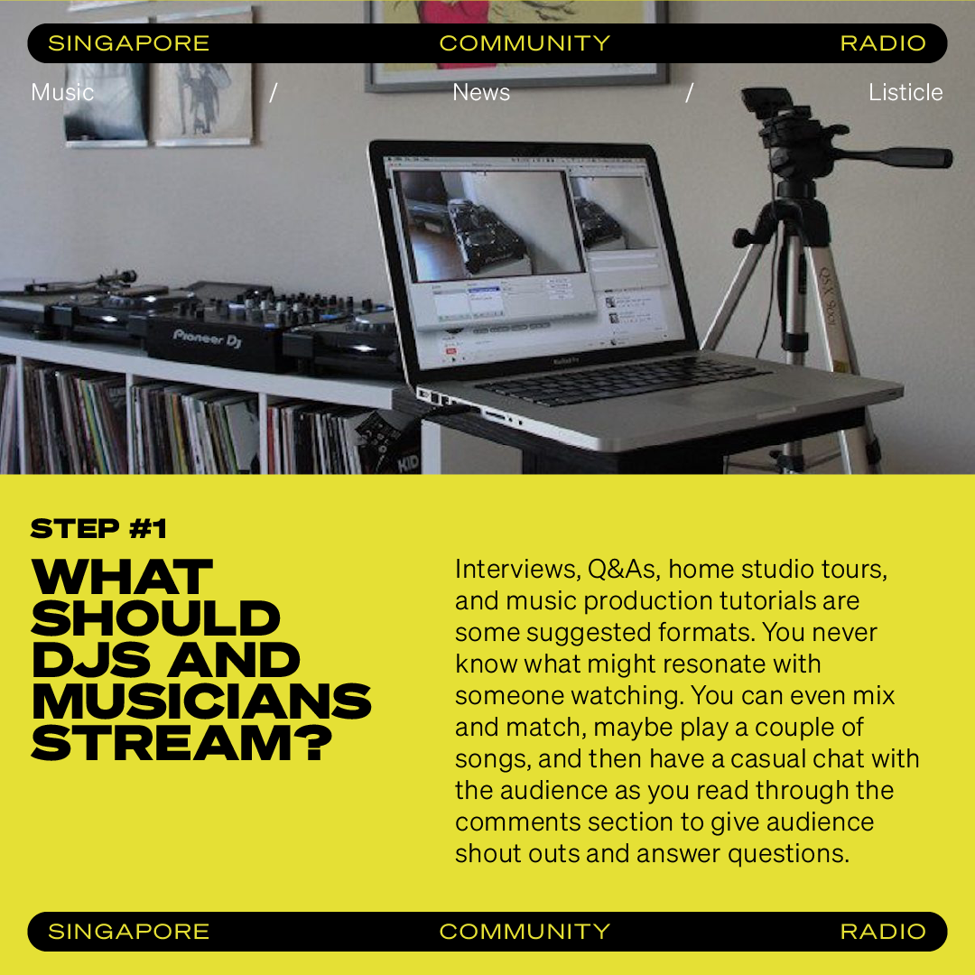
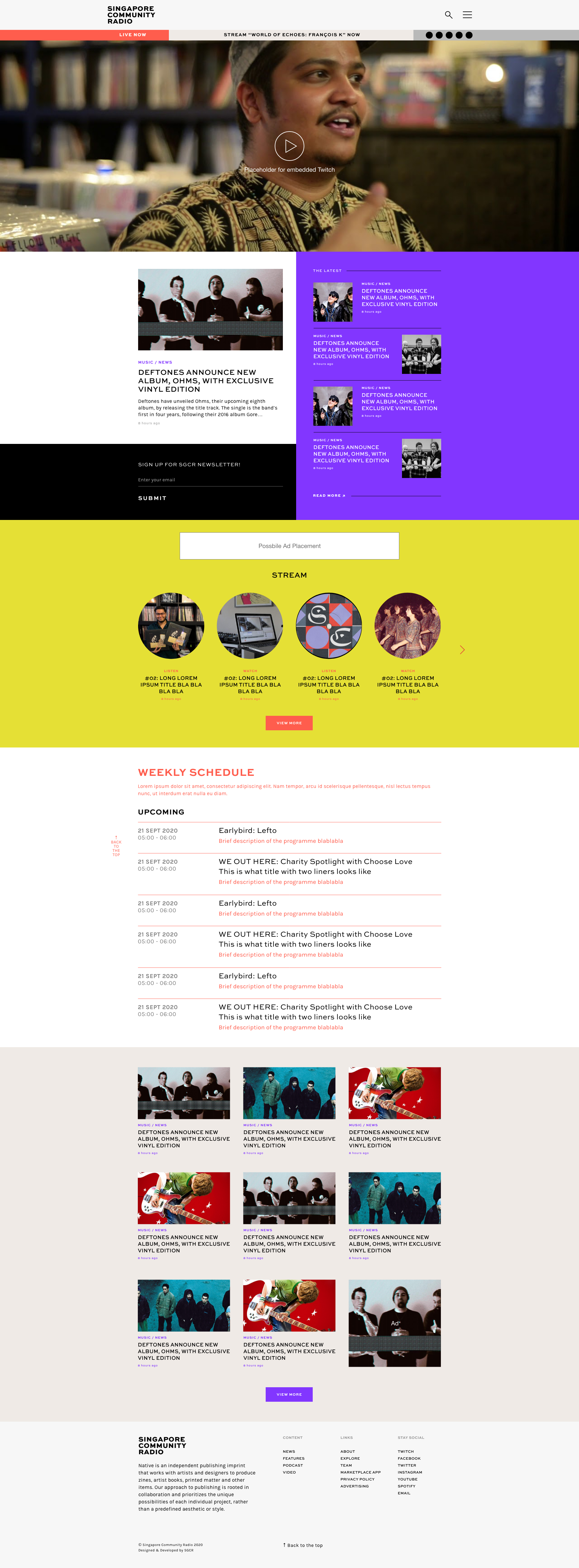
Commissioned to lead a 360° design and digital overhaul for Singapore Community Radio (SGCR), centred on adaptability, flexibility, and long-term sustainability. The project supported SGCR’s relaunch as a community-driven platform amplifying diverse Singaporean voices across music, culture, and conversation.
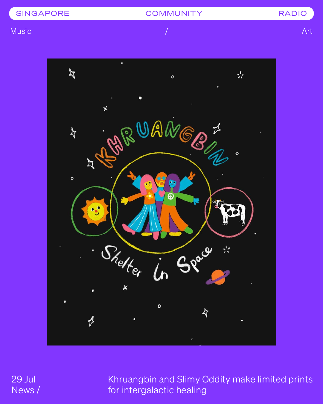
The revamp included a simplified logo identity, a flexible visual system for social media, a series of illustrated programme title artworks, and an intuitive website designed to support weekly content and evolving programming. The system was built to accommodate frequent updates while maintaining clarity and consistency across platforms.
The relaunch marked SGCR’s return with refreshed content airing weekly from Tuesdays to Saturdays, positioning the platform as a shared space for regional and local perspectives.
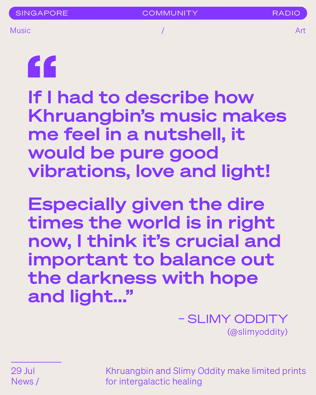
“Singapore Community Radio (SGCR) has announced its return with new, revamped content and programming.
... with content airing weekly from Tuesdays to Saturdays. The new direction for SGCR is targeted at elevating the “diverse Singaporean voices on a shared platform”” – NME.com
Logo Rebrand


Social Media Adaptations


Branding /
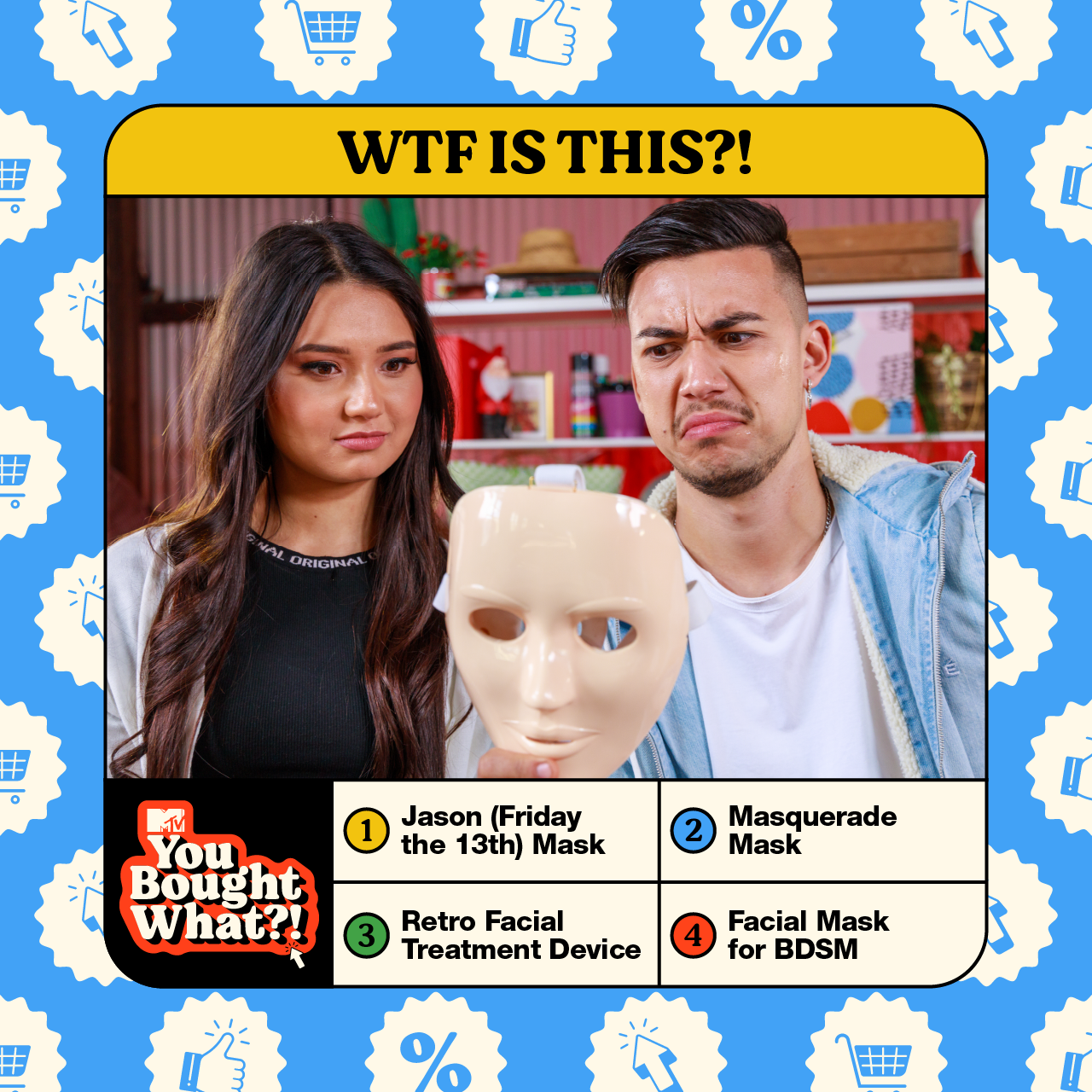
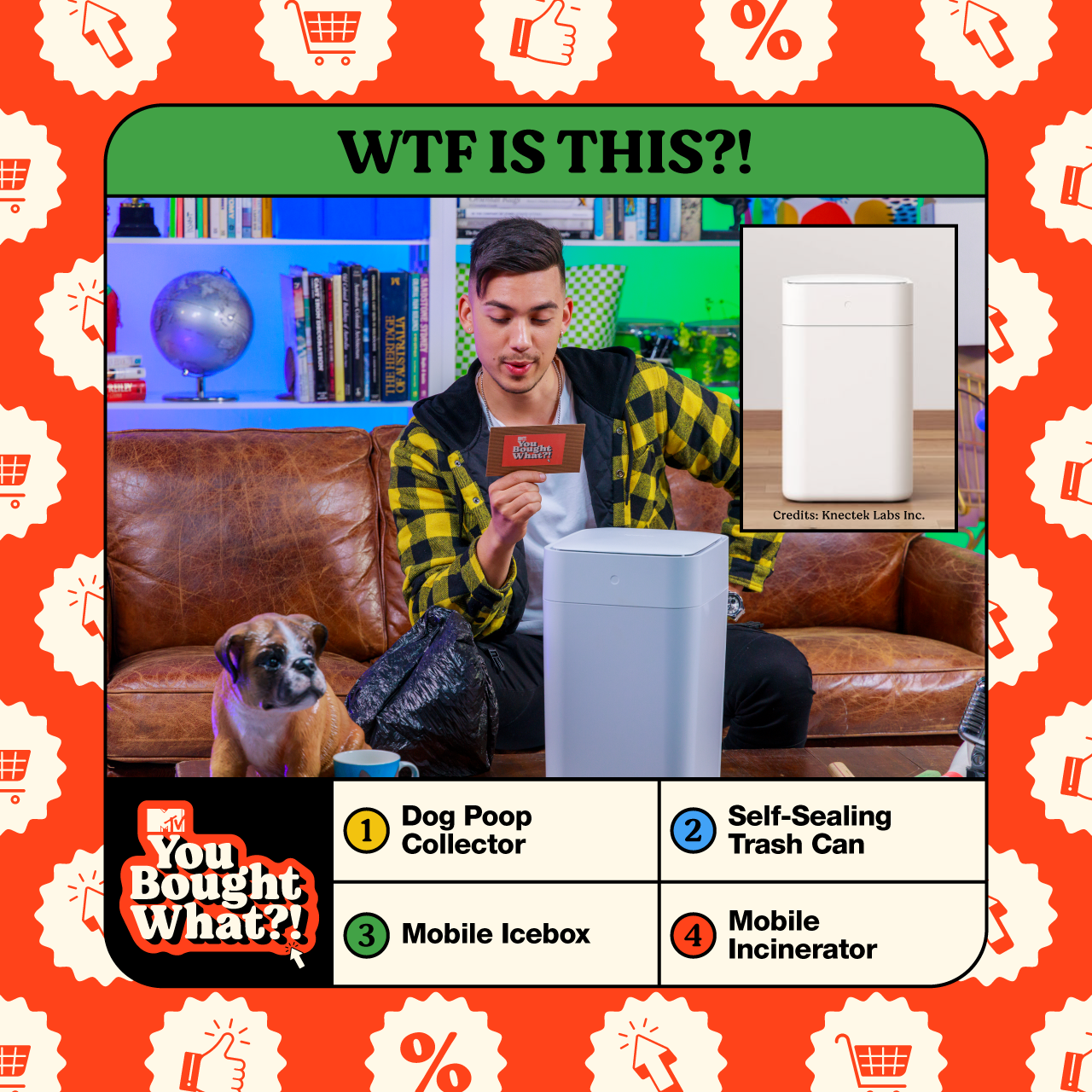
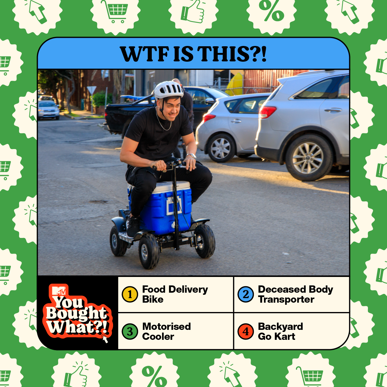
MTV: You Bought What

Logo Design
Social Media Template

Art Direction & Illustration
Client: MTV
Year: 2020
Role: Art direction & illustration
Scope: Visual identity, show graphics, and animated assets
Watch Now
Client: MTV
Year: 2020
Role: Art direction & illustration
Scope: Visual identity, show graphics, and animated assets
Watch Now
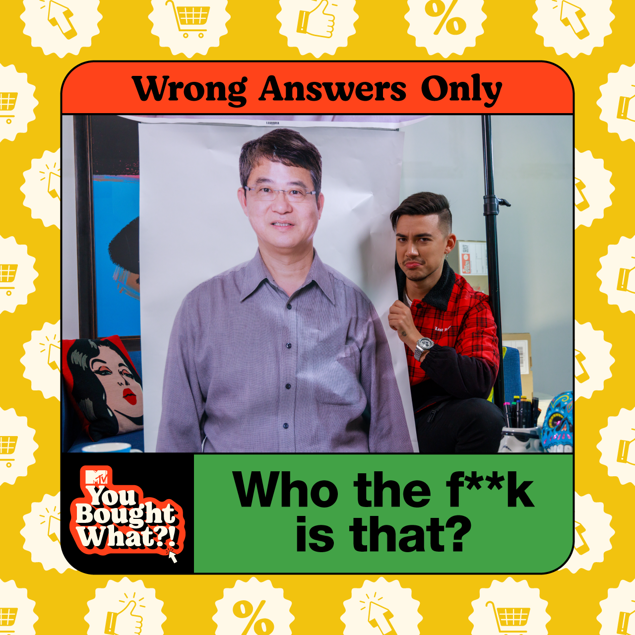
Led the art direction and illustration for You Bought What?!, a digital series produced by MTV Asia exploring internet culture through humour-driven product discovery and commentary.
The visual approach translated the show’s irreverent tone into a bold, graphic language, supporting episodic content through expressive illustration and animated assets. The system was designed to be flexible across episodes, formats, and platforms, maintaining visual consistency while allowing space for playful experimentation.
The project formed part of MTV’s digital content slate, requiring close collaboration across production and animation teams to deliver assets at pace while aligning with MTV’s established brand language.
“The internet: a haven for all things weird and wacky. Enter our host, Jamie Zhu, who’s on a quest to procure some truly unique s***. This is no ordinary unboxing, as Jamie reveals crazy online items you never knew existed (or that you needed!). From whacky beauty devices to odd online services and plenty of peculiar products in between, Jamie will unbox each one, test it out and asks questions about its overall bizarreness, such as “Who actually orders this stuff!?”.”
CREDITS
Animation by Lindsey Ng
Art Direction & Illustration by Natasha Hassan
Animation by Lindsey Ng
Art Direction & Illustration by Natasha Hassan
Iconography